How deep learning can solve problems in high energy physics

Using data from high energy collisions to detect new particles

Photo by Yulia Buchatskaya on Unsplash

An interesting branch of physics that is still being researched and developed today is the study of subatomic particles. Scientists at particle physics laboratories around the world will use particle accelerators to smash particles together at high speeds in the search for new particles. Finding new particles involves identifying events of interest (signal processes) from background processes.

The HEPMASS Dataset, which is publicly available in the UCI Machine Learning Repository, contains data from Monte Carlo simulations of 10.5 million particle collisions. The dataset contains labeled samples with 27 normalized features and a mass feature for each particle collision. You can read more about this dataset in the paper Parameterized Machine Learning for High-Energy Physics.

In this article, I will demonstrate how you can use the HEPMASS Dataset to train a deep learning model that can distinguish particle-producing collisions from background processes.

A Brief Introduction to Particle Physics

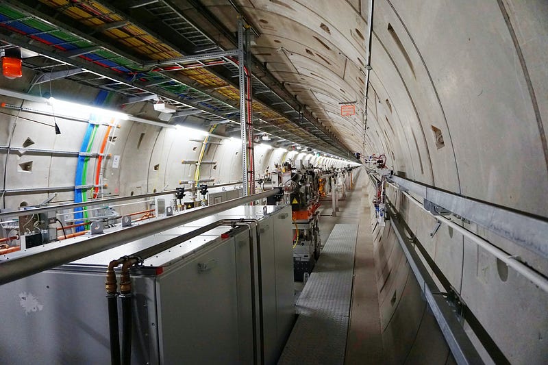
Particle physics is the study of the tiny particles that make up matter and radiation. This field is often referred to as high energy physics because the search for new particles involves using particle accelerators to collide particles at high energy levels and analyzing the byproducts of these collisions. Several particle accelerators and particle physics laboratories exist around the world. The Large Hadron Collider (LHC), built by the European Organization for Nuclear Research (CERN), is the world’s largest particle accelerator. The LHC is located in an underground tunnel near the Franco-Swiss border and features a 27-kilometer ring of superconducting magnets.

Large Hadron Collider. Photo by Erwan Martin on Unsplash.

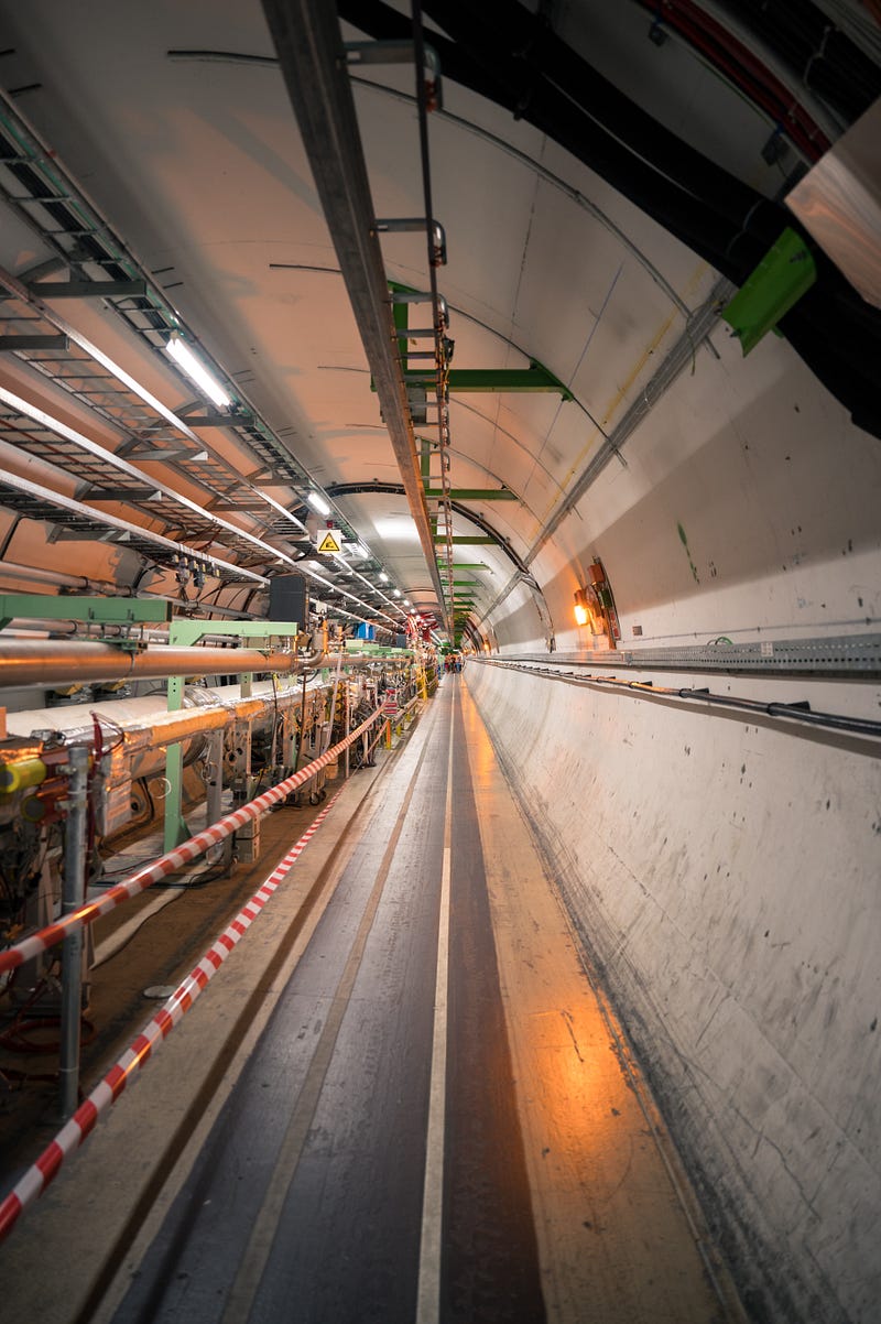
Imagine performing millions of particle collisions in a particle accelerator like the LHC, pictured above, and then trying to make sense of the data from those experiments. This is where deep learning can help us.

Importing Libraries

In the code below, I simply imported some of the basic Python libraries for data manipulation, analysis, and visualization. Please refer to this GitHub repository to find the full code used in this article.

import numpy as np
import pandas as pd
import matplotlib.pyplot as plt
import seaborn as sns
%matplotlib inline

Reading the Data

The HEPMASS Dataset comes with separate training and testing sets. In order to make the model evaluation process unbiased, I decided to read the training set first and leave the testing set untouched until after training and validating my models.

train = pd.read_csv('all_train.csv.gz')

Calling the Pandas info function on this dataframe produces the following summary for each of the columns.

<class 'pandas.core.frame.DataFrame'>
RangeIndex: 7000000 entries, 0 to 6999999
Data columns (total 29 columns):
# Column Dtype
--- ------ -----
0 # label float64
1 f0 float64
2 f1 float64
3 f2 float64
4 f3 float64
5 f4 float64
6 f5 float64
7 f6 float64
8 f7 float64
9 f8 float64
10 f9 float64
11 f10 float64
12 f11 float64
13 f12 float64
14 f13 float64
15 f14 float64
16 f15 float64
17 f16 float64
18 f17 float64
19 f18 float64
20 f19 float64
21 f20 float64
22 f21 float64
23 f22 float64
24 f23 float64
25 f24 float64
26 f25 float64
27 f26 float64
28 mass float64
dtypes: float64(29)
memory usage: 1.5 GB

The first column in the dataset corresponds to the class label indicating whether or not the collision produced a particle. Predicting this label is basically a binary classification task.

Exploratory Data Analysis

Now that we have the data, we can use seaborn to create some visualizations and understand it better.

Visualizing the Class Distribution

We can take a look at the distribution of classes using Seaborn’s countplot function as demonstrated below.

sns.countplot(train['# label'])
Distribution of class labels.

Based on the plot above, we can see that the classes are evenly distributed, with 3.5 million samples corresponding to background processes and the other 3.5 million corresponding to signal processes that produced particles. Note that a label of 1 corresponds to a signal process while a label of 0 corresponds to a background process.

Visualizing the Distributions of Different Features

We can also visualize the distributions of the features extracted from each simulated collision as demonstrated in the code below.

cols = 4
fig, axes = plt.subplots(ncols=cols, nrows=3, sharey=False, figsize=(15,15))
for i in range(12):
feature = 'f{}'.format(i)
col = i % cols
row = i // cols
sns.distplot(train[feature], ax=axes[row][col])
Distributions of the first 12 features.

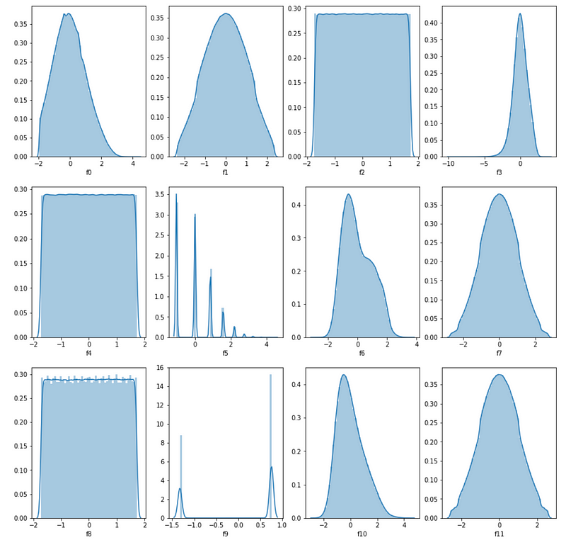
Several of the features above tend to follow similar probability distributions. Many of the features seem to follow approximately normal distributions with a slight skew towards the left or right while others such as f2, f4, and f5 roughly follow a uniform distribution.

Data Preprocessing

Scaling Mass

Unlike the scaled features, the mass feature has not been normalized or scaled, so we should scale it in order to make it easier for deep learning models to use it.

from sklearn.preprocessing import StandardScaler
scaler = StandardScaler()
train['mass'] = scaler.fit_transform(train['mass'].values.reshape(-1, 1))

Training and Validation Split

In the code below, I used the classic train_test_split function from Scikit-learn to split the data into training and validation sets. Based on the code, 70 percent of the data was used for training and the remaining 30 percent was used for validation.

from sklearn.model_selection import train_test_split
X = train.drop(['# label'], axis=1)
y = train['# label']
X_train, X_valid, y_train, y_valid = train_test_split(X, y, test_size=0.3, random_state=42)

Training Deep Learning Models

Now we are finally ready to train deep learning models to identify particle-producing collisions. In this section, I followed three steps for creating an optimal deep learning model:

  1. Defined the basic architecture and hyperparameters for the network.
  2. Tuned the hyperparameters of the network.
  3. Retrained the model with the best-performing hyperparameters.

I used the validation data to measure the performance of models with different hyperparameter configurations.

Defining the Neural Network Architecture and Hyperparameters

In the code below, I used a Keras extension called Keras Tuner to optimize the hyperparameters for a simple neural network with three hidden layers. You can read more about this tool and how to install it using the Keras Tuner documentation page.

from keras.regularizers import l2 # L2 regularization
from keras.callbacks import *
from keras.optimizers import *
from keras.models import Sequential
from keras.layers import Dense
from kerastuner import Hyperband
n_features = X.values.shape[1]
def build_model(hp):

hp_n_layers = hp.Int('units', min_value = 28, max_value = 112, step = 28)
model = Sequential()
model.add(Dense(hp_n_layers, input_dim=n_features, activation='relu'))
model.add(Dense(hp_n_layers, activation='relu'))
model.add(Dense(1, activation='sigmoid'))
hp_learning_rate = hp.Choice('learning_rate', values = [1e-2, 1e-3, 1e-4])
# Compile model
model.compile(loss='binary_crossentropy',
optimizer=Adam(learning_rate=hp_learning_rate),
metrics=['accuracy'])
return model
tuner = Hyperband(build_model,
objective = 'val_accuracy',
max_epochs = 10,
factor = 3,
directory = 'hyperparameters',
project_name = 'hepmass_deep_learning')

In the code above, I used Keras Tuner to define hyperparameter options for both the number of units in each hidden layer of the network and the learning rate used when training the network. I tested the following options for each hyperparameter:

  • Number of hidden layers: 28, 56, 84, and 112.
  • Learning rate: 0.01, 0.001, 0.0001.

This is by no means an exhaustive list and if you want to truly find the best hyperparameters for this problem, you can try experimenting with many more hyperparameter combinations.

Hyperparameter Tuning

Now that the neural network architecture and hyperparameter options have been defined, we can use Keras Tuner to find the best hyperparameter combinations.

The code segment below is an optional callback that I added to clear the training output at the end of the training run for each model in the hyperparameter search. This callback makes the output cleaner in a Jupyter Notebook or Jupyter Lab environment.

import IPython
class ClearTrainingOutput(Callback):

def on_train_end(*args, **kwargs):
IPython.display.clear_output(wait = True)

In the code below, I ran a simple search on the hyperparameters to find the best model. This search process involves training and validating different hyperparameter combinations and comparing them to find the best performing model.

tuner.search(X_train, y_train, epochs=4, 
validation_data = (X_valid, y_valid),
callbacks = [ClearTrainingOutput()])
# Get the optimal hyperparameters
best_hps = tuner.get_best_hyperparameters(num_trials = 1)[0]
print(f"""
Optimal hidden layer size: {best_hps.get('units')} \n
optimal learning rate: {best_hps.get('learning_rate')}.""")

Running the search yields the following optimal hyperparameters.

Optimal hidden layer size: 112 

optimal learning rate: 0.001.

Training the Best Model

Now that the hyperparameter search is complete, we can retrain a model with the best hyperparameters.

model = tuner.hypermodel.build(best_hps)
history = model.fit(X_train, y_train, epochs=4, validation_data = (X_valid, y_valid))

The training process above produces the following output for each epoch.

Epoch 1/4
153125/153125 [==============================] - 150s 973us/step - loss: 0.2859 - accuracy: 0.8691 - val_loss: 0.2684 - val_accuracy: 0.8788
Epoch 2/4
153125/153125 [==============================] - 151s 984us/step - loss: 0.2688 - accuracy: 0.8788 - val_loss: 0.2660 - val_accuracy: 0.8799
Epoch 3/4
153125/153125 [==============================] - 181s 1ms/step - loss: 0.2660 - accuracy: 0.8801 - val_loss: 0.2645 - val_accuracy: 0.8809
Epoch 4/4
153125/153125 [==============================] - 148s 969us/step - loss: 0.2655 - accuracy: 0.8806 - val_loss: 0.2655 - val_accuracy: 0.8816

Based on the training output above, we can see that the best model achieved a validation accuracy of just over 88 percent.

Testing the Best Model

Now we can finally evaluate the model using the separate testing data. I scaled the mass column as usual and used the Keras evaluate function to evaluate the model from the previous section.

test = pd.read_csv('./all_test.csv.gz')
test['mass'] = scaler.fit_transform(test['mass'].values.reshape(-1, 1))
X = test.drop(['# label'], axis=1)
y = test['# label']
model.evaluate(X, y)

The code above produces the output below.

109375/109375 [==============================] - 60s 544us/step - loss: 0.2666 - accuracy: 0.8808
[0.26661229133605957, 0.8807885646820068]

Based on this output, we can see that the model achieved a loss of about 0.2667 and just over 88 percent accuracy on the testing data. This level of performance is what we would expect based on the training and validation results and we can see that the model is not overfitting.

Summary

In this article, I demonstrated how to use the HEPMASS dataset to train a neural network to identify particle-producing collisions. This is an interesting application of deep learning to the field of particle physics and will likely become more popular in research with advances in both fields. As usual, you can find the full code for this article on GitHub.

Sources

  1. CERN, Facts and figures about the LHC, (2021), CERN Website.
  2. Wikipedia, Monte Carlo method, (2021), Wikipedia the Free Encyclopedia.
  3. P. Baldi, K. Cramer, et. al, Parameterized Machine Learning for High-Energy Physics, (2016), arXiv.org.

How to build an amazing music recommendation system.

Using Spotify’s data to generate music recommendations.

Photo by Marcela Laskoski on Unsplash

Have you ever wondered how Spotify recommends songs and playlists based on your listening history? Do you wonder how Spotify manages to find songs that sound similar to the ones you’ve already listened to?

Interestingly, Spotify has a web API that developers can use to retrieve audio features and metadata about songs such as the song’s popularity, tempo, loudness, key, and the year in which it was released. We can use this data to build music recommendation systems that recommend songs to users based on both the audio features and the metadata of the songs that they have listened to.

In this article, I will demonstrate how I used a Spotify song dataset and Spotipy, a Python client for Spotify, to build a content-based music recommendation system.

Installing Spotipy

Spotipy is a Python client for the Spotify Web API that makes it easy for developers to fetch data and query Spotify’s catalog for songs. In this project, I used Spotipy to fetch data for songs that did not exist in the original Spotify Song Dataset that I accessed from Kaggle. You can install Spotipy with pip using the command below.

pip install spotipy

After installing Spotipy, you will need to create an app on the Spotify Developer’s page and save your Client ID and secret key.

Import Libraries

In the code below, I imported Spotipy and some other basic libraries for data manipulation and visualization. You can find the full code for this project on GitHub.

import numpy as np
import pandas as pd
import matplotlib.pyplot as plt
import seaborn as sns
import spotipy
import os
%matplotlib inline

Reading the Data

In order to build a music recommendation system, I used the Spotify Dataset, which is publicly available on Kaggle and contains metadata and audio features for over 170,000 different songs. I used three data files from this dataset. The first one contains data for individual songs while the next two files contain the data grouped the genres and years in which the songs were released.

spotify_data = pd.read_csv('./data/data.csv.zip')
genre_data = pd.read_csv('./data/data_by_genres.csv')
data_by_year = pd.read_csv('./data/data_by_year.csv')

I have included the column metadata below that was generated by calling the Pandas info function for each data frame.

spotify_data

<class 'pandas.core.frame.DataFrame'>
RangeIndex: 170653 entries, 0 to 170652
Data columns (total 19 columns):
# Column Non-Null Count Dtype
--- ------ -------------- -----
0 valence 170653 non-null float64
1 year 170653 non-null int64
2 acousticness 170653 non-null float64
3 artists 170653 non-null object
4 danceability 170653 non-null float64
5 duration_ms 170653 non-null int64
6 energy 170653 non-null float64
7 explicit 170653 non-null int64
8 id 170653 non-null object
9 instrumentalness 170653 non-null float64
10 key 170653 non-null int64
11 liveness 170653 non-null float64
12 loudness 170653 non-null float64
13 mode 170653 non-null int64
14 name 170653 non-null object
15 popularity 170653 non-null int64
16 release_date 170653 non-null object
17 speechiness 170653 non-null float64
18 tempo 170653 non-null float64
dtypes: float64(9), int64(6), object(4)
memory usage: 24.7+ MB

genre_data

<class 'pandas.core.frame.DataFrame'>
RangeIndex: 2973 entries, 0 to 2972
Data columns (total 14 columns):
# Column Non-Null Count Dtype
--- ------ -------------- -----
0 mode 2973 non-null int64
1 genres 2973 non-null object
2 acousticness 2973 non-null float64
3 danceability 2973 non-null float64
4 duration_ms 2973 non-null float64
5 energy 2973 non-null float64
6 instrumentalness 2973 non-null float64
7 liveness 2973 non-null float64
8 loudness 2973 non-null float64
9 speechiness 2973 non-null float64
10 tempo 2973 non-null float64
11 valence 2973 non-null float64
12 popularity 2973 non-null float64
13 key 2973 non-null int64
dtypes: float64(11), int64(2), object(1)
memory usage: 325.3+ KB

data_by_year

<class 'pandas.core.frame.DataFrame'>
RangeIndex: 2973 entries, 0 to 2972
Data columns (total 14 columns):
# Column Non-Null Count Dtype
--- ------ -------------- -----
0 mode 2973 non-null int64
1 genres 2973 non-null object
2 acousticness 2973 non-null float64
3 danceability 2973 non-null float64
4 duration_ms 2973 non-null float64
5 energy 2973 non-null float64
6 instrumentalness 2973 non-null float64
7 liveness 2973 non-null float64
8 loudness 2973 non-null float64
9 speechiness 2973 non-null float64
10 tempo 2973 non-null float64
11 valence 2973 non-null float64
12 popularity 2973 non-null float64
13 key 2973 non-null int64
dtypes: float64(11), int64(2), object(1)
memory usage: 325.3+ KBExploratory Data Analysis

Based on the column descriptions above, we can see that each dataframe has information about the audio features such as the danceability and loudness of different songs, that have also been aggregated across genres and specific years.

Exploratory Data Analysis

This dataset is extremely useful and can be used for a wide range of tasks. Before building a recommendation system, I decided to create some visualizations to better understand the data and the trends in music over the last 100 years.

Music Over Time

Using the data grouped by year, we can understand how the overall sound of music has changed from 1921 to 2020. In the code below, I used Plotly to visualize the values of different audio features for songs over the past 100 years.

import plotly.express as px 
sound_features = ['acousticness', 'danceability', 'energy', 'instrumentalness', 'liveness', 'valence']
fig = px.line(data_by_year, x='year', y=sound_features)
fig.show()

https://datapane.com/u/amolmavuduru/reports/music-over-time

Based on the plot above, we can see that music has transitioned from the more acoustic and instrumental sound of the early 1900s to the more danceable and energetic sound of the 2000s. The majority of the tracks from the 1920s were likely instrumental pieces from classical and jazz genres. The music of the 2000s sounds very different due to the advent of computers and advanced audio engineering technology that allows us to create electronic music with a wide range of effects and beats.

We can also take a look at how the average tempo or speed of music has changed over the years. The drastic shift in sound towards electronic music is supported by the graph produced by the code below as well.

fig = px.line(data_by_year, x='year', y='tempo')
fig.show()

https://datapane.com/u/amolmavuduru/reports/music-tempo-over-time/

Based on the graph above, we can clearly see that music has gotten significantly faster over the last century. This trend is not only the result of new genres in the 1960s such as psychedelic rock but also advancements in audio engineering technology.

Characteristics of Different Genres

This dataset contains the audio features for different songs along with the audio features for different genres. We can use this information to compare different genres and understand their unique differences in sound. In the code below, I selected the ten most popular genres from the dataset and visualized audio features for each of them.

top10_genres = genre_data.nlargest(10, 'popularity')
fig = px.bar(top10_genres, x='genres', y=['valence', 'energy', 'danceability', 'acousticness'], barmode='group')
fig.show()

https://datapane.com/u/amolmavuduru/reports/sound-of-different-genres

Many of the genres above, such as Chinese electropop are extremely specific and likely belong to one or more broad genres such as pop or electronic music. We can take these highly specific genres and understand how similar they are to other genres by clustering them based on their audio features.

Clustering Genres with K-Means

In the code below, I used the famous and simple K-means clustering algorithm to divide the over 2,900 genres in this dataset into ten clusters based on the numerical audio features of each genre.

from sklearn.cluster import KMeans
from sklearn.preprocessing import StandardScaler
from sklearn.pipeline import Pipeline
cluster_pipeline = Pipeline([('scaler', StandardScaler()), ('kmeans', KMeans(n_clusters=10, n_jobs=-1))])
X = genre_data.select_dtypes(np.number)
cluster_pipeline.fit(X)
genre_data['cluster'] = cluster_pipeline.predict(X)

Now that the genres have been assigned to clusters, we can take this analysis a step further by visualizing the clusters in a two-dimensional space.

Visualizing the Genre Clusters with t-SNE

There are many audio features for each genre and it is difficult to visualize clusters in a high-dimensional space. However, we can use a dimensionality reduction technique known as t-Distributed Stochastic Neighbor Embedding to compress the data into a two-dimensional space as demonstrated in the code below.

from sklearn.manifold import TSNE
tsne_pipeline = Pipeline([('scaler', StandardScaler()), ('tsne', TSNE(n_components=2, verbose=2))])
genre_embedding = tsne_pipeline.fit_transform(X)
projection = pd.DataFrame(columns=['x', 'y'], data=genre_embedding)
projection['genres'] = genre_data['genres']
projection['cluster'] = genre_data['cluster']

Now, we can easily visualize the genre clusters in a two-dimensional coordinate plane by using Plotly’s scatter function.

import plotly.express as px
fig = px.scatter(
projection, x='x', y='y', color='cluster', hover_data=['x', 'y', 'genres'])
fig.show()

https://datapane.com/u/amolmavuduru/reports/clustering-genres/

Clustering Songs with K-Means

We can also cluster the songs using K-means as demonstrated below in order to understand how to build a better recommendation system.

song_cluster_pipeline = Pipeline([('scaler', StandardScaler()), 
('kmeans', KMeans(n_clusters=20,
verbose=2, n_jobs=4))],verbose=True)
X = spotify_data.select_dtypes(np.number)
number_cols = list(X.columns)
song_cluster_pipeline.fit(X)
song_cluster_labels = song_cluster_pipeline.predict(X)
spotify_data['cluster_label'] = song_cluster_labels

Visualizing the Song Clusters with PCA

The song data frame is much larger than the genre data frame so I decided to use PCA for dimensionality reduction rather than t-SNE because it runs significantly faster.

from sklearn.decomposition import PCA
pca_pipeline = Pipeline([('scaler', StandardScaler()), ('PCA', PCA(n_components=2))])
song_embedding = pca_pipeline.fit_transform(X)
projection = pd.DataFrame(columns=['x', 'y'], data=song_embedding)
projection['title'] = spotify_data['name']
projection['cluster'] = spotify_data['cluster_label']

Now, we can visualize the song cluster in a two-dimensional space using the code below.

import plotly.express as px
fig = px.scatter(projection, x='x', y='y', color='cluster', hover_data=['x', 'y', 'title'])
fig.show()

https://datapane.com/u/amolmavuduru/reports/clustering-songs

The plot above is interactive, so you can see the title of each song when you hover over the points. If you spend some time exploring the plot above you’ll find that similar songs tend to be located close to each other and songs within clusters tend to be at least somewhat similar. This observation is the key idea behind the content-based recommendation system that I created in the next section.

Building a Content-Based Recommender System

Based on the analysis and visualizations in the previous section, it’s clear that similar genres tend to have data points that are located close to each other while similar types of songs are also clustered together.

At a practical level, this observation makes perfect sense. Similar genres will sound similar and will come from similar time periods while the same can be said for songs within those genres. We can use this idea to build a recommendation system by taking the data points of the songs a user has listened to and recommending songs corresponding to nearby data points.

Finding songs that are not in the dataset

Before we build this recommendation system, we need to be able to accommodate songs that don’t exist in the original Spotify Songs Dataset. The find_song function that I defined below fetches the data for any song from Spotify’s catalog given the song’s name and release year. The results are returned as a Pandas Dataframe with the data fields present in the original dataset that I downloaded from Kaggle.

https://gist.github.com/AmolMavuduru/5507896df1d3befa3596cc92a6850a85

For detailed examples on how to use Spotipy, please refer to the documentation page here.

Generating song recommendations

Now we can finally build the music recommendation system! The recommendation algorithm I used is pretty simple and follows three steps:

  1. Compute the average vector of the audio and metadata features for each song the user has listened to.
  2. Find the n-closest data points in the dataset (excluding the points from the songs in the user’s listening history) to this average vector.
  3. Take these n points and recommend the songs corresponding to them

This algorithm follows a common approach that is used in content-based recommender systems and is generalizable because we can mathematically define the term closest with a wide range of distance metrics ranging from the classic Euclidean distance to the cosine distance. For the purpose of this project, I used the cosine distance, which is defined below for two vectors u and v.

Cosine distance formula.

In other words, the cosine distance is one minus the cosine similarity — the cosine of the angle between the two vectors. The cosine distance is commonly used in recommender systems and can work well even when the vectors being used have different magnitudes. If the vectors for two songs are parallel, the angle between them will be zero, meaning the cosine distance between them will also be zero because the cosine of zero is 1.

The functions that I have defined below implement this simple algorithm with the help of Scipy’s cdist function for finding the distances between two pairs of collections of points.

https://gist.github.com/AmolMavuduru/9eb1b185b70a0d7432a761e57a60cf28

The logic behind the algorithm sounds convincing but does this recommender system really work? The only way to find out is by testing it with practical examples.

Let’s say that we want to recommend music for someone who listens to 1990s grunge, specifically songs by Nirvana. We can use the recommend_songs function to specify their listening history and generate recommendations as shown below.

recommend_songs([{'name': 'Come As You Are', 'year':1991},
{'name': 'Smells Like Teen Spirit', 'year': 1991},
{'name': 'Lithium', 'year': 1992},
{'name': 'All Apologies', 'year': 1993},
{'name': 'Stay Away', 'year': 1993}], spotify_data)

Running this function produces the list of songs below.

[{'name': 'Life is a Highway - From "Cars"',
'year': 2009,
'artists': "['Rascal Flatts']"},
{'name': 'Of Wolf And Man', 'year': 1991, 'artists': "['Metallica']"},
{'name': 'Somebody Like You', 'year': 2002, 'artists': "['Keith Urban']"},
{'name': 'Kayleigh', 'year': 1992, 'artists': "['Marillion']"},
{'name': 'Little Secrets', 'year': 2009, 'artists': "['Passion Pit']"},
{'name': 'No Excuses', 'year': 1994, 'artists': "['Alice In Chains']"},
{'name': 'Corazón Mágico', 'year': 1995, 'artists': "['Los Fugitivos']"},
{'name': 'If Today Was Your Last Day',
'year': 2008,
'artists': "['Nickelback']"},
{'name': "Let's Get Rocked", 'year': 1992, 'artists': "['Def Leppard']"},
{'name': "Breakfast At Tiffany's",
'year': 1995,
'artists': "['Deep Blue Something']"}]

As we can see from the list above, the recommendation algorithm produced a list of rock songs from the 1990s and 2000s. Bands in the list such as Metallica, Alice in Chains, and Nickelback are similar to Nirvana. The top song on the list, “Life is a Highway” is not a grunge song, but the rhythm of the guitar riff actually sounds similar to Nirvana’s “Smells Like Teen Spirit” if you listen closely.

What if we wanted to do the same for someone who listens to Michael Jackson songs?

recommend_songs([{'name':'Beat It', 'year': 1982},
{'name': 'Billie Jean', 'year': 1988},
{'name': 'Thriller', 'year': 1982}], spotify_data)

The recommendation function gives us the output below.

[{'name': 'Hot Legs', 'year': 1977, 'artists': "['Rod Stewart']"},
{'name': 'Thriller - 2003 Edit',
'year': 2003,
'artists': "['Michael Jackson']"},
{'name': "I Didn't Mean To Turn You On",
'year': 1984,
'artists': "['Cherrelle']"},
{'name': 'Stars On 45 - Original Single Version',
'year': 1981,
'artists': "['Stars On 45']"},
{'name': "Stars On '89 Remix - Radio Version",
'year': 1984,
'artists': "['Stars On 45']"},
{'name': 'Take Me to the River - Live',
'year': 1984,
'artists': "['Talking Heads']"},
{'name': 'Nothing Can Stop Us', 'year': 1992, 'artists': "['Saint Etienne']"}]

The top song on the list is by Rod Stewart, who like Michael Jackson, rose to fame in the 1980s. The list also contains a 2003 edit of Michael Jackson’s Thriller, which makes sense given that the user has already heard the original 1982 version of this song. The list also includes pop and rock songs from 1980s groups such as Stars On 45 and Talking Heads.

There are many more examples that we could work with, but these examples should be enough to demonstrate how the recommender system produces song recommendations. For a more complete set of examples, check out the GitHub repository for this project. Feel free to create your own playlists with this code!

Summary

Spotify keeps track of metadata and audio features for songs that we can use to build music recommendation systems. In this article, I demonstrated how you can use this data to build a simple content-based music recommender system with the cosine distance metric. As usual, you can find the full code for this project on GitHub.

If you enjoyed this article and want to learn more about recommender systems, check out some of my previous articles listed below.

https://towardsdatascience.com/how-to-build-powerful-deep-recommender-systems-using-spotlight-ec11198c173chttps://towardsdatascience.com/how-to-build-powerful-deep-recommender-systems-using-spotlight-ec11198c173c

Join My Mailing List

Do you want to get better at data science and machine learning? Do you want to stay up to date with the latest libraries, developments, and research in the data science and machine learning community?

Join my mailing list to get updates on my data science content. You’ll also get my free Step-By-Step Guide to Solving Machine Learning Problems when you sign up!

Sources

  1. Y. E. Ay, Spotify Dataset 1921–2020, 160k+ Tracks, (2020), Kaggle.
  2. L. van der Maaten and G. Hinton, Visualizing Data using t-SNE, (2008), Journal of Machine Learning Research.
  3. P. Virtanen et. al, SciPy 1.0: Fundamental Algorithms for Scientific Computing in Python, (2020), Nature Methods.

How to build powerful deep recommender systems using Spotlight.

Building movie recommender systems with deep learning.

Spotlight on a stage.
Photo by Nick Fewings on Unsplash

In my previous article, I demonstrated how to build shallow recommender systems based on techniques such as matrix factorization using Surprise.

https://towardsdatascience.com/how-you-can-build-simple-recommender-systems-with-surprise-b0d32a8e4802

But what if you want to build a recommender system that uses techniques that are more sophisticated than simple matrix factorization? What if you want to build recommender systems with deep learning? What if you want to use a user’s viewing history to predict the next movie that they will watch?

This is where Spotlight, a Python library that uses PyTorch to create recommender systems with deep learning, comes into play. Spotlight features an interface similar to that of Surprise but supports both recommender systems based on matrix factorization and sequential deep learning models.

In this article, I will demonstrate how you can use Spotlight to build deep recommender systems for movie recommendations using both matrix factorization and sequential models.

Installation

The official documentation page provides a command for installing Spotlight with Conda, but I would recommend installing the library directly from Git using the following commands, especially if you have Python 3.7.

git clone https://github.com/maciejkula/spotlight.git
cd spotlight
python setup.py build
python setup.py install

Building a Movie Recommendation System

In this practical example, I decided to use data from The Movies Dataset available on Kaggle. This dataset contains files with 26 million ratings from 270,000 users for 45,000 movies. For the purpose of this example, I used the ratings_small file from the dataset, which contains a subset of 100,000 ratings from 700 users on 9,000 movies. The full dataset takes a much longer time to train on but you can try using it if you have a machine with a powerful GPU. You can find the full code for this practical example on GitHub.

Import Basic Libraries

In the code below, I simply imported the basic libraries that I use for most data science projects.

import numpy as np
import pandas as pd
import matplotlib.pyplot as plt
%matplotlib inline

Reading the Data

In the code below, I read three different data files:

  • ratings_small.csv — contains the rating data for different users and movies.
  • movies_metadata.csv — contains the metadata for all the 45,000 movies in the dataset.
  • links.csv — contains the IDs that can be used to lookup each movie when joining this data with the movie metadata.
ratings_data = pd.read_csv('./data/ratings_small.csv.zip')
metadata = pd.read_csv('./data/movies_metadata.csv.zip')
links_data = pd.read_csv('./data/links.csv')

The columns obtained for each data frame using the info function in Pandas are displayed below.

ratings_data

<class 'pandas.core.frame.DataFrame'>
RangeIndex: 100004 entries, 0 to 100003
Data columns (total 4 columns):
# Column Non-Null Count Dtype
--- ------ -------------- -----
0 userId 100004 non-null int64
1 movieId 100004 non-null int64
2 rating 100004 non-null float64
3 timestamp 100004 non-null int64
dtypes: float64(1), int64(3)
memory usage: 3.1 MB

metadata

<class 'pandas.core.frame.DataFrame'>
RangeIndex: 45466 entries, 0 to 45465
Data columns (total 24 columns):
# Column Non-Null Count Dtype
--- ------ -------------- -----
0 adult 45466 non-null object
1 belongs_to_collection 4494 non-null object
2 budget 45466 non-null object
3 genres 45466 non-null object
4 homepage 7782 non-null object
5 id 45466 non-null object
6 imdb_id 45449 non-null object
7 original_language 45455 non-null object
8 original_title 45466 non-null object
9 overview 44512 non-null object
10 popularity 45461 non-null object
11 poster_path 45080 non-null object
12 production_companies 45463 non-null object
13 production_countries 45463 non-null object
14 release_date 45379 non-null object
15 revenue 45460 non-null float64
16 runtime 45203 non-null float64
17 spoken_languages 45460 non-null object
18 status 45379 non-null object
19 tagline 20412 non-null object
20 title 45460 non-null object
21 video 45460 non-null object
22 vote_average 45460 non-null float64
23 vote_count 45460 non-null float64
dtypes: float64(4), object(20)
memory usage: 8.3+ MB

links_data

<class 'pandas.core.frame.DataFrame'>
RangeIndex: 45843 entries, 0 to 45842
Data columns (total 3 columns):
# Column Non-Null Count Dtype
--- ------ -------------- -----
0 movieId 45843 non-null int64
1 imdbId 45843 non-null int64
2 tmdbId 45624 non-null float64
dtypes: float64(1), int64(2)
memory usage: 1.0 MB

Notice the following mappings and column relationships:

  • The movieId column in links_data maps to the movieId column in ratings_data.
  • The imdbId column in links_data maps to the imdb_id column in metadata.

Preprocessing the Metadata

In this next section, I preprocessed the data using the steps listed below. Refer to my Jupyter Notebook on GitHub and the dataset description on Kaggle for clarification.

  1. Removed rows from the metadata data frame where the imdb_id was null.
  2. Convert each element of the imdb_id column in metadata to an int by applying a lambda function.
  3. Merge metadata and links_data by joining the data frames on the imbd_id and imdbId columns respectively.
metadata = metadata[metadata['imdb_id'].notna()]
def remove_characters(string):

return ''.join(filter(str.isdigit, string))
metadata['imdb_id'] = metadata['imdb_id'].apply(lambda x: int(remove_characters(str(x))))
full_metadata = pd.merge(metadata, links_data, left_on='imdb_id', right_on='imdbId')

Running the code above produces a single data frame that we can use to retrieve the metadata for a movie based on the movie ID alone.

Creating a Spotlight Interactions Dataset

Like Surprise, Spotlight also has a dataset object that we need to use in order to train models on our data. In the code below, I created an Interactions object by supplying the following parameters, all of which must be Numpy arrays:

  • user_ids — the user IDs in the rating data
  • item_ids — the item IDs in the rating data
  • ratings — the corresponding ratings in the rating data.
  • timestamps (optional) — the timestamps for each user/item interaction.
from spotlight.interactions import Interactions
dataset = Interactions(user_ids=ratings_data['userId'].values,
item_ids=ratings_data['movieId'].values,
ratings=ratings_data['rating'].values,
timestamps=ratings_data['timestamp'].values)

Training a Matrix Factorization Model

Now that a dataset has been created, we can train a deep learning-based matrix factorization model using the ExplicitFactorizationModel module from Spotlight as demonstrated below.

from spotlight.cross_validation import random_train_test_split
from spotlight.evaluation import rmse_score
from spotlight.factorization.explicit import ExplicitFactorizationModel
train, test = random_train_test_split(dataset)
model = ExplicitFactorizationModel(n_iter=10)
model.fit(train, verbose=True)
rmse = rmse_score(model, test)
print('RMSE = ', rmse)

Running the code above produced the following output with loss values for each epoch:

Epoch 0: loss 4.494929069874945
Epoch 1: loss 0.8425834600011973
Epoch 2: loss 0.5420750372064997
Epoch 3: loss 0.38652444562064103
Epoch 4: loss 0.30954678428190163
Epoch 5: loss 0.26690390673145314
Epoch 6: loss 0.24580617306721325
Epoch 7: loss 0.23303465699786075
Epoch 8: loss 0.2235499506040965
Epoch 9: loss 0.2163570392770579
RMSE = 1.1101374661355057

Generating Movie Recommendations with the Factorization Model

Now that we have trained a matrix factorization model, we can use it to generate movie recommendations. The predict method takes a single user ID or an array of user IDs and generates predicted ratings or “scores” for each movie item in the dataset.

model.predict(user_ids=1)

The output of the predict method is an array of values that each correspond to the predicted rating or score for an item (in this case a movie) in the dataset.

array([0.42891726, 2.2079964 , 1.6789076 , ..., 0.24747998, 0.36188596, 1.658421  ], dtype=float32)

I created some utility functions below for converting the output of the predict method to actual movie recommendations.

https://gist.github.com/AmolMavuduru/67a1e67171a88055832716f8fcc37e67

We can call the recommend_movies function to generate movie recommendations for the user with a specific ID as demonstrated below.

recommend_movies(1, full_metadata, model)

Calling this function produces the following output, which contains a list of dictionaries with metadata for each recommended movie.

[[{'original_title': '2001: A Space Odyssey',
'release_date': '1968-04-10',
'genres': "[{'id': 878, 'name': 'Science Fiction'}, {'id': 9648, 'name': 'Mystery'}, {'id': 12, 'name': 'Adventure'}]"}],
[{'original_title': 'Rocky',
'release_date': '1976-11-21',
'genres': "[{'id': 18, 'name': 'Drama'}]"}],
[{'original_title': "The Young Poisoner's Handbook",
'release_date': '1995-01-20',
'genres': "[{'id': 35, 'name': 'Comedy'}, {'id': 80, 'name': 'Crime'}, {'id': 18, 'name': 'Drama'}]"}],
[{'original_title': 'Thinner',
'release_date': '1996-10-25',
'genres': "[{'id': 27, 'name': 'Horror'}, {'id': 53, 'name': 'Thriller'}]"}],
[{'original_title': 'Groundhog Day',
'release_date': '1993-02-11',
'genres': "[{'id': 10749, 'name': 'Romance'}, {'id': 14, 'name': 'Fantasy'}, {'id': 18, 'name': 'Drama'}, {'id': 35, 'name': 'Comedy'}]"}]]

Training a Sequence Model

We can take a different approach to building recommender systems by using sequential deep learning models. Rather than learning a matrix factorization, sequence models learn to use a sequence of user-item interactions to predict the next item that a user will interact with. In the context of this example, a sequential model will learn to use the viewing/rating history of each user to predict the next movie that they will watch.

The ImplicitSequenceModel allows us to train a sequence model with deep learning as demonstrated below. Note that I had to convert the train and test datasets to sequence datasets using the to_sequence method.

from spotlight.sequence.implicit import ImplicitSequenceModel
from spotlight.cross_validation import user_based_train_test_split
train, test = user_based_train_test_split(dataset)
train = train.to_sequence()
test = test.to_sequence()
model = ImplicitSequenceModel(n_iter=10,
representation='cnn',
loss='bpr')
model.fit(train)

We can evaluate this model on the testing data using the mean reciprocal rank (MRR) metric. The reciprocal rank metric takes a ranking of items and outputs the reciprocal of the rank of the correct item. For example, let’s say that our recommender system produces the following ranking of movies for a user:

  1. Batman Begins
  2. Spider-Man
  3. Superman

Let’s assume that the user actually decides to watch Spider-Man next. In this case, Spider-Man is ranked second in the list above, meaning the reciprocal rank would be 1/2. The MRR averages these reciprocal ranks across all predictions in the testing set. We can compute the MRR for a model in Spotlight using the sequence_mrr_score function as demonstrated below.

from spotlight.evaluation import sequence_mrr_score
sequence_mrr_score(model, test)

The result is a list of MRR scores for each movie in the testing set.

[0.00100402 0.00277778 0.00194932 ... 0.00110619 0.0005305  0.00471698]

Generating Movie Recommendations with a Sequence Model

The sequence model also has a predict method that allows us to generate predictions, but rather than using a user ID, this method accepts a sequence of items and predicts the next item that a general user would likely select.

model.predict(sequences=np.array([1, 2, 3, 4, 5]))

Running the function above produces a Numpy array with scores for each movie in the test set. Higher scores correspond to a higher probability of being viewed next by the user.

array([ 0.      , 16.237215, 11.529311, ..., -2.713985, -2.403066,
-3.747315], dtype=float32)

As in the previous example with the matrix factorization model, I created some more utility functions below to generate movie recommendations from the predictions generated by sequence models.

https://gist.github.com/AmolMavuduru/966b985252bde7cfcda9cf903909b45d

The recommend_next_movies function uses a list of movie names to recommend the top movies that the user is likely to watch next. The n_movies parameter specifies the number of movies to return. Consider the example code below.

movies = ['Shallow Grave', 'Twilight', 'Star Wars', 'Harry Potter']
recommend_next_movies(movies, full_metadata, model, n_movies=5)

The sequence model produces the following movie recommendations for a user that has watched Shallow Grave, Twilight, Star Wars, and Harry Potter:

[[{'original_title': 'Azúcar amarga',
'release_date': '1996-02-10',
'genres': "[{'id': 18, 'name': 'Drama'}, {'id': 10749, 'name': 'Romance'}]"}],
[{'original_title': 'The American President',
'release_date': '1995-11-17',
'genres': "[{'id': 35, 'name': 'Comedy'}, {'id': 18, 'name': 'Drama'}, {'id': 10749, 'name': 'Romance'}]"}],
[{'original_title': 'Jaws 2',
'release_date': '1978-06-16',
'genres': "[{'id': 27, 'name': 'Horror'}, {'id': 53, 'name': 'Thriller'}]"}],
[{'original_title': 'Robin Hood',
'release_date': '1973-11-08',
'genres': "[{'id': 16, 'name': 'Animation'}, {'id': 10751, 'name': 'Family'}]"}],
[{'original_title': 'Touch of Evil',
'release_date': '1958-04-23',
'genres': "[{'id': 18, 'name': 'Drama'}, {'id': 53, 'name': 'Thriller'}, {'id': 80, 'name': 'Crime'}]"}]]

As you can see from this example, the sequence models provided in Spotlight are quite powerful and can generate recommendations for users that don’t exist in the training dataset. The best part about Spotlight is that it makes it really easy to build these powerful deep recommender systems without having to reinvent the wheel by implementing your own neural networks.

Summary

Spotlight is an easy-to-use and powerful library for building recommender systems using deep learning. It supports both matrix factorization and sequence models for recommender systems, which makes it well-suited for building both simple and more complex recommender systems.

As always, you can find the code for this article on GitHub. If you enjoyed this article, feel free to check out some of my previous articles on deep learning below.

https://towardsdatascience.com/how-you-can-build-simple-recommender-systems-with-surprise-b0d32a8e4802https://towardsdatascience.com/how-you-can-build-simple-recommender-systems-with-surprise-b0d32a8e4802

Join My Mailing List

Do you want to get better at data science and machine learning? Do you want to stay up to date with the latest libraries, developments, and research in the data science and machine learning community?

Join my mailing list to get updates on my data science content. You’ll also get my free Step-By-Step Guide to Solving Machine Learning Problems when you sign up!

Sources

  1. N. Hug, Surprise: A Python library for recommender systems, (2020), Journal of Open Source Software.
  2. R. Banik, The Movies Dataset, (2017), Kaggle.
  3. M. Kula, Spotlight, (2017), GitHub.

How to get started with and get better at data science in 2021.

A step-by-step approach to getting started and developing your skills in this rapidly changing field.

Photo by Myriam Jessier on Unsplash

For several years, Data Scientist was ranked as the best job in America by Glassdoor. Today it no longer holds the top spot in job rankings but it still ranks near the top of the list. It’s no secret that data science is a broad and rapidly growing field, especially as advances in artificial intelligence push the limits of what we previously believed was possible.

If you are reading this article, you probably want to learn data science or get better at data science if you’ve already started learning. One of the most challenging parts of learning data science is knowing where to start and how to get started. Data science is an interdisciplinary field with so many subfields and newly developed technologies and techniques that it is easy for a beginner to get overwhelmed. However, if you work towards building a solid base of essential skills, you can get started on the path towards data science mastery.

In this article, I will walk you through my recommended step-by-step process for building a strong foundation of skills and knowledge that will help you get started in this field regardless of where you are at now.

The links to books that I have included in this article are affiliate links. If you click on a link and purchase a product I will receive a commission. I decided to recommend these books because some of them have personally helped me get started in data science over the last few years.

Step 0: Cover the prerequisites.

Photo by Roman Mager on Unsplash

When I first decided to get into data science, I had very little experience. I was a first-semester computer science student who was writing simple math programs in C++ while many of his classmates were already building mobile apps and websites. Despite my starting point, by the end of my first year in college, I was already competing in data science competitions. My rapid progress was possible because I was able to quickly satisfy the prerequisite math and programming knowledge for data science.

If you can make sure you have a decent understanding of the basic concepts outlined below, your transition towards learning data science will be much smoother.

Basic Linear Algebra

Linear algebra is important because most forms of data that you will work with as a data scientist can be represented as matrices. But you don’t need to be a linear algebra expert to get started. You should instead focus on understanding the following concepts:

  • Vectors and vector operations such as dot products.
  • Basic matrix operations such as multiplication and computing the transpose of a matrix.
  • Eigenvalues and eigenvectors.

MIT Open CourseWare has free and publicly available video lectures for the Linear Algebra course taught by Dr. Gilbert Strang. Check out the video lectures here if you want a more comprehensive overview of Linear Algebra.

Calculus Fundamentals

Calculus is important because many of the optimization techniques used in machine learning are based on basic concepts in calculus. Fortunately, most machine learning algorithms require only a basic understanding of calculus, particularly derivatives. I would recommend focusing on the following concepts:

  • The mathematical definition of a derivative.
  • The rules for computing the derivatives of common functions.
  • How you can use first derivatives to solve simple optimization problems.

To brush up on your calculus skills, you can check out the free Highlights of Calculus resource on MIT Open Course Ware that contains some key lectures on calculus from Dr. Gilbert Strang.

Basic Statistics

You should focus on understanding the following concepts in statistics:

  • Measures of central tendency such as mean, median, and mode.
  • Measures of spread such as range, standard deviation, and quartiles.
  • Probability and basic probability distributions such as geometric, binomial, and normal distributions.
  • Regression metrics such as the R² coefficient and the mean absolute error.

MIT Open CourseWare also has publicly available notes and lectures for the Introduction to Probability and Statistics course that you can look at if you need a brief review of some of these topics in statistics.

Learn Python

If there is one key programming language that you should learn for data science it is Python. Yes, you can do machine learning in Java or C++, but it is much easier to do it in Python because of the wide range of powerful data science libraries that the Python community has developed.

Going into 2021, Python is still the most widely used programming language for data science. Before you start learning data science, you should make sure you understand the basics of Python. There are plenty of free resources for learning Python and watching a one-hour Python crash course video on YouTube should be enough to get you started.

Step 1: Learn the fundamental tools.

Photo by Katie Rodriguez on Unsplash

The goal of this step is to learn enough to reach a point where you can work on your own practical data science projects. This means you should understand fundamental algorithms, concepts, and Python libraries used for data science. I have listed the essential algorithms, concepts, and libraries that you should cover in this step. Keep in mind that this is not a comprehensive list but this is a baseline level of knowledge that you should strive for.

Fundamental Machine Learning Algorithms

  • Linear regression.
  • Logistic regression.
  • Decision trees.
  • Bagging and boosting.
  • Random forests.
  • K-Nearest Neighbors
  • K-Means Clustering.
  • Support Vector Machines.
  • Feed-forward neural networks.
  • Bag-of-words model for text data.

Fundamental Concepts in Data Science

  • Regression vs. classification vs. clustering.
  • Supervised vs. unsupervised machine learning.
  • Loss functions.
  • Cross-validation and training vs. testing data.
  • Bias-variance tradeoff.
  • Evaluation metrics.

Fundamental Python Libraries for Data Science

  • Numpy — for linear algebra.
  • Pandas — for data manipulation.
  • Matplotlib — for data visualization.
  • Scikit-learn — general-purpose library for machine learning.
  • Keras — arguably the best library for beginners starting out with deep learning.

If you want to learn most of the topics I listed above, I would recommend checking out Python Machine Learning by Sebastian Raschka. I personally used this book when I was starting out in data science and it not only explains the theory behind machine learning but also provides practical code examples in Python.

Step 2: Work on practical projects.

Photo by Scott Graham on Unsplash

By now, you should have enough knowledge to start working on your own data science projects. The best part about this step is that you will not only gain practical experience, but you will also start experimenting with even more new tools and libraries depending on the demands of each project. These projects can also be used as material for a data science portfolio or resume if you ever decide to apply for a data science job.

Every data science project begins with a dataset related to the problem you are trying to solve. With over 66,000 publicly available datasets, Kaggle is probably one of the best places to find public datasets for data science projects. You can also use the following websites for retrieving public datasets for your projects:

  • UCI Machine Learning Repository: maintains over 470 datasets that have often been cited in machine learning research or used as examples for teaching machine learning to beginners.
  • Google Dataset Search: a tool (currently in beta) created by Google to make it easier for machine learning practitioners to search for datasets.
  • Quandl: a great source for financial and economic data. Quandl even has a Python API that you can use to fetch data.

Machine learning competitions on Kaggle are also a great way to develop your skills as a data scientist. You’ll get a chance to compete against other data scientists around the globe on real-world challenges sponsored by companies and research organizations. You can also get a chance to learn from better data scientists who will often share their work and post their winning solutions at the end of the competition.

At this stage, I will also recommend reading Approaching (Almost) Any Machine Learning Problem by four-time Kaggle grandmaster Abhishek Thakur. This book is heavily code-based and focuses on the practical side of applied machine learning. If you plan on competing in machine learning competitions on Kaggle, or even decide to work on your own machine learning projects, this is book is a great resource that you can refer to.

Step 3: Explore different areas of specialization.

Photo by Toomas Tartes on Unsplash

At this point, you should have a solid foundation of data science knowledge supported by both a theoretical understanding of fundamental concepts and practical experience from real-world projects. The next step is to start exploring more advanced areas of specialization. The point of this step is not to become an expert in a topic such as computer vision or natural language processing, but rather to get a broad overview of most of these subfields. I have listed some of the major areas of specialization in data science and the topics within them that you should consider exploring.

Computer Vision

  • Image processing.
  • Convolutional neural networks (CNNs).
  • Early CNN architectures such as AlexNet, VGG, ResNet, and Inception.
  • Image segmentation and object detection.

Natural Language Processing

  • The classic bag-of-words approach.
  • Lemmatization and stemming.
  • Word2Vec and word embeddings.
  • Using LSTMs for text classification.
  • Language models and tasks such as named entity-recognition and part of speech tagging.

Advanced Deep Learning

  • Autoencoders.
  • Variational Autoencoders.
  • Generative Adversarial Networks (GANs).
  • Deep Reinforcement Learning.

Big Data Analytics

  • MapReduce.
  • Big data processing with Hadoop and Hive.
  • Big data processing and analytics with Apache Spark.
  • Distributed streaming analytics with Kafka.

Data Visualization and Reporting

  • Data visualization with libraries such as Seaborn and Bokeh.
  • Interactive visualizations with Plotly.
  • Dashboard and report development with Dash.
  • Geographic visualizations.

Step 4: Dive deep into one or more specializations.

If you completed the previous steps, by now you have enough data science knowledge and skills to solve a wide variety of real-world problems ranging from spam classification to facial recognition. The final step in your journey towards data science mastery is a step that never truly ends.

In this final step, you should choose one or more subfields that you want to specialize in. Most data scientists may fit into certain niches while having enough general knowledge to approach problems outside their area of expertise when necessary. For example, you might end up becoming an expert in natural language processing, but if you ever need to solve a computer vision problem at work, you’ll have enough basic knowledge of computer vision to do it.

In order to specialize in a subfield, you need to continually do the following:

  1. Understand the more recent developments in the subfield such as new techniques, algorithms, and libraries.
  2. Stay up-to-date with new algorithms and libraries as the field progresses.

In order to complete the first step, I would recommend checking out one of the books or courses below to understand the more recent developments in your area of specialization.

Recommended Books and Courses

The links to the books that I have included below are affiliate links. If you click on a link and purchase a product I will receive a commission.

To stay updated with the latest developments in a subfield of data science, you can get information from the following sources:

  • Data science publications and blogs such as Towards Data Science.
  • Videos created on platforms such as YouTube by data science and AI content creators.
  • Professional data science journals such as the Journal of Big Data.

Summary

Data science is a rapidly growing field with so many different subfields that it is easy for a beginner to have trouble figuring out where to get started. If you follow the steps that I outlined in this article, you can build a foundation of basic data science knowledge and later choose a subfield to specialize in rather than getting lost in a vast range of different topics at the beginning.

Join My Mailing List

Do you want to get better at data science and machine learning? Do you want to stay up to date with the latest libraries, developments, and research in the data science and machine learning community?

Join my mailing list to get updates on my data science content. You’ll also get my free Step-By-Step Guide to Solving Machine Learning Problems when you sign up!

Sources

  1. A. Woodie, Why Data Science is Still a Top Job, (2020), Datanami.

How you can build simple recommender systems with Surprise.

Using this Python library to build a book recommendation system.

Surprise with confetti.
Photo by Hugo Ruiz on Unsplash

If you’ve ever worked on a data science project, you probably have a default library that you use for standard tasks. Most people will probably use Pandas for data manipulation, Scikit-learn for general-purpose machine learning applications, and TensorFlow or PyTorch for deep learning. But what would you use to build a recommender system? This is where Surprise comes into play.

Surprise is an open-source Python library that makes it easy for developers to build recommender systems with explicit rating data. In this article, I will show you how you can use Surprise to build a book recommendation system using the goodbooks-10k dataset available on Kaggle under the CC BY-SA 4.0 license.

Installation

You can install Surprise with pip using the following command.

pip install scikit-surprise

If you would prefer to use Anaconda for package management, you can use the following command to install Surprise with Anaconda.

conda install -c conda-forge scikit-surprise

If you want to install the latest version of the library directly from GitHub, you should use the following commands (you will need Numpy and Cython).

pip install numpy cython
git clone https://github.com/NicolasHug/surprise.git
cd surprise
python setup.py install

Building a Book Recommendation System

You can find the entire code for this practical example on GitHub.

Import Libraries

To get started, I just imported some basic libraries for data manipulation and visualization.

import numpy as np
import pandas as pd
import matplotlib.pyplot as plt
%matplotlib inline

Read the Dataset

I used two CSV files from the goodbooks-10k dataset available on Kaggle. The first one contains rating data for 10,000 books rated by over 53,000 users. The second file contains the metadata (title, author, ISBN, etc.) for each of the 10,000 books.

ratings_data = pd.read_csv('./data/ratings.csv.zip')
books_metadata = pd.read_csv('./data/books.csv.zip')
ratings_data.head(10)

Create a Surprise Dataset

In order to train recommender systems with Surprise, we need to create a Dataset object. A Surprise Dataset object is a dataset that contains the following fields in this order:

  1. The user IDs
  2. The item IDs (in this case the IDs for each book)
  3. The corresponding rating (usually on a scale such as 1–5)
from surprise import Dataset
from surprise import Reader
reader = Reader(rating_scale=(1, 5))
data = Dataset.load_from_df(ratings_data[['user_id', 'book_id', 'rating']], reader)

Training and Cross-Validating a Simple SVD Model

We can train and cross-validate a model that performs SVD (singular value decomposition) in order to build a recommendation system in just a few lines of code. SVD is a popular matrix factorization algorithm that can be used for recommender systems.

Recommender systems that use matrix factorization generally follow a pattern where a matrix of ratings is factored into a product of matrices representing latent factors for the items (in this case books) and the users.

Representing ratings as a matrix product of item and user factors. Image by the author.

Considering the figure above, notice how the rating matrix, R, has missing values in some places. The matrix factorization algorithm uses a procedure such as gradient descent to minimize the error when predicting existing ratings using the matrix factors. Thus, an algorithm like SVD builds a recommendation system by allowing us to “fill in the gaps” in the rating matrix, predicting the ratings that each user would assign to each item in the dataset.

Starting with an input matrix A, SVD actually factorizes the original matrix into three matrices as demonstrated in the equation below.

The equation for SVD. Image by the author.

We can map these new matrices to the rating matrix R and the item and user factors Q and P as follows:

Mapping the SVD factorization to the user and item factors. Image by the author.

In the case of our book recommendation system, the SVD algorithm will represent the rating matrix as a product of matrices representing the book factors and user factors respectively. Of course, this is a very brief explanation of the SVD algorithm without all of the mathematical details but if you want a more detailed explanation of this algorithm, you should check out the Stanford CS 246 lecture notes.

In the code below, I cross-validated an SVD model using three-fold cross-validation.

from surprise import SVD
from surprise.model_selection import cross_validate
svd = SVD(verbose=True, n_epochs=10)
cross_validate(svd, data, measures=['RMSE', 'MAE'], cv=3, verbose=True)

Running the code above produced the following output.

Fold 1  Fold 2  Fold 3  Mean    Std     
RMSE (testset) 0.8561 0.8577 0.8551 0.8563 0.0011
MAE (testset) 0.6753 0.6764 0.6746 0.6754 0.0007
Fit time 20.21 22.62 23.25 22.03 1.31
Test time 3.18 4.68 4.79 4.22 0.74

We can also train the model on the entire dataset using the fit method after converting the dataset for cross-validation into a Surprise Trainset object using the build_full_trainset method.

trainset = data.build_full_trainset()
svd.fit(trainset)

Generating Rating Predictions

Now that we have a trained SVD model, we can use it to predict the rating a user would assign to a book given an ID for the user (UID) and an ID for the item/book (IID). The code below demonstrates how to do this with the predict method.

svd.predict(uid=10, iid=100)

The predict method returns the Prediction shown below, which contains a field called est that indicates the estimated book rating for this specific user.

Prediction(uid=10, iid=100, r_ui=None, est=4.051206489275292, details={'was_impossible': False})

Based on the output above, we can see that the model predicted that this specific user would give a four-star rating (roughly) to the book corresponding to an IID of 100. The model doesn’t directly recommend books, but we can use this rating prediction utility to identify what books a user would likely enjoy, which allows us to justify recommending them to a user.

Generating Book Recommendations

Using this rating prediction utility, I defined the following utility functions below for generating book recommendations.

https://gist.github.com/AmolMavuduru/aad95a6ffe227cd678e0fbe0380bb94d

The generate_recommendation function generates a book recommendation for a user by iterating through the shuffled list of book titles and predicting the user ratings for each title until it finds a book with a rating at or above the specified threshold that qualifies it for being recommended to a user. Shuffling the book titles at the beginning adds some randomness to the book recommendation.

generate_recommendation(1000, svd, books_metadata)

Running the function as demonstrated above produced the output below (note that due to the randomness of the function, you may get a different recommendation).

[{'id': 7034,
'isbn': '1402792808',
'authors': 'Corban Addison',
'title': 'A Walk Across the Sun',
'original_title': 'A Walk Across the Sun'}]

Based on the output above, we can see that the function returns a dictionary with metadata about the book that was recommended. Running this function multiple times will produce multiple book recommendations. After a user reviews a book, we can add that data to the rating data and retrain the model to produce an even better recommender system.

Visualizing the Book Factors Using t-SNE

We can take this project a step further and actually visualize the similarity between books based on the book factor matrix, referred to as Q in the previous diagram used to explain matrix factorization models.

This 10,000 x 100 matrix has a 100-dimensional vector for each book, which is too many dimensions for us to visualize intuitively, but we can use a dimensionality reduction technique to represent each book as a two-dimensional point in space. In the code below, I used a technique called t-SNE (t-Distributed Stochastic Neighbors Embedding) to represent each book as a two-dimensional point and stored the results in a data frame.

from sklearn.manifold import TSNE
tsne = TSNE(n_components=2, n_iter=500, verbose=3, random_state=1)
books_embedding = tsne.fit_transform(svd.qi)
projection = pd.DataFrame(columns=['x', 'y'], data=books_embedding)
projection['title'] = books_metadata['original_title']

After creating this data frame with two-dimensional points for each book, I used Plotly to create a visualization with each point corresponding to a book in the original dataset.

import plotly.express as px
fig = px.scatter(
projection, x='x', y='y'
)
fig.show()

https://datapane.com/u/amolmavuduru/reports/books-scatter-plot/

Based on the plot produced above by the Plotly code, we can see that the points representing the 10,000 books seem to follow a two-dimensional normal distribution. We can explain this distribution with the following theories about the books in the dataset:

  • Some books may be generally popular among a wide range of audiences and thus correspond to points in the center of this scatterplot.
  • Other books may fall into very specific genres such as vampire novels, mystery novels, and romance that are popular among specific audiences. These books may correspond to points away from the center of the plot.

To actually look at the book titles associated with each point, I defined a specific function for plotting a list of books given their titles. Note that I used Datapane to display the visualizations embedded in this article. In the code below, I added a function argument for publishing the resulting plot as a Datapane report.

import datapane as dp
def plot_books(titles, plot_name):

book_indices = []
for book in titles:
book_indices.append(get_book_id(book, books_metadata)-1)

book_vector_df = projection.iloc[book_indices]

fig = px.scatter(
book_vector_df, x='x', y='y', text='title',
)
fig.show()

report = dp.Report(dp.Plot(fig) ) #Create a report
report.publish(name=plot_name, open=True, visibility='PUBLIC')

Using the code below, I plotted the points associated with the first 30 books in the dataset.

books = list(books_metadata['title'][:30])
plot_books(books, plot_name='books_embedding')

https://datapane.com/u/amolmavuduru/reports/books-embedding/

This visualization allows us to see the similarities between different books. Books located closer to each other tend to perform similarly when it comes to ratings provided by similar users. For example, we can see that Catching Fire and Divergent, two novels from the Hunger Games and Divergent series respectively, were popular among similar users.

Summary

  • Surprise is an easy-to-use Python library that allows us to quickly build rating-based recommender systems without reinventing the wheel.
  • Surprise also gives us access to the matrix factors when using models such as SVD, which allows us to visualize the similarities between the items in our dataset.

As mentioned earlier, I have included the code for all of the examples in this article on GitHub.

Join My Mailing List

Do you want to get better at data science and machine learning? Do you want to stay up to date with the latest libraries, developments, and research in the data science and machine learning community?

Join my mailing list to get updates on my data science content. You’ll also get my free Step-By-Step Guide to Solving Machine Learning Problems when you sign up!

Sources

  1. N. Hug, Surprise: A Python library for recommender systems, (2020), Journal of Open Source Software.
  2. Z. Zajac, Goodbooks-10k dataset, (2017), Kaggle.
  3. J. Leskovec, Stanford CS 246 Mining Massive Datasets Lecture Notes, (2015), Stanford Network Analysis Project.

How to use Facebook’s NeuralProphet and why it’s so powerful.

An introduction to Facebook’s updated forecasting library.

Stock price prediction with NeuralProphet.
Image created by author using NeuralProphet.

Just recently, Facebook, in collaboration with researchers at Stanford and Monash University, released a new open-source time-series forecasting library called NeuralProphet. NeuralProphet is an extension of Prophet, a forecasting library that was released in 2017 by Facebook’s Core Data Science Team.

NeuralProphet is an upgraded version of Prophet that is built using PyTorch and uses deep learning models such as AR-Net for time-series forecasting. The main benefit of using NeuralProphet is that it features a simple API inspired by Prophet, but gives you access to more sophisticated deep learning models for time-series forecasting.

How to Use NeuralProphet

Installation

You can install NeuralProphet directly with pip using the command below.

pip install neuralprophet

If you plan to use NeuralProphet in a Jupyter Notebook, you may benefit from installing the live version of NeuralProphet with the following command.

pip install neuralprophet[live]

The live version allows you to visualize the training and validation loss for a model in real-time, which is a pretty powerful feature.

Keep in mind that since the library is very new and still undergoing changes and bug fixes, you may benefit from installing the latest version from GitHub using the following commands. If you experience any errors when using the pip installation, this method will probably fix them.

git clone https://github.com/ourownstory/neural_prophet.git
cd neural_prophet
pip install .

Basic Example

You can find the full code for the examples in this article on GitHub.

I used a dataset with historical weather data for Seattle from 1948 to 2017 that you can find on Kaggle. I used the code below to read the dataset and display the first ten rows.

import pandas as pd
from neuralprophet import NeuralProphet
data = pd.read_csv('./data/seattleWeather_1948-2017.csv')
data.head(10)
The first 10 rows of the Seattle weather dataset.

In order to train NeuralProphet on a dataset, we need to make sure that the data is formatted so that the date column is named ds and the column with the target variable is named y. In the code below, I rearranged the original dataset to match the format expected by NeuralProphet.

prcp_data = data.rename(columns={'DATE': 'ds', 'PRCP': 'y'})[['ds', 'y']]
Data format expected for NeuralProphet.

Now that the data is in the correct format, we can train and validate a NeuralProphet model with just a few lines of code. The fit function used below uses the following parameters:

  • The data used for training/validation.
  • validate_each_epoch — a flag indicating whether or not to validate the model’s performance on the validation data in each epoch.
  • valid_p — a float between 0 and 1 indicating the proportion of the data that should be used for validation.
  • plot_live_loss — a flag indicating whether or not to generate a live plot of the model’s training and validation loss.
  • epochs — the number of epochs that the model should be trained for.
model = NeuralProphet()
metrics = model.fit(prcp_data, validate_each_epoch=True,
valid_p=0.2, freq='D',
plot_live_loss=True, epochs=10)

The code above produces the live loss plot below. Notice how the plot and loss values are updated after each epoch.

Live loss plot generated in NeuralProphet. GIF created by the author.

Once the model is trained, it can be used to make a forecast as demonstrated in the code below. For this example, I used the data to make a 365-day forecast. Keep in mind that this is not a true forecast into the future because the data only contains observations from 1948 to 2017.

Precipitation forecast plot. Image created by the author using NeuralProphet.

We can take this a step further and even generate a five-year forecast.

future = model.make_future_dataframe(prcp_data, periods=365*5)
forecast = model.predict(future)
forecasts_plot = model.plot(forecast)A
Five-year precipitation forecast. Image created by the author using NeuralProphet.

Notice how the model was able to learn the seasonal patterns in Seattle’s daily precipitation levels.

Why NeuralProphet is So Powerful

NeuralProphet is definitely a cool tool, but what makes it better than building your own neural network from scratch for time-series forecasting? NeuralProphet is especially powerful when it comes to time-series forecasting because it can take additional information such as trends, seasonality, and recurring events into account. Another great feature of NeuralProphet is that it gives developers access to AR-Net, a simple, yet state-of-the-art neural network for time-series forecasting developed by researchers at Facebook AI.

Trend

With NeuralProphet, we can model trends in time-series data by specifying a few arguments. NeuralProphet allows us to specify the following parameters in the fit method when modeling trends:

  • n_changepoints — specifies the number of points where the broader trend (rate of increase/decrease) in the data changes.
  • trend_reg — a regularization parameter that controls the flexibility of changepoint selection. Larger values (~1–100) will limit the variability of changepoints. Smaller values (~0.001–1.0) will allow for more variability in changepoints.

To understand how we can model trends in time-series data using NeuralProphet, consider the daily stock price data for the S&P 500 index for the last 10 years.

import pandas_datareader as pdr
from datetime import datetime
import matplotlib.pyplot as plt
%matplotlib inline
start = datetime(2010, 12, 13)
end = datetime(2020, 12, 11)
sp500_data = pdr.get_data_fred('sp500', start, end)
plt.figure(figsize=(10, 7))
plt.plot(sp500_data)
plt.title('S&P 500 Prices')
S&P 500 prices over the last 10 years.

If we take a look at the graph produced by the code above, we can clearly see that the S&P 500 follows a generally increasing trend, with several points where the price rises or falls sharply. We can think of these points as changepoints. With this idea in mind, we can train a NeuralProphet model to predict the S&P 500 prices, only focusing on the trend for the first version of our model.

sp500_data = sp500_data.reset_index().rename(columns={'DATE': 'ds', 'sp500': 'y'}) # the usual preprocessing routine
model = NeuralProphet(n_changepoints=100,
trend_reg=0.05,
yearly_seasonality=False,
weekly_seasonality=False,
daily_seasonality=False)
metrics = model.fit(sp500_data, validate_each_epoch=True, 
valid_p=0.2, freq='D',
plot_live_loss=True,
epochs=100)
Loss plot for the initial S&P 500 forecasting model.

The loss plot looks promising and it seems like, after a lot of volatility, the model has converged. We can take visualize the model’s predictions using the plot_forecast function that I defined below.

https://gist.github.com/AmolMavuduru/9d288d0c2d812a85955aa00a4e946adf

Using this function, we can visualize the model’s S&P 500 price predictions on historical data and its forecast for the next 60 days as demonstrated below.

plot_forecast(model, sp500_data, periods=60)
Initial S&P 500 forecast including predictions on historical data.

It’s very clear that our model has captured the general increasing trend of the S&P 500 index, but the model seems to suffer from underfitting, particularly when we look at the historical data from January 2019 to December 2020 that was likely used for validation. We can take a look at just the model’s forecast without the predictions on the historical data to see what is really going on here.

Naive S&P 500 forecasts generated by a model with trend parameters but no seasonality.

Based on the graph above, we can see that the model’s forecast for the future seems to follow a straight line. If stocks were this predictable, no one would even think about hiring a financial advisor to manage their portfolio! Fortunately, we can make this model more realistic by adding seasonality parameters to it.

Seasonality

Real-world time-series data often involves seasonal patterns. This is true even for the stock market and trends such as the January effect may appear from year to year. We can make the previous model more realistic by adding yearly seasonality as demonstrated below.

model = NeuralProphet(n_changepoints=100,
trend_reg=0.5,
yearly_seasonality=True,
weekly_seasonality=False,
daily_seasonality=False)
metrics = model.fit(sp500_data, validate_each_epoch=True, 
valid_p=0.2, freq='D',
plot_live_loss=True,
epochs=100)

Plotting the model’s predictions on historical data and its forecast for the next two months shows us that this revised model is a bit more realistic.

plot_forecast(model, sp500_data, periods=60, historic_predictions=True)
S&P 500 forecast with yearly seasonality including historical data.
plot_forecast(model, sp500_data, periods=60, historic_predictions=False, highlight_steps_ahead=60)
S&P 500 forecast with yearly seasonality.

Based on the plots above, we can see that this model is a bit more realistic but still suffers from some underfitting. The forecast plot shows a smooth curve that reflects some degree of yearly seasonality, but stocks rarely move so smoothly. Most graphs of stock prices feature several jagged lines. We can capture this volatility in the stock market by using an autoregressive model such as AR-Net.

Using AR-Net

AR-Net is an autoregressive neural network used for time-series forecasting. Autoregressive models use past historical data from previous timesteps to generate predictions for the next timesteps. The values of the target variable in previous timesteps are parameters that serve as inputs for the models. This is where the term autoregressive comes from.

For the purpose of forecasting S&P 500 prices, for example, we can train a model that uses the price of the S&P 500 from the past 60 days to predict the price for the next 60 days. These parameters are specified by the n_lags and n_forecasts arguments in the code below.

model = NeuralProphet(
n_forecasts=60,
n_lags=60,
n_changepoints=100,
yearly_seasonality=True,
weekly_seasonality=False,
daily_seasonality=False,
batch_size=64,
epochs=100,
learning_rate=1.0,
)
model.fit(sp500_data, 
freq='D',
valid_p=0.2,
epochs=100)

Plotting the forecast for the AR-Net model demonstrates how much better it really is when it comes to capturing movements in the stock market.

plot_forecast(model, sp500_data, periods=60, historic_predictions=True)
S&P 500 forecast using AR-Net, including historical data.
plot_forecast(model, sp500_data, periods=60, historic_predictions=False, highlight_steps_ahead=60)
S&P 500 forecast using AR-Net.

Based on the forecast plots above, we can see that the AR-Net model generates more realistic predictions for the S&P 500 and manages to capture some of the jagged lines in the movements of the stock market. However, we can improve the model even further by allowing it to take real-world events into account.

Recurring Events

We can also configure the model to take into account the dates of national holidays in the U.S. Some holidays, especially those that lead to increases in online and in-person shopping, may impact the movements of the stock market. We can let the model figure this out by adding one simple line of code before training it.

model = model.add_country_holidays("US", mode="additive", lower_window=-1, upper_window=1)

The window parameters represent the window of influence for the holiday. For example, based on the parameters used above, we will not only consider the impact of the Christmas holiday on stock prices on Christmas Day but also on the days immediately before and after the holiday.

Plotting the forecasts of the refined model demonstrates the predicted impact of holidays on stock prices.

plot_forecast(model, sp500_data, periods=60, historic_predictions=False, highlight_steps_ahead=60)
AR-Net forecasts for the S&P 500 taking holidays into account.

In the graph above, we can see the model has predicted pronounced shifts in the S&P 500 around the following holidays:

  • Christmas Day (December 25)
  • New Year’s Day (January 1)
  • Martin Luther King Jr. Day (January 18)

Predicting stock prices is an extremely difficult task but this final model seems to do a good job of capturing the general trends in the stock market. Of course, due to the day-to-day volatility of the stock market, I would not recommend using this model for your own day trading but it is still a good demonstration of the capabilities of NeuralProphet.

Summary

NeuralProphet is Facebook’s updated version of Prophet and allows developers to use simple, yet powerful deep learning models such as AR-Net for forecasting tasks. What makes NeuralProphet so powerful is its ability to take additional information regarding trends, seasonality, and recurring events into account when generating forecasts.

As I mentioned earlier, you can access the full code for the practical examples in this article on GitHub.

Join My Mailing List

Do you want to get better at data science and machine learning? Do you want to stay up to date with the latest libraries, developments, and research in the data science and machine learning community?

Join my mailing list to get updates on my data science content. You’ll also get my free Step-By-Step Guide to Solving Machine Learning Problems when you sign up!


Note from Towards Data Science’s editors: While we allow independent authors to publish articles in accordance with our rules and guidelines, we do not endorse each author’s contribution. You should not rely on an author’s works without seeking professional advice. See our Reader Terms for details.


Sources

  1. O. J. Triebe, N. Laptev, and R. Rajagopal, AR-Net: A SIMPLE AUTO-REGRESSIVE NEURAL NETWORK FOR TIME-SERIES, (2019), arXiv.org.
  2. Wikipedia, The January Effect, (2020), Wikipedia the Free Encyclopedia.

Is Data Really the New Oil in the 21st Century?

Exploring the strengths and limitations of this metaphor in the information age.

Oil refinery at night.
Photo by Robin Sommer on Unsplash

Data is the new oil. It’s valuable, but if unrefined it cannot really be used. It has to be changed into gas, plastic, chemicals, etc to create a valuable entity that drives profitable activity; so must data be broken down, analyzed for it to have value.” — Clive Humby, 2006

Clive Humby, a British mathematician and data science entrepreneur, originally coined the phrase “data is the new oil” and since then several others have repeated this phrase. In 2011, the senior vice-president of Gartner, Peter Sondergaard, took this concept even further.

“Information is the oil of the 21st century, and analytics is the combustion engine.” — Peter Sondergaard, 2011

Since then, this phrase has become the topic of many articles and has also appeared more often in Google searches as demonstrated in the graph below.

The popularity of the phrase, “data is the new oil” in Google searches. Image source: Google Trends.

It’s clear that this metaphor has become increasingly popular in the last decade, but is it a sound way of looking at data? Are there better ways of conceptualizing data that can help organizations better understand the role that it plays in the 21st-century business world, especially with innovations in predictive analytics and artificial intelligence? How should businesses approach data as a resource?


What aspects of the metaphor are correct?

The phrase “data is the new oil”, as originally proposed by Clive Humby, does have some merit to it. In a sense, data can be viewed as a resource that is valuable, but only if we can find ways to properly extract value from it.

Data needs to be refined

Like oil, data is only valuable if it is in a usable form. Just as crude oil is transformed into more useful products such as petroleum in oil refineries, raw data needs to be preprocessed before it can be used for analytics. In practice, real-world data collected by businesses for analytics may suffer from some of the following flaws:

  • The data contains inconsistent or inaccurate information.
  • The data contains missing information.
  • The data does not represent the population that it was intended to represent.
  • The data is not in a form that is ready for predictive analytics.

Let’s say for example that you run an e-commerce business and want to build a recommender system that uses machine learning to recommend products to customers based on their purchasing habits. You might try to collect information about each customer’s purchasing history and provide them with surveys to obtain additional information so that your algorithm can generate more appropriate recommendations. However, you will have to consider the following questions when collecting and preparing this data:

  • What if customers provide incorrect information on surveys?
  • What if some customers refuse to fill out the surveys or opt-out of allowing you to collect certain types of information?
  • What if you have customers who haven’t purchased enough items for you to make confident recommendations?
  • How can you be sure that the data you sampled represents the broader market of customers that you are targeting with your business?
  • How can you combine the data from the customer’s purchasing history and their responses to surveys in a structured format that is ready for analytics?

It’s clear that simply collecting raw data isn’t enough for this task. You need to make sure the data is reliable, reasonably accurate, and representative of the market for your products. Even then, you will be confronted with the task of putting the data together in a format that a machine learning algorithm can use to build a recommender system.

Quality data is fuel for analytics and artificial intelligence

To some extent, Sondergaard was right when he said that “data is the new oil and analytics is the combustion engine”. Modern artificial intelligence requires large amounts of quality data to automate tasks normally performed by humans.

Analytics and artificial intelligence are where we finally get to see the real-world value of data. Consider a business inbox with 100,000 emails from customers. This stack of emails seems useless until you use it to generate insights about your customer’s queries and train an intelligent system that automatically categorizes your customer’s emails and directs them to the correct customer support departments. All of a sudden, those 100,000 emails are actually a valuable asset.

It’s easy to give AI and tools like Python, PowerBI, and Tableau all the credit for these business outcomes but the truth is none of it would have been possible without quality data. Quality data is the fuel that drives analytics and artificial intelligence. Just as you can use state-of-the-art engineering techniques to design a car, you can use the most sophisticated mathematical and statistical techniques to design a machine learning algorithm, but at the end of the day, the car is useless without fuel and the machine learning algorithm is useless without data to actually learn from.

Data Requires Infrastructure

Just as oil requires infrastructure for storage and transportation, data requires infrastructure in the form of software and hardware. Any business that wants to maintain data for analytics will need technology for collecting the data and storing the data. This technology can range from on-premise data servers to databases and data lakes maintained in cloud platforms such as Amazon Web Services and Microsoft Azure. The bottom line is that you need a data management system with both a place to keep your existing data and tools for acquiring and storing more data. Good data infrastructure has the following qualities:

  • Available — obviously, you should be able to retrieve data from the system in a reasonable amount of time. Especially if you plan to frequently reuse the data for analytics.
  • Fault-tolerant — what happens if a machine suddenly fails and the data on it is lost or corrupted? You need a system that can handle events such as these without losing data. This is where distributed computing comes into play in big data applications.
  • Cost-effective — data infrastructure that becomes unnecessarily expensive becomes a liability rather than an asset.

Why data is actually quite different from oil

While this metaphor does have its strengths, ultimately data as a resource is very different from oil, and this comparison grossly oversimplifies the nature of data. In order to take advantage of data when solving business problems, we need to understand what kind of resource data really is.

Oil is a finite resource, while data is virtually infinite

While there may be many undiscovered oil reserves in the world, there is a finite amount of oil left on our planet. At some point, we will run out of oil and be forced to transition to other forms of energy. In 2019, the U.S. on average alone consumed 20.54 million barrels of petroleum per day. However, sources from as early as 2018 claim that 2.5 quintillion bytes of data are produced each day globally.

With the number of internet users growing exponentially, we can safely say that data is practically infinite. We will never really run out of data. In fact, we will keep creating more and more indefinitely. This concept leads to the next point.

Oil is consumed, but data is created

When oil is used as fuel it is consumed once and permanently destroyed. Data, on the other hand, is created and does not have to be destroyed even after we use it for analytics. In the information age, everyday human actions generate data every day. Here are a few examples:

  • When someone creates a Facebook profile, they are creating data.
  • When someone accepts a friend request on Facebook they have created data that Facebook can use for friend suggestions.
  • When you watch a movie on Netflix, you are creating data for the movie recommendation algorithm.
  • When you buy something on Amazon, you are creating data for Amazon’s recommendation system.
  • When you search for something on Google, you are creating data in the form of your search history.

What this means is that data is an asset that doesn’t have to go away and can remain useful for a long time. Technology companies can keep collecting data about customer behavior for years in order to build more robust models that can provide a better experience for customers. Just imagine how much more sophisticated Amazon’s product recommendation system will be after learning patterns in another ten years of online shopping. By updating and improving algorithms with the arrival of new data, companies can turn data into an asset that keeps adding value.

Privacy and ethics come into play when collecting data

So far, data sounds like the ultimate resource for any company. The fact that data is virtually infinite and continues to be created every day seems too good to be true. And truthfully, there are some caveats to this idea. Not all of the data that the world produces is directly accessible to businesses. In fact, a significant amount of potentially useful data may be protected by privacy guidelines and laws. Naturally, there are also ethical concerns that may occur when using data collected from customers. Companies that produce digital products and collect customer data may have to keep the following questions in mind:

  • What kinds of customer data can they legally collect?
  • What data must remain private if it is collected?
  • How can the company protect private customer data from data breaches?
  • Is it ethical to use the data collected from real customers for analytics?

These are very real issues and failing to consider them can have serious consequences for companies. Take the famous Facebook-Cambridge Analytica scandal of 2018 for example. In this data scandal, Cambridge Analytica, a British political consulting firm, collected personal information without consent from millions of Facebook users for the purpose of political advertising. This scandal was so serious that it led to the downfall of Cambridge Analytica and caused Facebook’s market cap to fall by over $100 billion in just a few days.

Although there are ethical issues involved in drilling for oil, the privacy concerns that apply to data do not apply to oil. Data is powerful because it is abundant and fuels analytics and artificial intelligence, but with great power comes great responsibility.

What this means for analytics in business

Invest in data infrastructure

Like oil, data is a resource that requires both collection and storage infrastructure to maintain. If you are part of a company that plans to take advantage of analytics or data mining, you need to make sure you have data infrastructure in place to manage your data. Whether your data management solution exists on the cloud or on a physical server that your company owns, you need to make sure it is available, fault-tolerant, and cost-effective.

Collect quality data that is actually useful

The quality of any practical analytics or AI solution is dependant on the data used to build it. High-quality data leads to high-quality analytics. Low-quality data leads to low-quality analytics. If your raw data contains missing or inaccurate information, you may have to refine it until it reaches the level of quality that you need for analytics.

Data can be an asset that keeps adding value

While more oil will not necessarily make a combustion engine perform better, more data has the potential to produce more robust predictive models. Having a system that allows you to collect and store more and more data for training and refining models allows you to turn data into an asset that keeps adding value to your business.

Be aware of the ethical issues involved in data analytics

Data analytics is powerful, but with great power comes great responsibility. Data, especially customer data is a resource that must be handled ethically and responsibly. Always consider the ethical and legal implications of your work if you plan to use customer data or otherwise private data for analytics.

Summary

  • Data is similar to oil because it acts as the fuel for analytics and artificial intelligence.
  • Like oil, data requires infrastructure in order to collect, store, and maintain it.
  • While data is similar to oil, it is much more complex than oil as a resource because it is created and not destroyed and can keep adding more value as more of it becomes available.
  • Unlike oil, collecting data comes with issues of privacy and ethics that must be carefully considered.
  • While data is valuable like oil, we need to look at it differently when understanding the potential of data as a resource for advancing businesses.

Join My Mailing List

Do you want to get better at data science and machine learning? Do you want to stay up to date with the latest libraries, developments, and research in the data science and machine learning community?

Join my mailing list to get updates on my data science content. You’ll also get my free Step-By-Step Guide to Solving Machine Learning Problems when you sign up!

Sources

  1. R. K. Ragan and T. Strasser, Big Data: The New Oil Fields, (2020), Credit Union Times.
  2. L. Adamson, Is Data the New Oil? , (2019), LinkedIn Pulse.
  3. Wikipedia, Facebook–Cambridge Analytica data scandal, (updated 2020), Wikipedia, the free Encyclopedia.

What are transformers and how can you use them?

An introduction to the models that have revolutionized natural language processing in the last few years.

Photo by Arseny Togulev on Unsplash

One innovation that has taken natural language processing to new heights in the last three years was the development of transformers. And no, I’m not talking about the giant robots that turn into cars in the famous science-fiction film series directed by Michael Bay.

Transformers are semi-supervised machine learning models that are primarily used with text data and have replaced recurrent neural networks in natural language processing tasks. The goal of this article is to explain how transformers work and to show you how you can use them in your own machine learning projects.

How Transformers Work

Transformers were originally introduced by researchers at Google in the 2017 NIPS paper Attention is All You Need. Transformers are designed to work on sequence data and will take an input sequence and use it to generate an output sequence one element at a time.

For example, a transformer could be used to translate a sentence in English into a sentence in French. In this case, a sentence is basically treated as a sequence of words. A transformer has two main segments, the first is an encoder that operates primarily on the input sequence and the second is a decoder that operates on the target output sequence during training and predicts the next item in the sequence. In a machine translation problem, for example, the transformer may take a sequence of words in English and iteratively predict the next French word in the proper translation until the sentence has been completely translated. The diagram below demonstrates how a transformer is put together, with the encoder on the left and the decoder on the right.

Diagram of a transformer. Image source: Attention is All You Need.

It looks like there’s a lot going on in the diagram above, so let’s take a look at each component separately. The parts of a transformer that are particularly important are the embeddings, the positional encoding block, and the multi-head attention blocks.

Input and Output Embedding

If you have ever worked with word embeddings using the Word2Vec algorithm, the input and output embeddings are basically just embedding layers. The embedding layer takes a sequence of words and learns a vector representation for each word.

Word embedding of a sentence with 5-dimensional vectors for each word. Image by the author.

In the image above, a word embedding has been created for the sentence “the quick brown fox jumped over the lazy dog”. Notice how the sentence with nine words has been transformed into a 9 x 5 embedding matrix.

The Word2Vec algorithm uses a large sample of text as training data and learns word embeddings using one of two algorithms:

  • Continuous bag of words (CBOW) — in this case, the algorithm tries to predict a center word in the middle of the sentence using the surrounding context words.
  • Skip-gram model — in this case, the algorithm does the opposite of CBOW and predicts the distribution of context words from a center word.

Word2Vec uses a shallow neural network with just one hidden layer to make these predictions. The word vectors come from the weights learned in the hidden layer and are used to represent the semantic meaning of each word in relation to other words. The idea behind Word2Vec is that words with similar meanings will have similar embedding vectors. For a more comprehensive explanation of this algorithm, please see these lecture notes from Stanford’s NLP class.

What’s important to understand from this description is that the input and output embeddings both take a text document and produce an embedding matrix with an embedding vector for each word.

Positional Encoding

The positional encoding block applies a function to the embedding matrix that allows a neural network to understand the relative position of each word vector even if the matrix was shuffled. This might seem insignificant, but you will see why it’s important when I describe the attention blocks in detail.

The positional encoding blocks inject information about the position of each word vector by concatenating sine and cosine functions of different wavelengths/frequencies to these vectors as demonstrated in the equations below.

Equations for sine and cosine positional embeddings.

Given the equations below, if we consider an input with 10,000 possible positions, the positional encoding block will add sine and cosine values with wavelengths that increase geometrically from 2𝝅 to 10000*2𝝅. This allows us to mathematically represent the relative position of word vectors such that a neural network can learn to recognize differences in position.

Multi-Head Attention

The multi-head attention block is the main innovation behind transformers. The question that the attention block aims to answer is what parts of the text should the model focus on? This is exactly why it is called an attention block. Each attention block takes three input matrices:

  • A query matrix, Q, of dimension n.
  • A key matrix, K, of dimension n.
  • And a value matrix, V, m.

This concept is best explained through a practical example. Let’s say the query matrix has values that represent a sentence in English such as “the quick brown fox jumped”. Let’s say that our goal is to translate this sentence into French. In this case, the transformer will have learned weights for individual English words in a key matrix and the query matrix will represent the actual input sentence. Computing the dot product of the query and key matrix is known as self-attention and will produce an output that looks something like this.

A visual depiction of the dot product of the query and key matrices. Image by the author.

Note that the key matrix contains representations of each word and the dot product is essentially a matrix of similarity scores between the query matrix and the key matrix. These scores are later scaled by dividing the dot product matrix by the square root of the number of dimensions in the key and query matrices. A softmax activation function is applied to the scaled scores to convert them into probabilities. These probabilities are referred to as the attention weights, which are then multiplied by the value matrix to produce the final output of the attention block. The final output of the attention block is defined using the equation below:

The equation for the attention output.

Note that n was previously defined as the number of dimensions in the query matrix (Q) and the key matrix (K). The key and value matrices are learned parameters while the query matrix is defined by the input word vectors. It is also important to note that the words of a sentence are passed into the transformer at the same time and the concept of a sequential order present in LSTMs is not that apparent with transformers. This is why the positional encoding blocks mentioned earlier are important. They allow attention block to understand the relative position of words in sentences.

A single attention block can tell a model to pay attention to something specific such as the tense in a sentence. Adding multiple attention blocks allows the model to pay attention to different linguistic elements such as part of speech, tense, nouns, verbs, and so on.

Add & Norm

This layer simply takes the outputs from the multi-head attention block, adds them together, and normalizes the result with layer normalization. If you have heard of batch normalization, layer normalization is similar but instead of normalizing the input features across the batch dimensions, it normalizes the inputs to a layer across all features.

Feed-Forward Layer

This layer needs very little explanation. It is simply a single fully-connected layer of a feed-forward neural network. The feed-forward layer operates on the output attention vectors and learns to recognize patterns within them.

Now that we have covered each of the building blocks of a transformer, we can see how they fit together in the encoder and decoder segments.

The Encoder

Encoder segment of a transformer.

The encoder is the part of the transformer that chooses what parts of the input to focus on. The encoder can take a sentence such as “the quick brown fox jumped”, computes the embedding matrix, and then converts it into a series of attention vectors. The multi-head attention block initially produces these attention vectors, which are then added and normalized, passed into a fully-connected layer (Feed Forward in the diagram above), and normalized again before being passed over to the decoder.

The Decoder

Decoder segment of a transformer.

During training, the decoder operates directly on the target output sequence. As per our example, let’s assume the target output is the French translation of the English sentence “the quick brown fox jumped”, which translates to “le renard brun rapide a sauté” in French. In the decoder, separate embedding vectors are computed for each French word in the sentence, and the positional encoding is also applied in the form of sine and cosine functions.

However, a masked attention block is used, meaning that only the previous word in the French sentence is used and the other words are masked. This allows the transformer to learn to predict the next French word. The outputs of this masked attention block are added and normalized before being passed to another attention block that also receives the attention vectors produced by the encoder.

A feed-forward network receives the final attention vectors and uses them to produce a single vector with a dimension equal to the number of unique words in the model’s vocabulary. Applying the softmax activation function to this vector produces a set of probabilities corresponding to each word. In the context of our example, these probabilities predict the likelihood of each French word appearing next in the translation. This is how a transformer performs tasks such as machine translation and text generation. Just as demonstrated in the figure below, a transformer iteratively predicts the next word in a translated sentence when performing translation tasks.

A transformer iteratively predicts the next word in machine translation tasks. Image by the author.

Common Transformer Architectures

In the last few years, several architectures based on the basic transformer introduced in the 2017 paper have been developed and trained for complex natural language processing tasks. Some of the most common transformer models that were created recently are listed below:

How You Can Use Transformers with HuggingFace

Transformers are definitely useful and as of 2020, are considered state-of-the-art NLP models. But implementing them seems quite difficult for the average machine learning practitioner. Luckily, HuggingFace has implemented a Python package for transformers that is really easy to use. It is open-source and you can find it on GitHub.

To install the transformers package run the following pip command:

pip install transformers

Make sure to install the library in a virtual environment as per the instructions provided in the GitHub repository. This package allows you to not only use pre-trained state-of-the-art transformers such as BERT and GPT for standard tasks but also lets you finetune them for your own tasks. Consider some of the examples below.

Sentiment Analysis with Transformers

The transformers package from HuggingFace has a really simple interface provided through the pipeline module that makes it easy to use pre-trained transformers for standard tasks such as sentiment analysis. Consider the example below.

from transformers import pipeline
classifier = pipeline('sentiment-analysis')
classifier('Batman Begins is a great movie! Truly a classic!')

Running this code produces a dictionary indicating the sentiment of the text.

[{'label': 'POSITIVE', 'score': 0.9998838305473328}]

Question-Answering with Transformers

We can also use the pipeline module for answering questions given some context information as demonstrated in the example below.

from transformers import pipeline
question_answerer = pipeline('question-answering')
question_answerer({
'question': 'What is the name of my dog?',
'context': 'I have a dog named Sam. He likes to chase cats in the neighborhood.'})

Running the code produces the output shown below.

{'score': 0.9907370805740356, 'start': 19, 'end': 22, 'answer': 'Sam'}

Interestingly, the transformer not only gives us the answer to the question about the name of the dog but also tells us where we can find the answer in the context string.

Translation

In this article, I gave the example of translating English sentences to French in order to demonstrate how transformers work. The pipeline module, as expected, allows us to use transformer models to translate text from one language to another as demonstrated below.

from transformers import pipeline
translator = pipeline('translation_en_to_fr')
translator("The quick brown fox jumped.")

Running the code above produces the French translation shown below.

[{'translation_text': 'Le renard brun rapide saute.'}]

Text Summarization

We can also use transformers for text summarization. In the example below, I used the T5 transformer to summarize Winston Churchill’s famous “Never Give In” speech in 1941 during one of the darkest times in World War II.

from transformers import pipeline
summarizer = pipeline('summarization', model="t5-base", tokenizer="t5-base", framework="tf")
speech = open('./data/never_give_in.txt').read()
summarizer(speech, min_length=50, max_length=100)

Running the code above produces this concise and beautifully worded summary below.

[{'summary_text': 'a year ago, we stood all alone, and to many countries it seemed that our account was closed, we were finished and liquidated . today, we can be sure that we have only to persevere to conquer . do not let us speak of dark days; these are great days - the greatest days our country has ever lived .'}]

Finetuning Transformers for Text Classification

We can also fine-tune pre-trained transformers for text classification tasks using transfer learning. In one of my previous articles, I used recurrent convolutional neural networks for classifying fake news articles.

https://towardsdatascience.com/fake-news-classification-with-recurrent-convolutional-neural-networks-4a081ff69f1a

In the example below, I used a preprocessed version of the same fake news dataset to train a BERT transformer model to detect fake news. Fine-tuning models requires a few extra steps so the sample code I provided is understandable but a bit more complicated than the previous examples. We not only have to import the transformer model, but also a tokenizer that can transform a text document into a series of integer tokens corresponding to different words as demonstrated in the image below.

Steps performed by a tokenizer.

Please note that I ran the code below on a GPU instance in AWS SageMaker because the training process is computationally expensive. If you plan on running this code yourself, I would recommend using a GPU.

https://gist.github.com/AmolMavuduru/8fd051007b6b49d808bbc1b087c2d4af

There’s a lot going on in the code above so here’s an overview of the steps that I performed in the process of fine-tuning the BERT transformer:

  1. Loaded the pre-trained BERT transformer model and initialized it for binary classification problems.
  2. Loaded the BERT tokenizer for encoding the text data as a series of integer tokens corresponding to each word.
  3. Read the fake news dataset using pandas and split it into training and validation sets.
  4. Encoded the text for the training and validation data using the BERT tokenizer and used this data to create TensorFlow datasets for training and validation.
  5. Set the parameters for the model and trained it for a single epoch on the training dataset.

The code produced the following output after the training process was complete:

3238/3238 [==============================] - 3420s 1s/step - loss: 0.1627 - accuracy: 0.9368 - val_loss: 0.1179 - val_accuracy: 0.9581
<tensorflow.python.keras.callbacks.History at 0x7f12f39dc080>

The finetuned BERT model achieved a validation accuracy of 95.81 percent after just one training epoch, which is quite impressive. With more training epochs, it may achieve an even higher validation accuracy.

Summary

  • Transformers are powerful deep learning models that can be used for a wide variety of natural language processing tasks.
  • The transformers package provided by HuggingFace makes it very easy for developers to use state-of-the-art transformers for standard tasks such as sentiment analysis, question-answering, and text-summarization.
  • You can also finetune pre-trained transformers for your own natural language processing tasks.

As usual, I have made the full code for this article available on GitHub.

Sources

  1. A. Vaswani, N. Shazeer, et. al, Attention Is All You Need, (2017), 31st Conference on Neural Information Processing Systems.
  2. F. Chaubard, M. Fang, et. al, Word Vectors I: Introduction, SVD and Word2Vec, (2019), CS224n: Natural Language Processing with Deep Learning lecture notes, Stanford University.
  3. J. Devlin, M. W. Chang, K. Lee, and K. Toutanova, BERT: Pre-training of Deep Bidirectional Transformers for Language Understanding, (2018), arXiv.org.
  4. V. Sanh, L. Debut, J. Chaumond, and T. Wolf, DistilBERT, a distilled version of BERT: smaller, faster, cheaper and lighter, (2019), arXiv.org.
  5. C. Raffel, N. Shazeer, et. al, Exploring the Limits of Transfer Learning with a Unified Text-to-Text Transformer, (2019), arXiv.org.
  6. A. Radford, J.Wu, et. al, Language Models are Unsupervised Multitask Learners, (2019), OpenAI.

Which deep learning framework is the best?

An in-depth comparison of Keras, PyTorch, and several others.

A complex circuit board.
Photo by Michael Dziedzic on Unsplash

As deep learning has grown in popularity over the last two decades, more and more companies and developers have created frameworks to make deep learning more accessible. Now there are so many deep learning frameworks available that the average deep learning practitioner probably isn’t even aware of all of them. With so many options available, which framework should you pick?

In this article, I will give you a tour of some of the most common Python deep learning frameworks and compare them in a way that allows you to decide which framework is the right one to use in your projects.

TensorFlow/Keras

https://www.tensorflow.org/https://www.tensorflow.org/

I have purposely bundled these two frameworks together because the latest versions of TensorFlow are tightly integrated with Keras. Keras serves as a high-level programming interface that uses TensorFlow as a backend. This means that if you use Keras, you are effectively using TensorFlow as well.

TensorFlow was released in 2015 by the Google Brain Team and is arguably the most popular deep learning framework as of 2020. However, because of the steep learning curve involved in the graph programming model for TensorFlow, a researcher at Google named François Chollet created Keras to provide a more intuitive and high-level interface for interacting with TensorFlow.

Features

  • A high-level, and simple API (Keras) that is beginner-friendly.
  • Support for training on GPUs and TPUs (Tensor Processing Units).
  • Support for multi-GPU and distributed training.
  • Flexibility when it comes to deploying models.
  • A wide range of pre-trained models made available via Keras Applications.
  • The ability to improvise for research by creating custom Keras layers or by directly accessing the TensorFlow backend via Keras.
  • The ability to automatically find the best model for a dataset using AutoKeras.
  • There are TensorFlow APIs available for Python, Javascript, C++, Java, and Go.

It’s very clear from the list above that Keras is easy to use, yet scalable and flexible enough to solve a wide range of deep learning problems.

Advantages

  • Keras is extremely flexible and the API is easy to use.
  • With the latest versions of TensorFlow, you can have the control and freedom to improvise that TensorFlow offers along with the high-level interface of Keras.
  • Keras is scalable and you can take advantage of the processing power of distributed environments or machines with multiple GPUs.
  • AutoKeras is like AutoML for deep learning and takes the guesswork out of the hyperparameter tuning and architecture search process for certain tasks.
  • TensorFlow has APIs for several languages.

Disadvantages

  • TensorFlow APIs in languages other than Python are not necessarily backward-compatible and are not covered by the API stability promises that apply to the Python API.
  • Keras is a little slower than some of the other frameworks.

PyTorch

https://www.tensorflow.org/

PyTorch is a deep learning framework that was created and initially released by Facebook AI Research (FAIR) in 2016. It is similar to Keras but has a more complex API, as well as interfaces for Python, Java, and C++. Interestingly, several modern deep learning software products were created using PyTorch such as Tesla Autopilot and Uber’s Pyro.

Features

  • An API that is a bit more complex than Keras, but still somewhat easy to use.
  • Support for training on GPUs and TPUs.
  • Support for distributed training and multi-GPU models.
  • APIs are available for Python, Java, and C++.
  • PyTorch is part of a much larger ecosystem for tools that are built on top of it.
  • Auto-PyTorch provides automatic architecture searching and hyperparameter tuning for a limited range of tasks.
  • Like Keras, PyTorch has pre-trained models available in TorchVision.
  • PyTorch allows you to improvise by extending the neural network classes that it provides.

Advantages

  • PyTorch offers flexibility when it comes to creating your own neural network architectures for research.
  • Like Keras, PyTorch allows you to train your models in distributed environments and on multiple GPUs.
  • Auto-PyTorch allows you to take advantage of AutoML.
  • PyTorch has better support for APIs in C++ and Java, unlike TensorFlow/Keras.
  • PyTorch has a large ecosystem of additional frameworks built on top of it, such as Skorch, which provides full Scikit-learn compatibility for your Torch models.

Disadvantages

  • The API is not as simple as Keras and a little tougher to use.
  • Auto-PyTorch is arguably not as sophisticated as AutoKeras.

Caffe

https://www.tensorflow.org/

Caffe, which stands for Convolutional Architecture for Fast Feature Embedding, is a deep learning framework that was developed and released by researchers at UC Berkeley in 2013. It was originally developed in C++ but also features a Python interface. Caffe was designed with expressibility and speed in mind and is geared towards computer vision applications. However, as of 2020, it is outdated as a standalone framework since Facebook created Caffe2 to extend the capabilities of Caffe and then later merged Caffe2 into PyTorch.

Features

  • Caffe is extremely fast. In fact, with a single Nvidia K40 GPU, Caffe can process over 60 million images per day.
  • The Caffe Model Zoo features many pre-trained models that can be reused for different tasks.
  • Caffe has great support for it’s C++ API.

Advantages

  • Caffe is really fast, and some benchmark studies have shown that is even faster than TensorFlow.
  • Caffe was designed for computer vision applications.

Disadvantages

  • The documentation is not as easy to follow compared to Keras and PyTorch.
  • The community is not as big as the ones for Keras and PyTorch.
  • The API for Caffe is not as beginner-friendly as the ones for Keras and PyTorch.
  • Caffe is great for computer vision applications but not suited for NLP applications involving architectures such as recurrent neural networks.
  • As a framework, it is outdated in 2020 and not as popular as Keras or PyTorch.

MXNet

Apache MXNet is a deep learning library created by the Apache Software Foundation. It supports many different languages and is supported by several cloud providers such as Amazon Web Services (AWS) and Microsoft Azure. Amazon also chose MXNet as the top deep learning framework at AWS.

https://www.tensorflow.org/

Features

  • MXNet is flexible and supports eight different languages, including Python, Scala, and Julia.
  • Like Keras and PyTorch, MXNet also offers multi-GPU and distributed training.
  • MXNet offers flexibility in terms of deployment by letting you export a neural network for inference in different languages.
  • Like PyTorch, MXNet also has a large ecosystem of libraries used to support its use in applications such as computer vision and NLP.

Advantages

  • MXNet offers flexibility for model deployment because it supports many different languages and allows you to export models for use with different languages.
  • MXNet offers multi-GPU and distributed training like Keras and PyTorch.
  • MXNet also has a large ecosystem of libraries that support it.
  • MXNet has a large community that includes users interacting with its GitHub repository, forums on its website, and a slack group.

Disadvantages

  • The MXNet API is still more complicated than that of Keras.
  • MXNet is similar to PyTorch in terms of syntax but lacks some of the functions that are present in PyTorch.

Overall Comparison

The two frameworks that are the most popular (and for good reasons) are TensorFlow/Keras and PyTorch. Overall, for deep learning applications in general, these are arguably the best frameworks to use. Both frameworks offer a balance between high-level APIs and the ability to customize your deep learning models without compromising on functionality. I am personally a fan of Keras and if I had to choose between PyTorch and Keras I would choose Keras as the best overall deep learning framework. However, PyTorch is definitely not far behind and MXNet is also a decent option to consider.

Best for Beginners

Keras is easily the best framework for beginners to start with. The API is extremely simple and easy to understand. There is a reason why François Chollet, the creator of Keras, used the phrase “deep learning for humans” to describe his library. If you are a beginner just getting started with deep learning or even an experienced deep learning practitioner who wants to quickly put together a deep learning model in just a few lines of code, I would recommend starting with Keras.

Best for Advanced Research

In advanced research involving deep learning, especially where the goal is to design new architectures or come up with novel methods, the ability to improvise and create highly customized neural networks is extremely important. For this reason, PyTorch, which offers a large ecosystem of additional libraries that support it as well as the ability to extend and customize its modules, is gaining popularity in research. Consider the graph below in which PyTorch achieved a 194 percent increase in arxiv.org paper mentions in the given period from 2018 to 2019. Compare this statistic to the 23 percent increase in mentions for TensorFlow and it is clear that PyTorch is growing faster in the research community. In fact, this data is a year old and PyTorch may have already surpassed TensorFlow in the research community as of 2020.

The popularity of TensorFlow versus PyTorch in 2018 and 2019 in arxiv.org papers. Image source: RISE Lab

Summary

  • TensorFlow/Keras and PyTorch are overall the most popular and arguably the two best frameworks for deep learning as of 2020.
  • If you are a beginner who is new to deep learning, Keras is probably the best framework for you to start out with.
  • If you are a researcher looking to create highly-customized architectures, you might be slightly better off choosing PyTorch over TensorFlow/Keras.

Sources

  1. M. Abadi, P. Barham, et. al., TensorFlow: A system for large-scale machine learning, (2015), 12th USENIX Symposium on Operating Systems Design and Implementation.
  2. F. Chollet et. al, Keras, (2015).
  3. A. Paszke, S. Gross et. al., PyTorch: An Imperative Style, High-Performance Deep Learning Library, (2019), 33rd Conference on Neural Information Processing Systems.
  4. Y. Jia, E. Shelhamer, et. al., Caffe: Convolutional Architecture for Fast Feature Embedding, (2014), arxiv.org.
  5. T. Chen, M. Li, et. al., MXNet: A Flexible and Efficient Machine Learning Library for Heterogeneous Distributed Systems, (2015), Neural Information Processing Systems, Workshop on Machine Learning Systems.
  6. E. Bingham, J. P. Chen, et. al., Pyro: Deep Universal Probabilistic Programming, (2018), Journal of Machine Learning Research.

How to approach AutoML as a data scientist

It doesn’t replace your job, it only makes it a little easier.

A robot playing piano.
Photo by Possessed Photography on Unsplash

In the past five years, one trend that has made AI more accessible and acted as the driving force behind several companies is automated machine learning (AutoML). Many companies such as H2O.ai, DataRobot, Google, and SparkCognition have created tools that automate the process of training machine learning models. All the user has to do is upload the data, select a few configuration options, and then the AutoML tool automatically tries and tests different machine learning models and hyperparameter combinations and comes up with the best models.

Does this mean that we no longer need to hire data scientists? No, of course not! In fact, AutoML makes the jobs of data scientists just a little easier by automating a small part of the data science workflow. Even with AutoML, data scientists and machine learning engineers have to do a significant amount of work to solve real-world business problems. The goal of this article is to explain what AutoML can and cannot do for you and how you can use it effectively when applying it to real-world machine learning problems.

The Data Science Process

As demonstrated in the figure below, based on the Team Data Science Process (TDSP) every data science project can be divided into four phases:

  1. Defining the business problem.
  2. Data acquisition and understanding.
  3. Modeling.
  4. Model deployment and presentation.

This workflow can be cyclical and it is possible to move to previous steps as we receive new information or project requirements. This is basically an agile approach to delivering data science solutions.

The data science workflow. Image by author, inspired by Microsoft Azure.

What AutoML Covers in the Data Science Process

What AutoML does for you as a data scientist is it takes care of some of the work in the modeling phase. These are the areas where AutoML can save you time when it comes to the modeling process:

  • AutoML can perform automatic feature engineering in the form of selecting features or creating new features from combinations of existing features.
  • You no longer have to try and test hundreds or even thousands of hyperparameter combinations to find the best model.
  • You no longer have to come up with complex ensemble models using stacking or blending yourself, AutoML solutions may do this for you.

What AutoML Does Not Cover

While AutoML takes care of the complex search process involved in finding the best model and hyperparameter combinations for a given machine learning problem, there are many parts of the data science process that it does not cover such as:

  • Understanding the business problem that you are trying to solve.
  • Acquiring the domain knowledge necessary to approach the problem.
  • Framing the business problem as a machine learning problem.
  • Collecting reliable and reasonably accurate data to solve the machine learning problem.
  • Cleaning the data and dealing with inconsistencies such as missing or inaccurate values.
  • Performing intelligent feature engineering based on your domain knowledge.
  • Sanity-checking your models and evaluating your assumptions about the data.
  • Integrating your models into existing software applications (some AutoML products may help you with this, but you still have to understand the existing applications).
  • Presenting your models to stakeholders and explaining the predictions generated by your model.
  • Getting stakeholders and/or customers to trust your models.

This list is clearly much longer than the previous list containing the parts of the data science process covered by AutoML. This is why AutoML can’t replace the jobs of human data scientists, no matter how sophisticated it becomes. It takes human data scientists to understand business problems, use domain knowledge to approach them, and then use this understanding to evaluate the practical effectiveness of the models in a real-world context.

The truth is, in practice, your models are only as good as the data you give them and the assumptions you put into them. You can give an AutoML tool low-quality data and even if it spends hours or days optimizing hyperparameters it will ultimately produce a low-quality model. AutoML makes your life easier as a data scientist, but even with AutoML, you still have a lot of work to do in order to arrive at a business-ready solution.

How You Can Use AutoML Effectively

While AutoML can’t solve all your data science problems for you, it can be valuable if you use it effectively. Here are four principles that you should keep in mind when working with AutoML:

  • Understand the requirements of the business problem you are solving.
  • Don’t treat the best AutoML model as a black box.
  • Always do a sanity check to determine if the model’s predictions make sense.

Understand the requirements of the business problem

In order to evaluate the effectiveness of a machine learning model, you need to understand the business problem that you are trying to solve and the requirements that come with it. AutoML tends to produce complex models when you let it search for the absolute best models for a particular problem. Complex models may be the most accurate, but that doesn’t necessarily mean they are the best for a specific business use case.

Consider the machine learning models behind the speech recognition software that powers virtual assistant technologies such as Siri and Amazon Alexa. These speech recognition models need to produce results in seconds rather than minutes. Imagine saying something to Alexa and waiting five minutes for a response. It would be pretty frustrating and a terrible user experience!

For this reason, one metric that may have been used to evaluate candidate models for this task would be their inference time in a practical situation where a user is talking to a virtual assistant. One model may achieve 99 percent accuracy but take five minutes on average to process the user’s spoken requests while another may achieve 95 percent accuracy and return results in seconds. The faster model is better for this business use case despite its lower testing accuracy.

In the context of AutoML, you may need to ask the following types of questions when evaluating the results of the model search performed by the AutoML tool:

  • How fast does the model need to produce results?
  • What kind of application are you building? Is there a limit to the amount of memory your model can use?
  • What does the model need to do to effectively solve the business problem?

Based on these requirements, you can place constraints on the search process that your AutoML tool is using in order to get the right model for your business problem.

Don’t treat the best AutoML model as a black box

It is tempting to just assume that AutoML is perfect and you can treat the final model returned by AutoML as a black box and still trust it. The truth is, there is no “free lunch” in machine learning, even in automated machine learning.

https://towardsdatascience.com/what-no-free-lunch-really-means-in-machine-learning-85493215625d

Even your AutoML model has strengths and limitations and you should make an effort to understand what type of model the AutoML tool has selected. If the AutoML tool selected some variation of XGBoost as the optimal model, for example, you need to have at least a high-level understanding of how XGBoost works and what it’s limitations are as an algorithm.

Understanding how the AutoML model works also helps you understand inconsistencies and anomalies that occur during the performance monitoring part of the model deployment phase in the data science process. This idea leads us to the next point.

Always do a sanity check

As I mentioned earlier, you shouldn’t treat your AutoML model as a black box and trust it blindly. This is why you need to do some kind of a sanity check to make sure the predictions that your model is generating actually make sense. One way to do this is to use a framework for explainable machine learning such as LIME or SHAP to explain some of the predictions generated by your model. This allows you to determine if you can truly trust the decision-making process that your model is using. In my previous article on explainable machine learning, I provided specific examples showing how you can use LIME and SHAP to explain the reasoning behind your model’s predictions.

https://towardsdatascience.com/what-no-free-lunch-really-means-in-machine-learning-85493215625d

Another way to sanity-check your model is to monitor its performance during an initial deployment phase and check to see if it’s predictions on unseen real-world data are reasonable. If you find that your model is producing unreasonable or inaccurate predictions during this phase, you may have to go back to a previous phase in the data science process to fine-tune your model. This is why the TDSP is iterative and meant to be an agile approach to data science. Data science is can be viewed as a form of experimental science because models are like hypotheses or theories that may be revised as we receive new data from the real-world that highlights inconsistencies in them. By taking these extra steps to experiment with and test the model, you can have confidence in your AutoML model rather than blindly trusting it and running into unexpected issues down the road.

Summary

  • AutoML is great, but it can’t solve all aspects of your machine learning business problems for you.
  • Before you get started with AutoML, make sure you understand the business requirements of the problem you are trying to solve.
  • Make sure you understand the limitations of the type of model selected by the AutoML tool you used.
  • Resist the temptation to treat your AutoML model as a black box and make sure you do a sanity check before blindly trusting it.

Sources

  1. Microsoft Azure Team, What is the Team Data Science Process?, (2020), Team Data Science Process Documentation.