Author Archives: Amol

How to make your machine learning models more explainable

Especially when presenting them to a non-technical audience

Photo by Samuel Pereira on Unsplash

One of the biggest challenges involved in solving business problems using machine learning is effectively explaining your model to a non-technical audience.

For example, if you work as a data scientist in an internship or a full-time position at a company, at some point you may have to present the results of your work to management. Similarly, if you decide to start a business based on machine learning, you will have to explain your models to stakeholders and investors in a way that makes sense. In both situations, your audience may lack a detailed understanding of machine learning algorithms. They probably aren’t concerned with the number of layers in your neural network or the number of trees in your random forest. These are the questions that really matter to them:

  • What business value does your model potentially add?
  • How well is your model performing?
  • Why should we trust your model?

If you can answer these questions, your audience will have a better understanding of your work as a data scientist and how it can provide tangible value.

The goal of this article is to demonstrate how you can answer these questions and leverage frameworks such as yellowbrick, LIME, and SHAP to provide visual explanations of your model’s performance and behavior regardless of how complex it is.


What business value does your model add?

As data scientists and machine learning practitioners, we take pride in our models and the technical aspects of our work. If you have a really solid understanding of the statistics and math behind your work and the algorithms that you chose or the flashy Python libraries that you used, you may be tempted to impress your stakeholders by making these details the focus of your presentation. By doing this, you are essentially trying to sell the technology first, which is a great strategy for a technical conference, but not a very good strategy for a business pitch or a presentation to management.

“You’ve got to start with the customer experience and work backward to the technology. You can’t start with the technology then try to figure out where to sell it.” — Steve Jobs, Apple’s Worldwide Developers Conference, 1997.

Instead, you need to sell the business value of your work. In order to do this, think about how you can answer some of the following questions:

  • What problem is your machine learning model aimed at solving?
  • How can your machine learning model benefit the company?
  • How will your machine learning model benefit the company’s customers?

By answering these questions, you are making your work relevant to your audience.


How well is your model performing?

There are two types of information that you should use when demonstrating your model’s performance to a general audience — performance metrics and visualizations. Performance metrics will summarize and quantify your model’s performance while visualizations will give your audience the bigger picture including little details that could have been missed when only looking at numerical metrics.

Performance Metrics

There are many performance metrics that data scientists like to use, ranging from simple and intuitive metrics like accuracy to more complex metrics like the root-mean-squared logarithmic error (RMSLE) or the weighted F1 score.

The most important thing to consider when choosing a metric is making sure that it is relevant in the context of the real-world problem that your model is trying to solve. To demonstrate this idea, consider the examples of real-world classification and regression problems listed below.

  • Determining whether or not a patient has diabetes (classification).
  • Predicting how many units of a product will be purchased by consumers (regression).

For the first problem, the consequences of a false positive (diagnosing someone who doesn’t have diabetes with diabetes) are not as serious as those of a false negative (failing to diagnose someone with diabetes). In this case, metrics such as accuracy and precision may be useful, but the one that is the most important is recall — which in this case measures the proportion of people with diabetes who were correctly diagnosed with diabetes. A model with a low recall will fail to diagnose many patients who actually have diabetes, leading to delays in treatment and further complications in patients. A model with a high recall will help prevent these negative outcomes.

For the second problem, let’s make the following assumptions (keep in mind this is a simplified example):

  • It costs $4 for the company to produce a unit of the product.
  • The company makes $6 when it sells a unit of the product.
  • If the company produces fewer units than the actual demand from customers, the product will go out of stock and it will only make money from the units that were produced.

In this situation, we might be tempted to use a typical regression metric like the R² coefficient or the mean absolute error (MAE). But both metrics fail to answer the question that truly matters to the company — how much will they profit from producing the number of units that your model predicts they will need? We can use the equation below to compute the net profit that the model would produce for a given prediction:

Profit, as defined for this problem.

Obviously, producing only 10 units has less potential for profit than producing 1000 units. For this reason, it might actually be better to scale this metric by computing the net profit margin or the ratio of the net profit to the initial profit generated by selling each unit of the product before taking costs into account:

Profit margin, as defined for this problem.

This metric is something that company executives and stakeholders can easily interpret because it is relevant to the real-world problem that your model is trying to solve and it provides a clear picture of the value delivered by your model.

Visualizations

A visualization can often tell you much more than a single metric that summarizes the model’s performance across thousands of data points. While a picture is worth a thousand words, in data science a visualization may literally be worth a thousand numbers.

You can easily visualize your model’s performance using yellowbrick, a library that extends the Scikit-learn API and allows you to create performance visualizations. I have listed two examples of visualizations (one for classification, and one for regression) that can give your audience a more holistic picture of your model’s performance. You can find the code I used to create these visualizations on GitHub.

1. Class Prediction Error

The class prediction error plot, which can be created using the yellowbrick API, is a bar graph with stacked bars showing the classes that were predicted for each actual class in the testing data. This plot is especially useful in multi-class classification problems and allows the audience to get a better view of the classification errors made by your model. In the example below, I created a class prediction error plot for a logistic regression model trained to predict the sentiment (positive or negative) of movie reviews using the famous IMDB Movie Review Dataset.

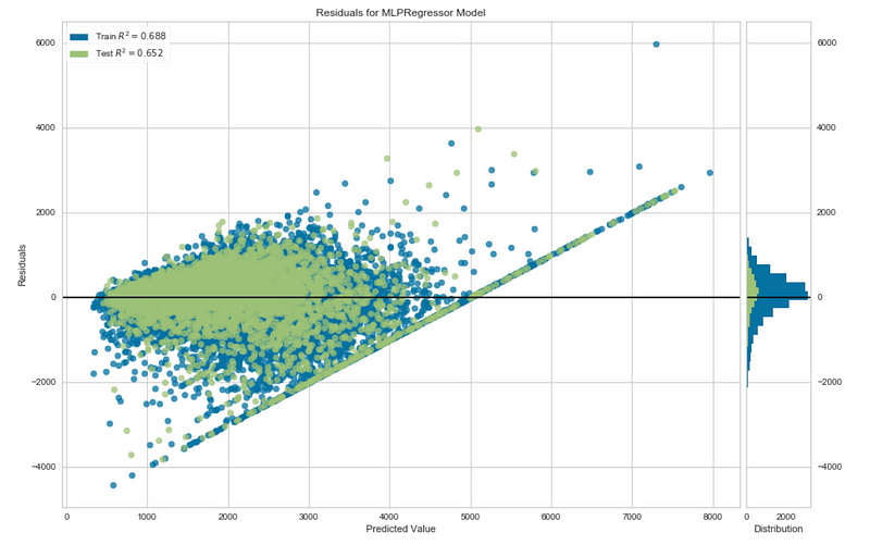
2. Residual Plot

A residual plot is basically a scatterplot that shows the range of prediction errors (residuals) for your model for different predicted values. The yellowbrick API allows you to create a residual plot that also plots the distribution of the residuals for both the training and testing set. In the figure below, I created a residual plot for a neural network trained to predict housing prices using the California Housing Prices Dataset.

Why should we trust your model?

To answer this question, especially when dealing with a non-technical audience, you need to explain your model’s predictions in a way that doesn’t involve diving into complex mathematical details about your model.

LIME and SHAP are two useful Python libraries that you can use to visually explain the predictions generated by your model, which allows your audience to trust the logic that your model is using. In the sections below, I have provided visualizations and the code segments used to produce them. You can find the full code for these examples on GitHub.

LIME

LIME, a Python library created by researchers at the University of Washington, stands for Local Interpretable Model-agnostic Explanations. What this means is that LIME can provide understandable explanations of your model’s predictions on specific instances regardless of how complex the model is.

Using LIME on Tabular Data

In the example below, I used the same neural network previously used to predict housing prices using the California Housing Prices Dataset and visualized the explanations for one particular prediction.

import lime
from lime.lime_tabular import LimeTabularExplainer
explainer = LimeTabularExplainer(X_train, feature_names=boston.feature_names, 
class_names=['price'], categorical_features=categorical_features,
verbose=True,
mode='regression')
i = 25
exp = explainer.explain_instance(X_test[i], neural_network_pipeline.predict, num_features=8)
exp.show_in_notebook(show_table=True)
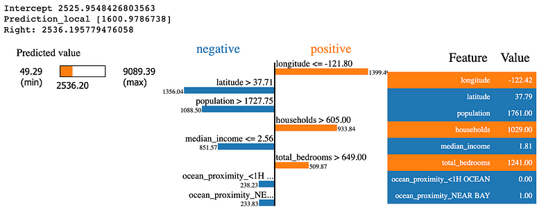
Explanation of a neural network’s predictions for the price of a house using LIME.

Here are some of the key features in the visualization above:

  • It provides the values of the eight most important features that influenced the model’s predictions.
  • It measures the impact of each feature on the prediction.
  • Features that contributed to an increase in the house price are in orange and those that contributed to a decrease are in blue.
  • It also gives us a general range of probable values for the target variable based on the model’s local behavior and shows us where the predicted value falls in this range.

Using LIME on Text Data

We can also use LIME to explain the predictions of models that work with text data. In the example below, I visualized the explanations for a prediction generated by a logistic regression model used for classifying the sentiment of movie reviews.

from lime.lime_text import LimeTextExplainer
i = 5
class_names = ['negative', 'positive']
explainer = LimeTextExplainer(class_names=class_names)
exp = explainer.explain_instance(X_test[i], logistic_reg_pipeline.predict_proba, num_features=10)
exp.show_in_notebook(text=True)
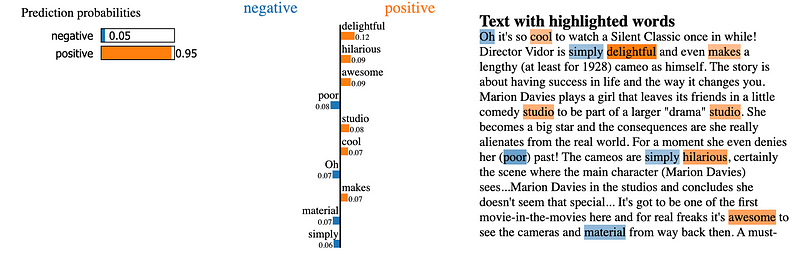
Explanation of a logistic regression model’s sentiment prediction on a movie review.

Based on the visualization above we can easily notice the following details:

  • The model clearly thinks the movie review is positive (with a 95 percent probability).
  • Words such as delightful, cool, hilarious, and awesome contributed to a higher probability of the review being positive.
  • Words such as poor, simply, and material contributed slightly to a higher probability of the review being negative.

These details align with our human expectations of what the model should be doing which allows us to trust it even if we don’t fully understand the math behind it.

SHAP

SHAP (SHapley Additive exPlanations) is a similar Python library for model explanations, but it is a bit more complex than LIME both in terms of its usage and the information provided in its visualizations. SHAP borrows ideas from game theory, using the Shapley values defined in this paper to explain the output of machine learning models. Unlike LIME, SHAP also has specific modules for explaining different types of models but it also features model-agnostic explainers that work on all types of categories of models.

Using SHAP on Tabular Data

The code below demonstrates how to visualize the predictions of the same neural network in the previous example using the KernelExplainer module, which is designed to explain the output of any function.

import shap
shap.initjs()
explainer = shap.KernelExplainer(neural_network_pipeline.predict, X_train)
shap_values = explainer.shap_values(X_test.iloc[25,:], nsamples=200)
shap.force_plot(explainer.expected_value, shap_values, X_test.iloc[25,:])
An explanation of the previous neural network’s house price prediction using SHAP.

The visualization above is interesting because it not only provides the value predicted by the model but also presents the competing influences of different features as arrows of different directions and lengths pushing the model’s prediction further from a base value.

Using SHAP on Text Data

SHAP can also be used on text data, but the process is a bit more complicated and the visual explanations for a single prediction are not as intuitive as those that can be created with LIME. The SHAP Explainer module can explain text-classification results by treating the text data as tabular data in the form of word counts or TF-IDF statistics for each word in a text document. In the example below, I used SHAP to create a visualization explaining the previous sentiment prediction generated by the logistic regression model.

X_train_processed = vectorizer.transform(X_train).toarray()
X_test_processed = vectorizer.transform(X_test).toarray()
explainer = shap.Explainer(logistic_reg_pipeline.steps[1][1],
X_train_processed, feature_names=vectorizer.get_feature_names())
shap_values = explainer(X_test_processed)
i = 5
shap.plots.force(shap_values[i])
An explanation of the previous logistic regression model’s sentiment prediction using SHAP.

If we compare this visualization to the one produced by LIME for the same movie review, we can see that it gives us similar information, but is less intuitive because it doesn’t highlight words in the text of the movie review. However, it still helps us see the influence of specific words on the model’s prediction.

SHAP also allows us to view the influence of individual words on the model’s predictions using a bee swarm plot as demonstrated below.

shap.plots.beeswarm(shap_values)
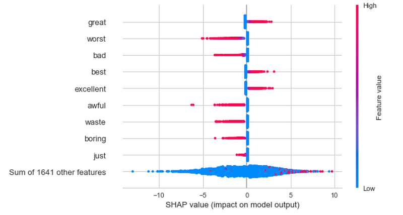
Based on this plot, we can tell that words such as great, best, and excellent in a movie review cause the model to conclude that a review is positive while words such as worst, bad, awful, waste, and boring cause the model to conclude that a review is negative. This visualization gives us more confidence in this model because it demonstrates that the model is using the same logic that we as humans would likely use when determining if a movie review is positive or negative. This is the key to building trust in machine learning models.

Summary

  • When explaining a machine learning model to an audience that is unfamiliar with the technical details of machine learning, always start by explaining the business value that your model can offer.
  • To explain your model’s performance results to your audience, use metrics that are meaningful in the context of the problem, and create visualizations that show the big picture of your model’s performance.
  • You can use LIME and SHAP to explain your model’s predictions in a way that allows your non-technical audience to trust your model.

As I mentioned earlier, please refer to this GitHub repository to find the full code that I used to train the models and create the corresponding visualizations used in this article.

Sources

  1. B. Bengfort and R. Bilbro, Yellowbrick: Visualizing the Scikit-Learn Model Selection Process, (2019), Journal of Open Source Software.
  2. M. T. Ribeiro, S. Singh, and C. Guestrin, Why should I trust you?: Explaining the predictions of any classifier, (2016), 22nd ACM SIGKDD International Conference on Knowledge Discovery and Data Mining.
  3. S. M. Lundberg, S. Lee, A Unified Approach to Interpreting Model Predictions, (2017), Advances in Neural Information Processing Systems 30 (NIPS 2017).
  4. A. L. Maas, R. E. Daly, P. T. Pham, D. Huang, A. Y. Ng, and C. Potts, Learning Word Vectors for Sentiment Analysis, (2011), The 49th Annual Meeting of the Association for Computational Linguistics.
  5. R.K. Pace and R. Barry, Sparse Spatial Autoregressions, (1997), Statistics and Probability Letters.

A Practical Guide to Stacking Using Scikit-Learn

How you can build more robust models using stacking.

A stack of white bricks in the middle of the forest.
Photo by Greg Rosenke on Unsplash

Introduction

In the last two decades, ensemble methods such as random forests and gradient boosting, which combine several instances of the same types of models using voting or weighted averaging to produce strong models, have become extremely popular. However, there is another approach that allows us to reap the benefits of different models by combining their individual predictions using higher-level models.

Stacked generalization, also known as stacking, is a method that trains a meta-model to intelligently combine the predictions of different base-models.

The goal of this article is to not only explain how this competition-winning technique works but to also demonstrate how you can implement it with just a few lines of code in Scikit-learn.

How Stacking Works

Every machine learning model has advantages and disadvantages due to the bias created by the assumptions behind the model. This is a concept that I mentioned in my previous post about the “no free lunch” theorem for supervised machine learning.

https://towardsdatascience.com/what-no-free-lunch-really-means-in-machine-learning-85493215625d

Different machine learning algorithms may be skilled at solving problems in different ways. If we had multiple algorithms working together to solve a problem, one algorithm’s strengths could potentially mask the other algorithm’s weaknesses and vice versa. This is the idea behind stacking.

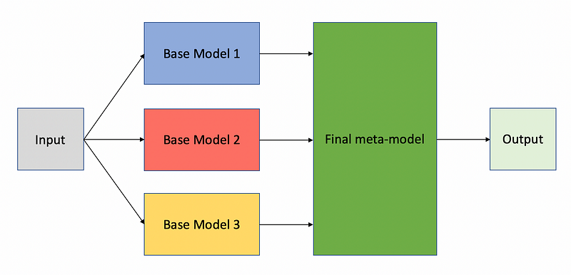
Stacking involves training multiple base-models to predict the target variable in a machine learning problem while at the same time, a meta-model learns to use the predictions of each base model to predict the value of the target variable. The figure below demonstrates this idea.

The blueprint for stacking models. Image by the author.

The algorithm for correctly training a stacked model follows these steps:

  1. Split the data into k-folds just like in k-fold cross-validation.
  2. Select one fold for validation and the remaining k-1 folds for training.
  3. Train the base models on the training set and generate predictions on the validation set.
  4. Repeat steps 2–3 for the remaining k-1 folds and create an augmented dataset with the predictions of each base model included as additional features.
  5. Train the final meta-model on the augmented dataset.

Note that each part of the model is trained separately, and the meta-model learns to use both the predictions of the base models and the original data to predict the final output.

For those who are unfamiliar with k-fold cross-validation, it is a technique in which the data for a machine learning problem is split into k-folds or distinct subsets and the model is evaluated iteratively across all the k-folds. In each iteration, one fold is used for evaluation, and the remaining k-1 folds are used for training the model.

The use of a k-fold cross-validation split ensures that the base models are generating predictions on unseen data because the base models will be retrained on different training sets in each iteration.

The power of stacking lies in the final step, in which the meta-model can actually learn the strengths and weaknesses of each base model and intelligently combine their predictions to produce the final output.

Practical Example Using Scikit-Learn

The StackingClassifier and StackingRegressor modules were introduced in Scikit-learn 0.22. So make sure you upgrade to the latest version of Scikit-learn to follow along with this example using the following pip command:

pip install --upgrade scikit-learn

Importing Basic Libraries

Most of the basic libraries I imported below are commonly used in data science projects and should come as no surprise. However, I also made use of the make_classification function from Scikit-learn to generate some synthetic data and I also used Plotly to build interactive plots. In order to embed the interactive plots, I also made use of Datapane.

import numpy as np 
import pandas as pd
import matplotlib.pyplot as plt
import seaborn as sns
from sklearn.datasets import make_classification
import plotly.graph_objects as go
import datapane as dp
%matplotlib inline

Generating the Dataset

Scikit-learn’s make_classification function is useful for generating synthetic datasets that can be used for testing different algorithms. The dataset I am generating in this scenario is designed to represent a binary classification problem with a realistic level of difficulty based on the following parameters:

  • n_features — the number of features in the dataset, which I set to 20.
  • n_informative and n_redundant — the number of informative and redundant features in the dataset. I included five redundant features to make the problem harder.
  • n_clusters_per_class — the number of clusters included in each class. Higher values make the problem more difficult so I set this value to five clusters.
  • class_sep — controls the separation between clusters/classes. Larger values make the task easier so I chose a value of 0.7 which is lower than the default of 1.0.
  • flip_y — specifies the percent of class labels that will be assigned at random. I set this value to 0.03 to add some noise to the dataset.
X, y = make_classification(n_samples=50000, 
n_features=20,
n_informative=15,
n_redundant=5,
n_clusters_per_class=5,
class_sep=0.7,
flip_y=0.03,
n_classes=2)

Training and Evaluating Individual Models

In order to get a baseline level of performance to compare against the stacked model, I trained and evaluated the following base models:

  • Random forest with 50 decision trees
  • Support vector machine (SVM)
  • K-nearest neighbors (KNN) classifier

The models are all stored in a dictionary for code reusability.

from sklearn.ensemble import RandomForestClassifier
from sklearn.svm import SVC
from sklearn.neighbors import KNeighborsClassifierfrom sklearn.model_selection import cross_val_score, RepeatedStratifiedKFold
from collections import defaultdict
models_dict = {'random_forest':     RandomForestClassifier(n_estimators=50),
'svm': SVC(),
'knn': KNeighborsClassifier(n_neighbors=11)}

The models were each validated using a repeated five-fold cross-validation strategy where each fold was repeated with a different random set of samples. In each fold, each model was trained on 80 percent of the data and validated on the remaining 20 percent.

This method results in 10 different accuracy scores for each model which are stored in a dictionary as demonstrated below.

def evaluate_model(model, X, y):
cv = RepeatedStratifiedKFold(n_splits=5, n_repeats=2, random_state=1)
scores = cross_val_score(model, X, y, scoring='accuracy', cv=cv, verbose=1, n_jobs=3, error_score='raise')
return scores
model_scores = defaultdict()
for name, model in models_dict.items():
print('Evaluating {}'.format(name))
scores = evaluate_model(model, X, y)
model_scores[name] = scores

Visualizing the Results for Individual Models

The function defined below takes the dictionary of cross-validation scores for all of the evaluated models and creates an interactive boxplot with Plotly to compare the performance of each model. The function also creates a Datapane report for embedding the plots as I have done in this article.

def plot_results(model_scores, name):

model_names = list(model_scores.keys())
results = [model_scores[model] for model in model_names]
fig = go.Figure()
for model, result in zip(model_names, results):
fig.add_trace(go.Box(
y=result,
name=model,
boxpoints='all',
jitter=0.5,
whiskerwidth=0.2,
marker_size=2,
line_width=1)
)

fig.update_layout(
title='Performance of Different Models Using 5-Fold Cross-Validation',
paper_bgcolor='rgb(243, 243, 243)',
plot_bgcolor='rgb(243, 243, 243)',
xaxis_title='Model',
yaxis_title='Accuracy',
showlegend=False)
fig.show()

report = dp.Report(dp.Plot(fig) ) #Create a report
report.publish(name=name, open=True, visibility='PUBLIC')
plot_results(model_scores, name='base_models_cv')

https://datapane.com/u/AmolMavuduru/reports/base-models?version=2

Based on the boxplot above, we can see that all of the base models have average accuracy scores over 87 percent, but the support vector machine performed the best on average. Surprisingly, a simple KNN classifier, which is often described as a “lazy learning algorithm” because it just memorizes the training data, clearly outperformed the random forest with 50 decision trees.

Defining The Stacked Model

Now let’s see what happens if we train a stacked model. Scikit-learn’s StackingClassifier has a constructor that requires a list of base models, along with the final meta-model that produces the final output. Note that in the code below, this list of base models is formatted as a list of tuples with the model names and model instances.

The stacked model uses a random forest, an SVM, and a KNN classifier as the base models and a logistic regression model as the meta-model that predicts the output using the data and the predictions from the base models. The code below demonstrates how to create this model with Scikit-learn.

from sklearn.ensemble import StackingClassifier
from sklearn.neural_network import MLPClassifier
from sklearn.linear_model import LogisticRegressionCV
base_models = [('random_forest', RandomForestClassifier(n_estimators=50)),
('svm', SVC()),
('knn', KNeighborsClassifier(n_neighbors=11))]
meta_model = LogisticRegressionCV()
stacking_model = StackingClassifier(estimators=base_models,
final_estimator=meta_model,
passthrough=True,
cv=5,
verbose=2)

Evaluating the Stacked Model

In the code below, I simply reused the function I defined earlier for obtaining cross-validation scores for models and used it to evaluate the stacked model.

stacking_scores = evaluate_model(stacking_model, X, y)
model_scores['stacking'] = stacking_scores

Visualizing and Comparing the Results

I reused the plotting function defined earlier to compare the performance of the base models to the stacked model using side-by-side boxplots.

plot_results(model_scores, name='stacking_model_cv')

https://datapane.com/u/AmolMavuduru/reports/stacking-model-cv

Based on the plot above, we can clearly see that stacking produced an improvement in performance, with the stacked model outperforming all of the base models and achieving a median accuracy close to 91 percent. This same process can be repeated for regression problems as well, using the StackingRegressor module from Scikit-learn, which behaves in a similar manner.

Advantages and Disadvantages of Stacking

Like all other methods in machine learning, stacking has advantages and disadvantages. Here are some of the advantages of stacking:

  • Stacking can yield improvements in model performance.
  • Stacking reduces variance and creates a more robust model by combining the predictions of multiple models.

Keep in mind that stacking also has the following disadvantages:

  • Stacked models can take significantly longer to train than simpler models and require more memory.
  • Generating predictions using stacked models will usually be slower and more computationally expensive. This drawback is important to consider if you are planning to deploy a stacked model into production.

Summary

Stacking is a great way to take advantage of the strengths of different models by combining their predictions. This method has been used to win machine learning competitions and thanks to Scikit-learn, it is very easy to implement. However, the performance improvements that come from stacking do come with a price in the form of longer training and inference times.

You can find the full code used for the practical example on GitHub. If you liked this article, feel free take a look at some of my recent articles on machine learning below.

https://towardsdatascience.com/what-no-free-lunch-really-means-in-machine-learning-85493215625dhttps://towardsdatascience.com/what-no-free-lunch-really-means-in-machine-learning-85493215625dhttps://towardsdatascience.com/what-no-free-lunch-really-means-in-machine-learning-85493215625d

Sources

  1. D.H. Wolpert, Stacked Generalization, (1992), Neural Networks.
  2. F. Pedregosa et al, Scikit-learn: Machine Learning in Python, (2011), Journal of Machine Learning Research.

What “no free lunch” really means in machine learning

Demystifying this often misunderstood theorem.

A table with nachos, salsa, drinks, and other lunch items.
Photo by Riccardo Bergamini on Unsplash

Who doesn’t love free lunch? You don’t have to cook or spend any of your hard-earned money. It’s a great deal for anyone! The truth is unless if you count special talks and lectures in graduate school that promise free pizza, there is no free lunch in machine learning.

The “no free lunch” (NFL) theorem for supervised machine learning is a theorem that essentially implies that no single machine learning algorithm is universally the best-performing algorithm for all problems. This is a concept that I explored in my previous article about the limitations of XGBoost, an algorithm that has gained immense popularity over the last five years due to its performance in academic studies and machine learning competitions.

https://towardsdatascience.com/why-xgboost-cant-solve-all-your-problems-b5003a62d12a

The goal of this article is to take this often misunderstood theorem and explain it so that you can appreciate the theory behind this theorem and understand the practical implications that it has on your work as a machine learning practitioner or data scientist.

The Problem of Induction

Strangely enough, the idea that may have inspired the NFL theorem was first proposed by a philosopher from the 1700s. Yes, you read that right! Not a mathematician or a statistician, but a philosopher.

In the mid-1700s, a Scottish philosopher named David Hume proposed what he called the problem of induction. This problem is a philosophical question that asks whether inductive reasoning really leads us to true knowledge.

Inductive reasoning is a form of reasoning where we draw conclusions about the world based on past observations. Strangely enough, this is exactly what machine learning algorithms do. If a neural network sees 100 images of white swans, it will likely conclude that all swans are white. But what happens if the neural network sees a black swan? Now the pattern learned by the algorithm is suddenly disproved by just one counter-example. This idea is often referred to as the black swan paradox.

Photo by Yuvraj Yadav on Unsplash

Hume used this logic to highlight a limitation of inductive reasoning — the fact that we cannot apply a conclusion about a particular set of observations to a more general set of observations.

“There can be no demonstrative arguments to prove, that those instances, of which we have had no experience, resemble those, of which we have had experience.” — David Hume in A Treatise of Human Nature

This same idea became the inspiration for the NFL theorem for machine learning over 200 years later.

Application to Machine Learning by Wolpert

In his 1996 paper, The Lack of A Priori Distinctions Between Learning Algorithms, Wolpert introduced the NFL theorem for supervised machine learning and actually used David Hume’s quote at the beginning of his paper. The theorem states that given a noise-free dataset, for any two machine learning algorithms A and B, the average performance of A and B will be the same across all possible problem instances drawn from a uniform probability distribution.

Why is this true? It goes back to the concept of inductive reasoning. Every machine learning algorithm makes prior assumptions about the relationship between the features and target variables for a machine learning problem. These assumptions are often called a priori assumptions. The performance of a machine learning algorithm on any given problem depends on how well the algorithm’s assumptions align with the problem’s reality. An algorithm may perform very well for one problem, but that gives us no reason to believe it will do just as well on a different problem where the same assumptions may not work. This concept is basically the black swan paradox in the context of machine learning.

The limiting assumptions that you make when choosing any algorithm are like the price that you pay for lunch. These assumptions will make your algorithm naturally better at some problems while simultaneously making it naturally worse at other problems.

The Bias-Variance Tradeoff

One of the key ideas in statistics and machine learning that is closely related to the NFL theorem is the concept of the bias-variance tradeoff. This concept explores the relationship between two sources of error for any model:

  • The bias of a model is the error that comes from the potentially wrong prior assumptions in the model. These assumptions cause the model to miss important information about the relationship between the features and targets for a machine learning problem.
  • The variance of a model is the error that comes from the model’s sensitivity to small variations in the training data.

Models with high bias are often too simple and lead to underfitting, while models with high variance are often too complex and lead to overfitting.

Overfitting vs. underfitting. Source: Edpresso, licensed under CC BY-SA 4.0.

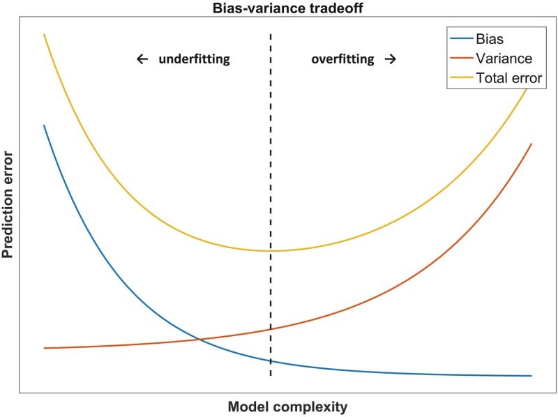
As demonstrated in the image above, a model with high bias fails to properly fit the training data, while a model with high variance fits the training data so well that it memorizes it and fails to correctly apply what it has learned to new real-world data. The optimal model for a given problem is one that fits somewhere in between these two extremes. It has enough bias to avoid simply memorizing the training data and enough variance to actually fit the patterns in the training data. This optimal model is the one that achieves the lowest prediction error on the testing data for a given problem by optimizing the bias-variance tradeoff as shown below.

The bias-variance tradeoff. Source: Fundamentals of Clinical Data Science, licensed under CC by 4.0.

Obviously, every machine learning problem has a different point at which the bias-variance tradeoff is optimized and the prediction error is minimized. For this reason, there is no super-algorithm that can solve every machine learning problem better than every other algorithm. Every algorithm makes assumptions that create different types and levels of bias, thus making them better suited for certain problems.

What “No Free Lunch” Means for You

All of this theory is great, but what does “no free lunch” mean for you as a data scientist, a machine learning engineer, or someone who just wants to get started with machine learning?

Does it mean that all algorithms are equal? No, of course not. In practice, all algorithms are not created equal. This is because the entire set of machine learning problems is a theoretical concept in the NFL theorem and it is much larger than the set of practical machine learning problems that we will actually attempt to solve. Some algorithms may generally perform better than others on certain types of problems, but every algorithm has disadvantages and advantages due to the prior assumptions that come with that algorithm.

An algorithm like XGBoost may win hundreds of Kaggle competitions yet fail miserably at forecasting tasks because of the limiting assumptions involved in tree-based models. Neural networks may perform really well when it comes to complex tasks like image classification and speech detection, yet suffer from overfitting due to their complexity if not trained properly.

In practice, this is what “no free lunch” means for you:

  • No single algorithm will solve all your machine learning problems better than every other algorithm.
  • Make sure you completely understand a machine learning problem and the data involved before selecting an algorithm to use.
  • All models are only as good as the assumptions that they were created with and the data that was used to train them.
  • Simpler models like logistic regression have more bias and tend to underfit, while more complex models like neural networks have more variance and tend to overfit.
  • The best models for a given problem are somewhere in the middle of the two bias-variance extremes.
  • To find a good model for a problem, you may have to try different models and compare them using a robust cross-validation strategy.

Sources

  1. The Stanford Encyclopedia of Philosophy, The Problem of Induction, (2018).
  2. DeepAI, Black Swan Paradox Definition, (2020), deepai.org.
  3. D. Hume, A Treatise of Human Nature, (1739), Project Gutenberg.
  4. D. H.Wolpert, The Lack of A Priori Distinctions Between Learning Algorithm, (1996), CiteSeerX.

Why XGBoost can’t solve all your problems.

Getting Started

A key limitation of XGBoost and other tree-based algorithms.

Overhead view of a road winding through a dense forest with green trees.
Photo by Sergey Kolomiyets on Unsplash

If you’ve ever competed in machine learning competitions on Kaggle or browsed articles or forums written by the data science community, you’ve probably heard of XGBoost. It’s the algorithm that has won many Kaggle competitions and there are more than a few benchmark studies that show instances in which XGBoost consistently outperforms other algorithms. The fact that XGBoost is parallelized and runs faster than other implementations of gradient boosting only adds to its mass appeal.

For those who are unfamiliar with this tool, XGBoost (which stands for “Extreme Gradient Boosting”) is a highly optimized framework for gradient boosting, an algorithm that iteratively combines the predictions of several weak learners such as decision trees to produce a much stronger and more robust model. Since its inception in 2014, XGBoost has become the go-to algorithm for many data scientists and machine learning practitioners.
“When in doubt, use XGBoost” — Owen Zhang, Winner of Avito Context Ad Click Prediction competition on Kaggle

This probably sounds too good to be true, right? XGBoost is definitely powerful and useful for many tasks, but there is one problem… In fact, this is a problem that affects not only XGBoost but all tree-based algorithms in general.


Tree-Based Models Are Bad at Extrapolation

This is perhaps the fundamental flaw inherent in all tree-based models. It doesn’t matter if you have a single decision tree, a random forest with 100 trees, or an XGBoost model with 1000 trees. Due to the method with which tree-based models partition the input space of any given problem, these algorithms are largely unable to extrapolate target values beyond the limits of the training data when making predictions. This is usually not a huge problem in classification tasks, but it is definitely a limitation when it comes to regression tasks that involve predicting a continuous output.

If the training dataset only contains target values between 0 and 100, a tree-based regression model will have a hard time predicting a value outside of this range. Here are some examples of predictive tasks in which extrapolation is important and XGBoost might not do the trick…

Predicting the Impact of Climate Change on Global Temperatures

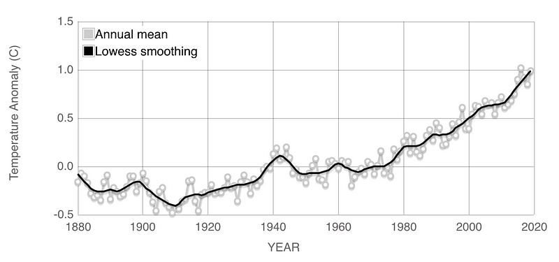
Over the last 100 years, global temperatures have risen at an increasing rate. Imagine trying to predict the global temperatures for the next 20 years using data from 1900 to 2020. A tree-based algorithm like XGBoost will be bounded by the highest global temperatures as of today. If the temperatures continue to rise, the model will surely underestimate the rise in global temperatures over the next 20 years.
Global temperature anomalies from 1880 to 2020. Source: NASA GISS

Predicting the Prices of a Stock Market Index Such as the S&P 500

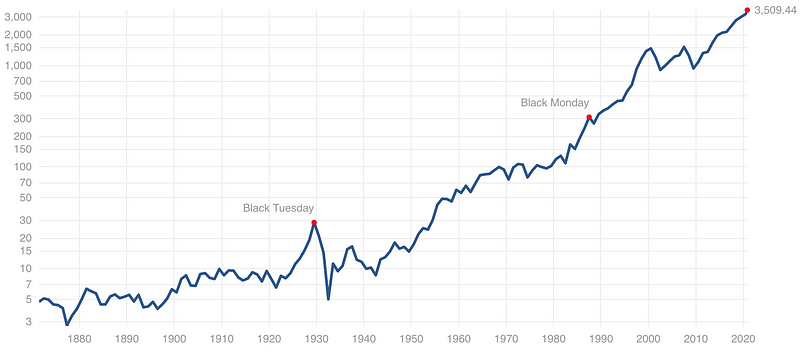
If we look at the trends of a popular stock market index like the S&P 500 over the last 50 years we will find that the price of the index goes through highs and lows but ultimately increases over time. In fact, the S&P 500 has an average annual return of around 10 percent based on historical data, meaning the price goes up by around 10 percent on average each year. Just try to forecast the price of the S&P 500 using XGBoost and you’ll see that it may predict decreases in prices, but fails to capture the overall increasing trend in the data. To be fair, predicting stock market prices is an extremely difficult problem that even machine learning hasn’t solved, but the point is, XGBoost can’t predict increases in prices beyond the range present in the training data.

S&P 500 Historical Prices. Source: Standard & Poor’s reproduced from multpl.com.
Forecasting Web Traffic

This task was the goal of the following Kaggle competition that I participated in a few years ago. Just as XGBoost may fail to capture an increasing trend in global temperatures or stock prices, if a webpage is going viral then XGBoost may not be able to predict the increase in traffic to that page even if the increasing trend is obvious.

The Math Behind Why Trees Are Bad at Extrapolation

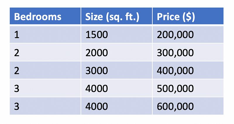
Decision trees take the input space and partition it into subsections which each correspond to a singular output value. Even in regression problems, a decision tree uses a finite set of rules to output one of a finite set of possible values. For this reason, a decision tree used for regression will always struggle to model a continuous function. Consider the following example where a decision tree can be used to predict the price of a house. Keep in mind the dataset I created below is completely made up and only used for the purpose of proving a point.

A simple dataset for housing prices.

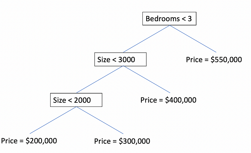
If we used this small dataset to train a decision tree, the following tree might end up being our model for predicting housing prices.

A simple decision tree for house price prediction.

Obviously, this is not a very good model or a good dataset, but it demonstrates one of the fundamental issues with decision tree regression. According to the dataset, it seems that the number of bedrooms and the size of a house is positively correlated with its price. In other words, larger houses with more bedrooms will cost more than smaller houses with fewer bedrooms. This seems logical, but the decision tree will never predict a price below $200,000 or a price above $550,000 because it has partitioned the infinite input space into a finite set of possibilities. Since decision tree regression models assign values to leaves based on averages, note that since there are two 4000 square-foot houses with three bedrooms, the decision tree predicts the average price of the two houses ($550,000) for this condition. Even though a $600,000 house exits in the dataset, the decision tree will never be able to identify a $600,000 house.

Even if a model like XGBoost computed a weighted average of 1000 decision trees, each decision tree would be limited to predicting only a set range of values and as a result, the weighted average is also limited to a predetermined range of values depending on the training data.

What Tree-Based Models Are Good at Doing

While tree-based models are not good at extrapolation, they are still good at solving a wide range of machine learning problems. XGBoost generally can’t predict the future very well, but it is well suited for tasks such as the following:

  • Classification problems, especially those related to real-world business problems such as fraud detection or customer churn prediction. The combined rule-based logic of many decision trees can detect reasonable and explainable patterns for approaching these classification problems.
  • Situations in which there are many categorical variables. The rule-based logic of decision trees works well with data including features with categories such as Yes/No, True/False, or Small/Medium/Large.
  • Problems in which the range or distribution of target values present in the training set can be expected to be similar to that of real-world testing data. This condition can apply to almost every machine learning problem with training data that has been sampled properly. Generally, the quality of a machine learning model is bounded by the quality of the training data. You can’t train XGBoost to effectively predict housing prices if the price range of houses in the dataset is between $300K and $400K. There will obviously be many houses that are less and more expensive than those in the training set. For problems like predicting housing prices, you can fix this issue with better training data, but if you are trying to predict future stock prices, XGBoost simply will not work because we don’t know anything about the range of target values in the future.

What You Should Use Instead for Extrapolation

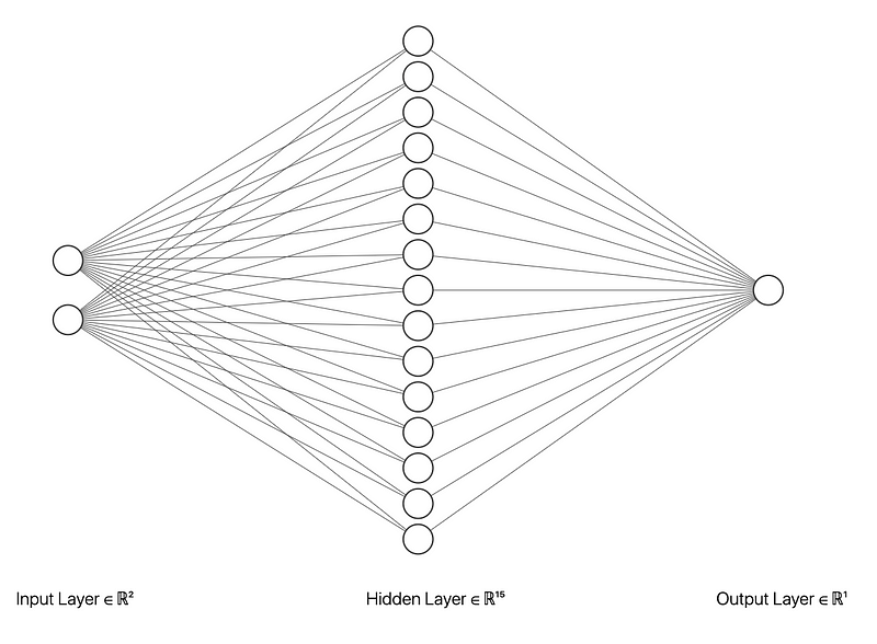
For forecasting or any machine learning problem involving extrapolation, neural networks will generally outperform tree-based methods. Unlike tree-based algorithms, neural networks are capable of fitting any continuous function, allowing them to capture complex trends in data. In the theory behind neural networks, this statement is known as the universal approximation theorem. This theorem essentially states that a neural network with just one hidden layer of arbitrary size can approximate any continuous function to any desired level of precision. Based on this theorem, a neural network can capture an increasing trend in stock prices or a rise in global temperatures and can predict values outside the range of the training data.

A neural network with just one hidden layer of arbitrary size can approximate any continuous function. Image created by the author using NN SVG.

For time-series forecasting problems such as forecasting global temperatures, recurrent neural networks with LSTM (long short-term memory) units can be very effective. In fact, LSTMs work well with sequential data in general and I even used them for text classification in this article.

Does that mean neural networks are better than XGBoost?

No, not necessarily. Neural networks are better than XGBoost for some but definitely not all problems. In machine learning, there is “no free lunch” and there is a price that you pay for the advantages of any algorithm.

In fact, while the generalization power of neural networks is a strength it is also a weakness because a neural network can fit any function and can also easily overfit the training data. Neural networks also tend to require larger amounts of training data to make reasonable predictions. Interestingly, the same complexity that makes neural networks so powerful is the same complexity that makes them much harder to explain and interpret compared to tree-based algorithms.

The moral of the story is that not all algorithms were created equal, but every algorithm has flaws and no algorithm is universally superior across all machine learning problems and business use cases.

Summary

  • XGBoost is an incredibly sophisticated algorithm but like other tree-based algorithms, it falls short when it comes to tasks involving extrapolation.
  • XGBoost is still a great choice for a wide variety of real-world machine learning problems.
  • Neural networks, especially recurrent neural networks with LSTMs are generally better for time-series forecasting tasks.
  • There is “no free lunch” in machine learning and every algorithm has its own advantages and disadvantages.

Sources

  1. T. Chen, C. Guestrin, XGBoost: A Scalable Tree Boosting System, (2016), the 22nd ACM SIGKDD International Conference.
  2. Kaggle, Avito Context Ad Clicks, (2015), Kaggle Competitions.
  3. NASA Goddard Institute for Space Studies (GISS), Global Temperature, (2020), Global Climate Change: Vital Signs of the Planet.
  4. Standard & Poor, S&P 500 Historical Prices, (2020), multpl.com.
  5. Wikipedia, Universal approximation theorem, (2020), Wikipedia the free encyclopedia.

Fake News Classification with Recurrent Convolutional Neural Networks

Photo by Markus Winkler on Unsplash

Introduction

Fake news is a topic that has gained a lot of attention in the past few years, and for good reasons. As social media becomes widely accessible, it becomes easier to influence millions of people by spreading misinformation. As humans, we often fail to recognize if the news we read is real or fake. A study from the University of Michigan found that human participants were able to detect fake news stories only 70 percent of the time. But can a neural network do any better? Keep reading to find out.

The goal of this article is to answer the following questions:

  • What kinds of topics or keywords appear frequently in real news versus fake news?
  • How can we use a deep neural network to identify fake news stories?

Importing Basic Libraries

While most of the libraries I imported below are commonly used (NumPy, Pandas, Matplotlib, etc.), I also made use of the following helpful libraries:

  • Pandarallel is a helpful library for running operations on Pandas data frames in parallel and monitoring the progress of each worker in real-time.
  • Spacy is a library for advanced natural language processing. It comes with language models for languages such as English, Spanish, and German. In this project, I installed and imported the English language model, en_core_web_md.
import numpy as np
import pandas as pd
from pandarallel import pandarallel
pandarallel.initialize(progress_bar=True, use_memory_fs=False, )
import spacy
import en_core_web_md
import matplotlib.pyplot as plt
import seaborn as sns

%matplotlib inline

The Dataset

The dataset that I used for this project contains data selected and aggregated from multiple Kaggle news datasets listed below:

As shown in the output of the Pandas code below, the dataset has around 74,000 rows with three columns: the title of the news article, the text of the news article, and a binary label indicating whether the news is real or fake.

data = pd.read_csv('./data/combined_news_data.csv')
data.dropna(inplace=True)
data.info()
<class 'pandas.core.frame.DataFrame'>
Int64Index: 74012 entries, 0 to 74783
Data columns (total 3 columns):
# Column Non-Null Count Dtype
--- ------ -------------- -----
0 title 74012 non-null object
1 text 74012 non-null object
2 label 74012 non-null int64
dtypes: int64(1), object(2)
memory usage: 2.3+ MB

Exploratory Data Analysis

Distribution of Fake and Real News Articles

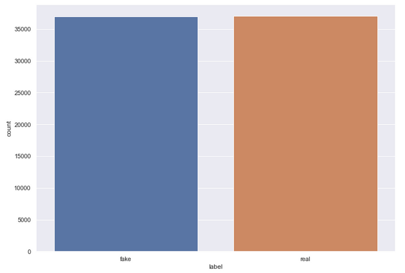
As demonstrated in the plot generated using Seaborn below, the dataset has a roughly even distribution of fake and real news articles, which is optimal for this binary classification task.

sns.set(rc={'figure.figsize':(11.7,8.27)})
sns.countplot(data['label'])
Distribution of real and fake news articles.

Distribution of Article Length (Word Count)

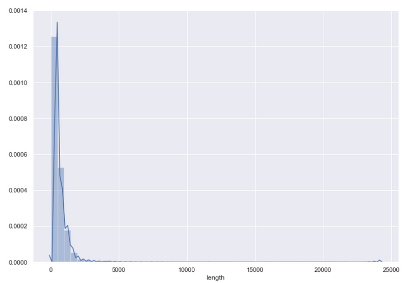
We can also examine the distribution of article lengths for the news articles using the code below, which creates a column that counts the word count of each article and displays the distribution of article lengths using Seaborn’s distplot function.

data['length'] = data['text'].apply(lambda x: len(x.split(' ')))
sns.distplot(data['length'])
Distribution of word count.

Taking a closer look at this distribution using the describe function from Pandas produces the following output.

data['length'].describe()
count    74012.000000
mean 549.869251
std 629.223073
min 1.000000
25% 235.000000
50% 404.000000
75% 672.000000
max 24234.000000
Name: length, dtype: float64

The average article length is about 550 words and the median article length is 404 words. The distribution is right-skewed with 75 percent of the articles having a word count under 672 words while the longest article is clearly an outlier with over 24,000 words. For the purpose of building a model, we could likely achieve satisfactory results by only using the first 500 or so words in each article to determine if it is fake news.

Data Preparation

Preprocessing the Text Data

The first step in preparing data for most natural language processing tasks is preprocessing the text data. For this task, I performed the following preprocessing steps in the preprocessor function defined below:

  • Removing unwanted characters such as punctuation, HTML tags, and emoticons using regular expressions.
  • Removing stop words (words that are extremely common in the English language and are generally not necessary for text classification purposes).
  • Lemmatization, which is the process of reducing a word to its lemma or dictionary form. For example, the word run is the lemma for the words runs, ran, and running.

I used Python’s regex library to remove unwanted characters from the text data and Spacy’s medium-sized English language model (en_core_web_md) to perform stopword removal and lemmatization. In order to speed up the computation process for this expensive text-processing function, I made use of the parallel_apply function from Pandarallel, which parallelized the execution process across four cores.

import re 
from spacy.lang.en.stop_words import STOP_WORDS

nlp = en_core_web_md.load()

def preprocessor(text):
text = re.sub('<[^>]*>', '', text)
emoticons = re.findall('(?::|;|=)(?:-)?(?:\)|\(|D|P)', text)
text = re.sub('[\W]+', ' ', text.lower()) + ''.join(emoticons).replace('-', '')
doc = nlp(text)
text = ' '.join([token.lemma_ for token in doc if token.text not in STOP_WORDS])
return text
X = data['text'].parallel_apply(preprocessor)
y = data['label']

data_processed = pd.DataFrame({'title': data['title'], 'text': X, 'label': y})
Progress bar output displayed by the parallel_apply function.

Topic Modeling with Latent Dirichlet Allocation

After preprocessing the text data, I was able to use latent Dirichlet allocation (LDA) to compare the topics and most significant terms in real and fake news articles. LDA is an unsupervised topic modeling technique based on the following assumptions:

  • Each document (in this case each news article) is a bag of words, meaning the order of words in the document is not taken into account when extracting topics.
  • Each document has a distribution of topics and each topic is defined by a distribution of words.
  • There are k topics across all documents. The parameter k is specified beforehand for the algorithm.
  • The probability of a document containing words belonging to a specific topic can be modeled as a Dirichlet distribution.

In its simplest form, the LDA algorithm follows these steps for every document D in the collection of documents:

  1. Distribute each of the k topics across the document D by assigning each word a topic according to the Dirichlet distribution.
  2. For each word in D assume its topic is wrong but every other word is assigned the correct topic.
  3. Assign this word a probability of belonging to each topic based on:
    – the topics in document D
    how many times this word has been assigned to each topic across all documents.
  4. Repeat steps 1–4 for all documents.

For a more detailed yet easily understandable overview of LDA, check out this page on Edwin Chen’s blog.

I used the LDA module from Scikit-learn to perform topic modeling and a useful Python library called pyLDAvis to create interactive visualizations of the topic models for both real and fake news. The necessary imports for this task are given below.

from sklearn.decomposition import LatentDirichletAllocation
from sklearn.feature_extraction.text import CountVectorizer
from sklearn.manifold import TSNE
from sklearn.pipeline import Pipeline
import pyLDAvis.sklearn

Real News

The code given below performs topic modeling on the preprocessed real news articles with ten different topics and then creates an interactive visualization that displays each topic in two-dimensional space using pyLDAvis.

real_news = data_processed[data_processed['label'] == 1]

num_topics = 10
num_features=5000

vectorizer = CountVectorizer(max_df=0.95, min_df=2, max_features=num_features, stop_words='english')
lda = LatentDirichletAllocation(n_components=num_topics,
max_iter=5,
learning_method='online',
learning_offset=50.,
random_state=0)

lda_pipeline = Pipeline([('vectorizer', vectorizer), ('lda', lda)])
lda_pipeline.fit(real_news['text'])
pyLDAvis.enable_notebook()
data_vectorized = vectorizer.fit_transform(data_processed['text'])
dash = pyLDAvis.sklearn.prepare(lda_pipeline.steps[1][1], data_vectorized, vectorizer, mds='tsne')
pyLDAvis.save_html(dash, 'real_news_lda.html')
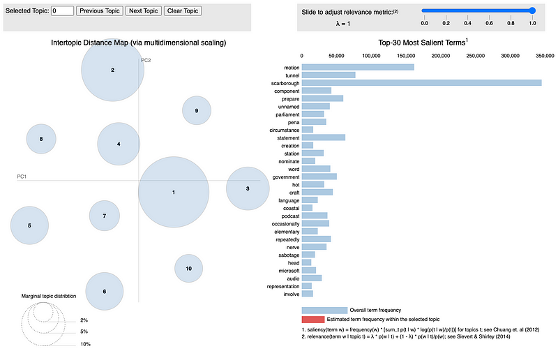
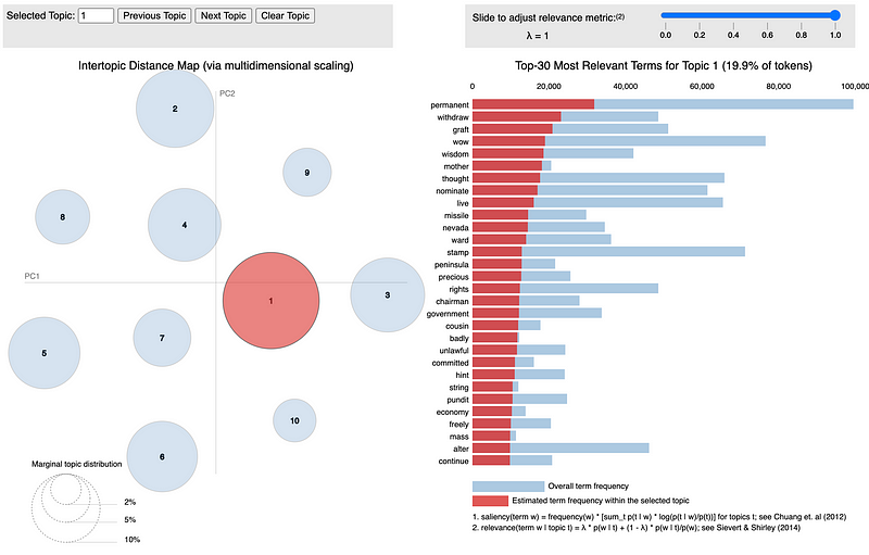
LDA visualization for real news data.
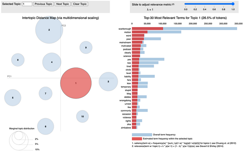
Top terms for the largest topic in real news data.

The visualization above allows the user to view the relative size of each of the ten extracted topics while displaying the most relevant terms for each topic. You can check out the full interactive visualization here.

Fake News

The code given below replicates the previous steps for the fake news articles to produce a similar interactive visualization.

fake_news = data_processed[data_processed['label'] == 0]

num_topics = 10
num_features=5000

vectorizer = CountVectorizer(max_df=0.95, min_df=2, max_features=num_features, stop_words='english')
lda = LatentDirichletAllocation(n_components=num_topics,
max_iter=5,
learning_method='online',
learning_offset=50.,
random_state=0)

lda_pipeline = Pipeline([('vectorizer', vectorizer), ('lda', lda)])
lda_pipeline.fit(fake_news['text'])

pyLDAvis.enable_notebook()
data_vectorized = vectorizer.fit_transform(data_processed['text'])
dash = pyLDAvis.sklearn.prepare(lda_pipeline.steps[1][1], data_vectorized, vectorizer, mds='tsne')
pyLDAvis.save_html(dash, 'fake_news_lda.html')
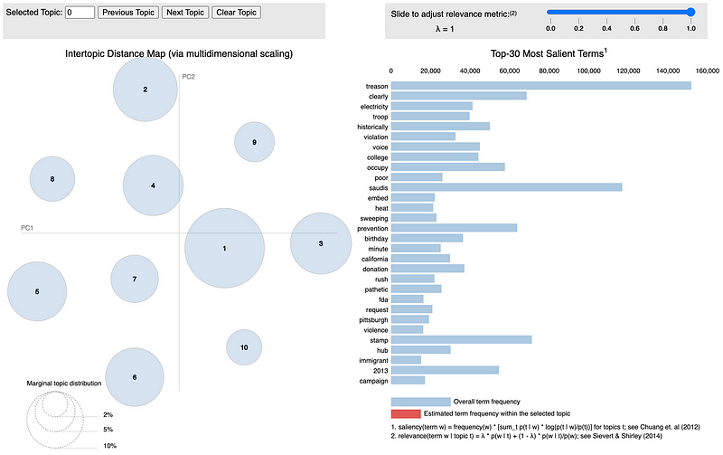
LDA visualization for fake news data.
Top terms for the largest topic in fake news data.

You can check out the full interactive visualization here. Based on the topic model visualizations for real and fake news, it is clear that fake news usually involves different topics when compared to real news. Based on the visualizations and some of the topic keywords such as treason, violation, pathetic, rush, and violence it seems that fake news generally covers more controversial topics such as alleged political scandals and conspiracy theories.

Defining and Training the Model

The deep learning model I designed for this task is a recurrent convolutional neural network model that consists of several different types of sequential operations and layers:

  1. A tokenizer is used to transform each article into a vector of indexed words (tokens).
  2. A word embedding layer that learns an embedding vector with m dimensions for each unique word and applies this embedding for the first n words in each news article, generating a m x n matrix.
  3. 1D convolutional and max-pooling layers.
  4. LSTM layers followed by dropout layers.
  5. A final fully-connected layer.

These components are explained in greater detail below.

The Tokenizer

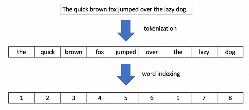
A tokenizer is used to split each news article into a vector of sequential words, which is later converted to a vector of integers by assigning a unique integer index to each word. The figure below demonstrates this process with a simple sentence.

The steps performed by the tokenizer. (Image by author)

Word Embedding Layers

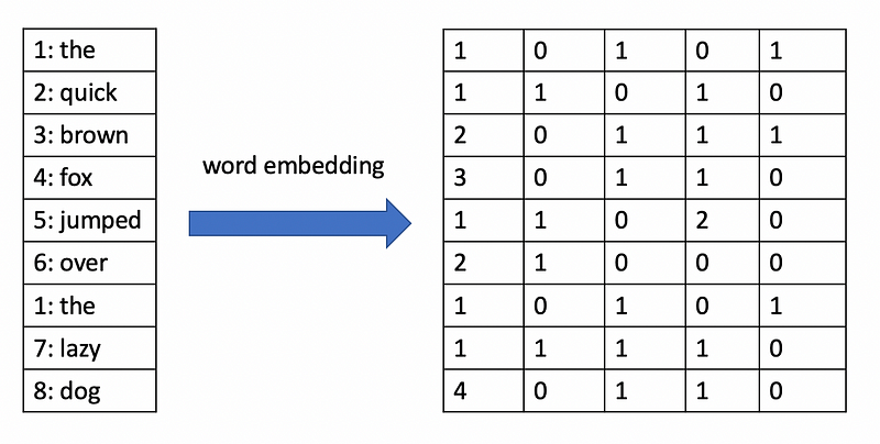
Word embeddings are learnable vector representations of words that represent the meaning of the words in relation to other words. Deep learning approaches can learn word embeddings from collections of text such that words with similar embedding vectors tend to have similar meanings or represent similar concepts.

Word embedding of a sentence with 5-dimensional vectors for each word. (Image by author)

1D Convolutional and Max-Pooling Layers

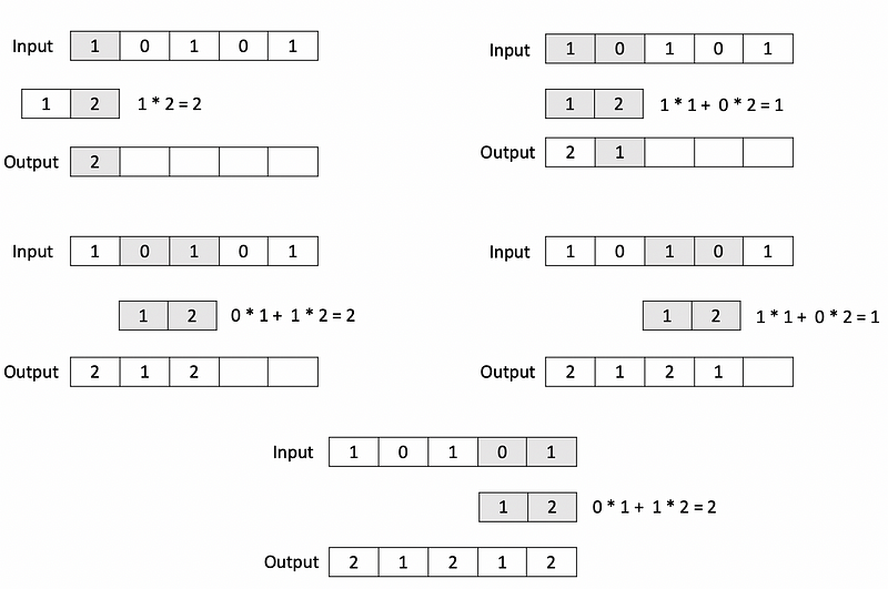
These components are the convolutional part of the recurrent convolutional neural network. If you have studied computer vision, you may be familiar with 2D convolutional and pooling layers that operate on image data. For text data, however, we need to use 1D convolutional and pooling layers. A 1D convolutional layer has a series of kernels, which are low-dimensional vectors that incrementally slide across the input vector as dot products are computed to produce the output vector. In the example below, a 1D convolutional operation with a kernel of size 2 is applied to an input vector with 5 elements.

Example of a 1D convolution operation. (Image by author)

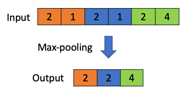
Like 1D convolutional layers, 1D max-pooling layers also operate on vectors but reduce the size of the input by selecting the maximum value from local regions in the input. In the example below, a max-pooling operation with a pool size of 2 is applied to a vector with 6 elements.

Example of a 1D max-pooling operation with a pool size of 2. (Image by author)

LSTMs

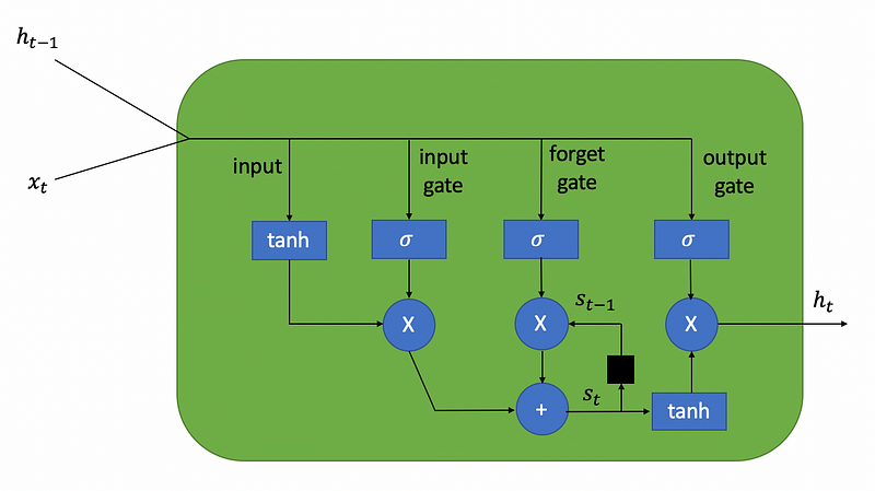
The LSTM (long short-term memory) units form the recurrent part of the recurrent convolutional neural network. LSTMs are often used for tasks involving sequence data such as time series forecasting and text classification. I won’t dive deeply into the mathematical background behind LSTMs because that topic is out of the scope of this article, but essentially an LSTM is a unit in a neural network capable of remembering essential information for long periods of time and forgetting information when it is no longer relevant (hence the name, long short-term memory). An LSTM unit consists of three gates:

  • An input gate which receives the input values.
  • A forget gate which decides how much of the past information acquired during training should be remembered.
  • An output gate which produces the output values.
Diagram of an LSTM unit. (Image by author)

The ability of LSTMs to selectively remember information is useful in text classification problems such as fake news classification, since the information at the beginning of a news article may still be relevant to the content in the middle or towards the end of the article.

Fully-Connected Layer

The final part of this model is simply a fully-connected layer that you would find in a “vanilla” neural network. This layer receives the output from the last LSTM layer and computes a weighted sum of the vector values, applying a sigmoid activation to this sum to produce the final output — a value between 0 and 1 corresponding to the probability of an article being real news.

Putting it All Together

The class that I created below is designed for customizing and encapsulating a model with all of the components described above. This class represents a pipeline that can be fitted directly to preprocessed text data without having to perform steps such as tokenization and word indexing beforehand. The LSTM_Text_Classifier class extends the BaseEstimator and ClassifierMixin classes from Scikit-learn, allowing it to behave like a Scikit-learn estimator.

https://gist.github.com/AmolMavuduru/b8dbc121b8aec8319e244e0719fa72d0

Using this class, I created a model with the following components in the code below:

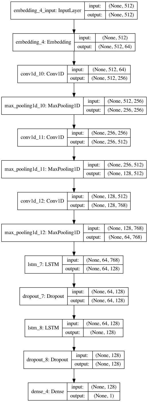
  • A word embedding layer that learns a 64-dimensional embedding vector for each word and aggregates the vectors from the first 512 words of a news article to generate a 512 x 64 embedding matrix for each input article.
  • Three convolutional layers with 128 convolutional filters and a kernel size of 5, each followed by a max-pooling layer.
  • Two LSTM layers with 128 neurons, each followed by a dropout layer with a 10 percent dropout rate.
  • A fully-connected layer at the end of the network with a sigmoid activation, outputting a single value ranging from 0 to 1 and indicating the probability of an article being real news.
lstm_classifier = LSTM_Text_Classifier(embedding_vector_length=64, max_seq_length=512, dropout=0.1, lstm_layers=[128, 128], batch_size=256, num_epochs=5, use_hash=False,
conv_params={'filters': 128,
'kernel_size': 5,
'pool_size': 2,
'n_layers': 3})

The visualization below gives us a good idea of what the model architecture for this recurrent convolutional network looks like.

Recurrent convolutional neural network architecture with a word embedding layer. (Image by author)

Training, Validation, and Testing Split

In order to evaluate the performance of this model effectively, it is necessary to split the data into separate training, validation, and testing sets. Based on the code below, 30 percent of the data is used for testing, and of the remaining 70 percent, 14 percent (20 percent of 70) is used for validation, and the remaining 56 percent is used for training.

from sklearn.model_selection import train_test_split
X_train, X_test, y_train, y_test = train_test_split(X, y, test_size=0.3, random_state=42)
X_train, X_valid, y_train, y_valid = train_test_split(X_train, y_train, test_size=0.2, random_state=42)

Model Training

After defining this complex model, I was able to train it on the training set while monitoring its performance on the validation set. The model was trained for three epochs and achieved its peak validation performance at the end second training epoch based on the code and output below.


lstm_classifier.fit(X_train, y_train, validation_data=(X_valid, y_valid))
Fitting Tokenizer...
Model: "sequential_4"
_________________________________________________________________
Layer (type) Output Shape Param #
=================================================================
embedding_4 (Embedding) (None, 512, 64) 13169920
_________________________________________________________________
conv1d_10 (Conv1D) (None, 512, 256) 82176
_________________________________________________________________
max_pooling1d_10 (MaxPooling (None, 256, 256) 0
_________________________________________________________________
conv1d_11 (Conv1D) (None, 256, 512) 655872
_________________________________________________________________
max_pooling1d_11 (MaxPooling (None, 128, 512) 0
_________________________________________________________________
conv1d_12 (Conv1D) (None, 128, 768) 1966848
_________________________________________________________________
max_pooling1d_12 (MaxPooling (None, 64, 768) 0
_________________________________________________________________
lstm_7 (LSTM) (None, 64, 128) 459264
_________________________________________________________________
dropout_7 (Dropout) (None, 64, 128) 0
_________________________________________________________________
lstm_8 (LSTM) (None, 128) 131584
_________________________________________________________________
dropout_8 (Dropout) (None, 128) 0
_________________________________________________________________
dense_4 (Dense) (None, 1) 129
=================================================================
Total params: 16,465,793
Trainable params: 16,465,793
Non-trainable params: 0
_________________________________________________________________
None
Fitting model...


Train on 41446 samples, validate on 10362 samples
Epoch 1/5
41446/41446 [==============================] - 43s 1ms/step - loss: 0.2858 - accuracy: 0.8648 - val_loss: 0.1433 - val_accuracy: 0.9505
Epoch 2/5
41446/41446 [==============================] - 42s 1ms/step - loss: 0.0806 - accuracy: 0.9715 - val_loss: 0.1192 - val_accuracy: 0.9543
Epoch 3/5
41446/41446 [==============================] - 43s 1ms/step - loss: 0.0381 - accuracy: 0.9881 - val_loss: 0.1470 - val_accuracy: 0.9527
Epoch 00003: early stopping

Validation Results

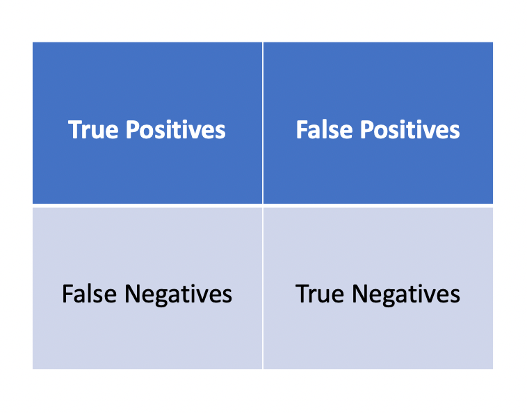
While accuracy is a useful metric for classification, it fails to tell us how the model is performing with respect to detecting each class. The code provided below computes the confusion matrix and classification report for the model’s predictions on the validation dataset to provide a better picture of the model’s performance. The confusion matrix provides classification statistics in the following format:

How to interpret a confusion matrix. (Image by author)

The classification report for each class provides the following additional metrics:

  1. Precision — the number of times a class was correctly predicted divided by the total number of times the model predicted this class.
  2. Recall — the number of times a class was correctly predicted divided by the total number of samples with that class label in the testing data.
  3. F1-Score — the harmonic mean of precision and recall.
lstm_classifier.load_model('best_model')
from sklearn.metrics import confusion_matrix, classification_report

y_pred = lstm_classifier.predict_classes(X_valid)
print(confusion_matrix(y_valid, y_pred))
print(classification_report(y_valid, y_pred, digits=4))
[[4910  204]
[ 271 4977]]
precision recall f1-score support

0 0.9477 0.9601 0.9539 5114
1 0.9606 0.9484 0.9545 5248

accuracy 0.9542 10362
macro avg 0.9542 0.9542 0.9542 10362
weighted avg 0.9542 0.9542 0.9542 10362

Based on the results above, we can clearly see that the model is nearly as good at detecting fake news correctly as it is at detecting real news correctly and achieved an overall accuracy of 95.42 percent on the validation data, which is pretty impressive. According to the confusion matrix, only 271 articles were misclassified as fake news and only 204 articles were misclassified as real news.

Testing Results

While the validation results can give us some indication of the model’s performance on unseen data, it is the testing set, which has not been touched at all during the model training process which provides the best objective and statistically correct measure of the model’s performance. The code below produces a classification report for the testing set.

from sklearn.metrics import accuracy_score

y_pred_test = lstm_classifier.predict_classes(X_test)
print(classification_report(y_test, y_pred_test))
               precision    recall  f1-score   support

0 0.94 0.95 0.95 11143
1 0.95 0.94 0.95 11061

accuracy 0.95 22204
macro avg 0.95 0.95 0.95 22204
weighted avg 0.95 0.95 0.95 22204

Based on the output above, the model achieved a similar level of performance on the testing set compared to its performance on the validation set. The model classified news articles in the testing set with an accuracy of 95 percent. Compared to the study in which humans were able to detect fake news only 70 percent of the time, these results are promising and demonstrate that a trained neural network could potentially do a better job at filtering out fake news than a human reader.

Conclusions

  • Based on the LDA visualizations, we can see that there is a different distribution of topics and associated keywords for real and fake news.
  • The recurrent convolutional neural network used in this project was able to distinguish between real and fake news articles with 95 percent accuracy on the testing data, which suggest that neural networks can potentially detect fake news better than human readers.

Feel free to check out the Jupyter notebook with the code for this article on GitHub.

Sources

  1. V. Pérez-Rosas, B. Kleinberg, A. Lefevre, R. Mihalcea, Automatic Detection of Fake News, (2018), arXiv.org
  2. A. Bharadwaj, B. Ashar, P. Barbhaya, R. Bhatia, Z. Shaikh, Source-Based Fake News Classification using Machine Learning, (2020), International Journal of Innovative Research in Science, Engineering and Technology

COVID-19 Analysis and Forecasting Using Deep Learning

Introduction

As of October 2020, the COVID-19 pandemic has claimed over 1 million lives across the world and over 41 million people have been infected. Understanding the factors and policies that influence the spread of the virus can help governments make informed decisions in order to control infections and deaths until a vaccine becomes widely available.

The goal of this article is to answer the following questions:

  • What are the factors and policies that have the greatest impact on the number of cases and deaths across the world?
  • How can we predict the number of COVID-19 cases, deaths, and recoveries in the future?

Datasets

In order to answer the questions above, I aggregated data from the following sources:

I used data aggregated from both sources to train three neural networks that can forecast the number of COVID-19 cases, deaths, and recoveries in any nation months into the future based on a wide range of factors including:

  • GDP
  • Government response to the coronavirus, including stay-at-home and social distancing restrictions.
  • The change in mobility of its population since the start of the pandemic.
  • Demographic data about its population.
  • Past data regarding the number of cases, deaths, and recoveries.

Source Code

All of the code that I used to build the models and visualizations described in this post are publicly available and can be accessed in the following GitHub repository: https://github.com/AmolMavuduru/COVID19FactorAnalysis.

A Detailed Look at the Data

The data used for this project can be divided into four different parts, each represented as separate data frames/tables in the code: policy data, mobility data, demographic data, and COVID-19 time-series statistics.

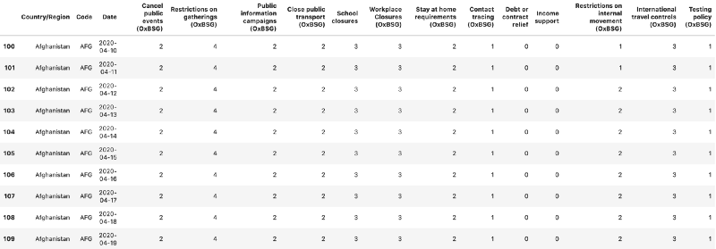
Policy Data

The policy data, extracted from the OxCGRT dataset, contains information about the policies implemented by the government in each country to control the spread of COVID-19. The policy data is available for each day after the start of the pandemic.

Sample of ten rows from the policy data.

Mobility Data

The mobility data, also extracted from the OxCGRT dataset, tracks the percent change in movement to public places such as grocery stores, residential areas, and parks since a baseline period between January and February 2020.

Sample of ten rows from the mobility data.

Demographic Data

The demographic data contains information about the characteristics of each country such as statistics regarding the age of the population, the country’s GDP (gross domestic product), and medical information such as the prevalence of diabetes. This data was also extracted from the OxCGRT website provided earlier.

Sample of ten rows and a subset of columns of demographic data.

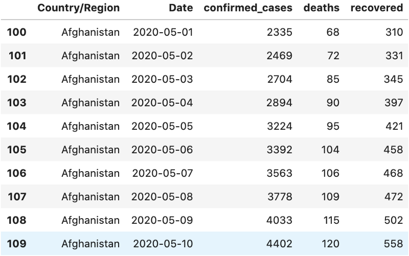
COVID-19 Time-Series Statistics

This data contains the target variables that the models in this project are designed to predict — the number of COVID-19 cases, deaths, and recoveries for each country. This data was downloaded from the JHU CSSE COVID-19 Dataset.

Sample of ten rows from COVID-19 time-series statistics.

Exploratory Data Analysis and Visualizations

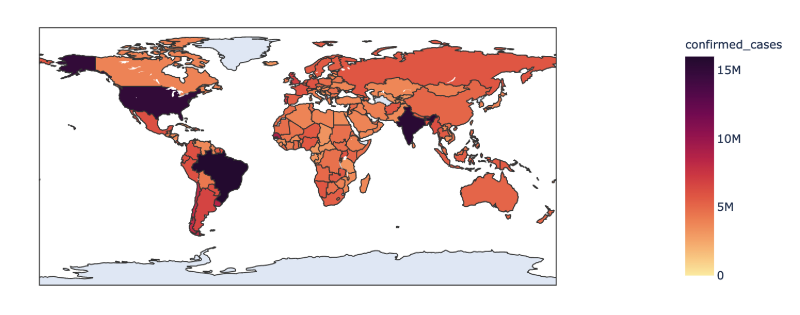
The visualizations presented below track the changes in confirmed cases, deaths, and recovered cases across the world since the start of the pandemic and until October. As the visualizations demonstrate, the pandemic started in China, but over time the United States, India, and Brazil became the three countries with the most cases and deaths.

Confirmed Cases Around the World

https://datapane.com/u/AmolMavuduru/reports/covid_cases?version=40

Deaths Around the World

https://datapane.com/u/AmolMavuduru/reports/covid_deaths?version=39

Recovered Cases Around the World

https://datapane.com/u/AmolMavuduru/reports/covid_recoveries?version=39

Factor Analysis

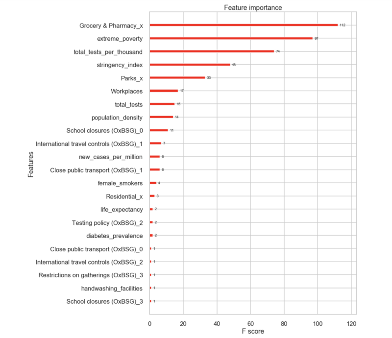
In order to determine which factors have the greatest impact on COVID-19 outcomes around the world, I used the data described earlier to create a country profile for every country with COVID-19 statistics. Each country profile contains demographic data, policy data, and mobility data. I framed this as a machine learning problem where I trained gradient-boosting models, using XGBoost, to predict the total number of cases, deaths, and recoveries based on the country profiles.

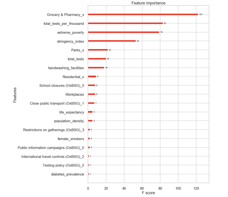
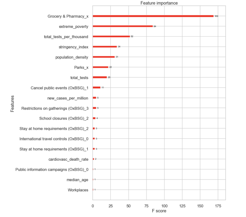
A helpful feature present in the XGBoost API is the ability to plot the importance of each feature considered by an XGBoost model after training. I used this feature to visualize and rank the importance of variables used in the country profiles. Each feature is ranked by its F-score, a metric that simply reports the number of times a feature was used to split a node in a decision tree used in a tree-based model such as XGBoost. The idea is that decision trees will select features with more predictive power more often, leading to higher F-scores for these features. The graphs below plot the F-scores for the top factors impacting the number of confirmed cases, deaths, and recoveries across all countries.

What factors have the greatest overall impact on the total number of confirmed cases?

Most important factors in the number of confirmed cases.

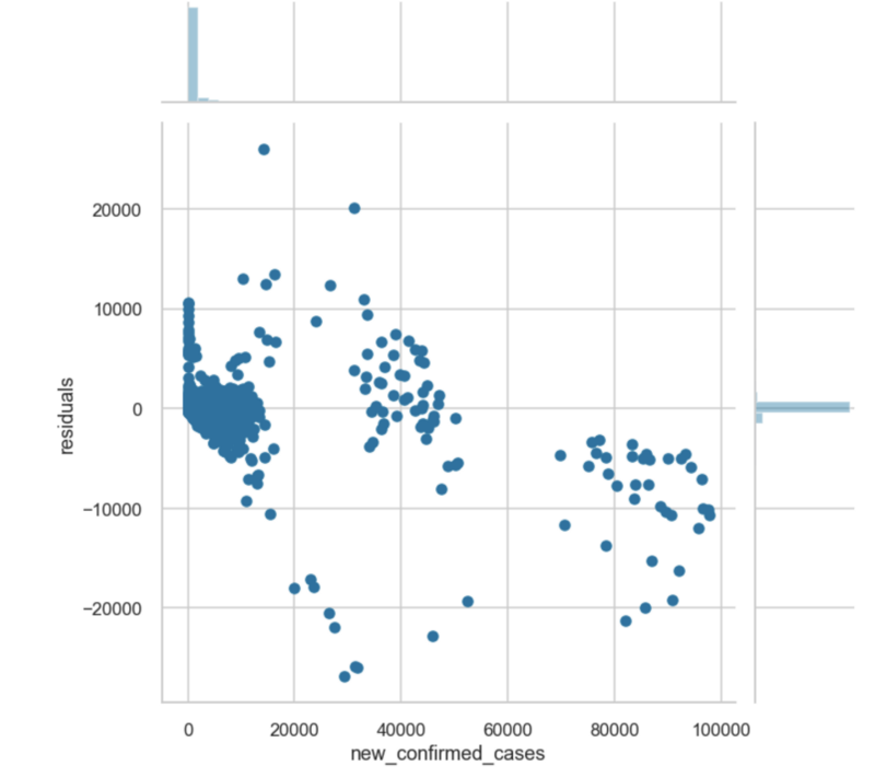
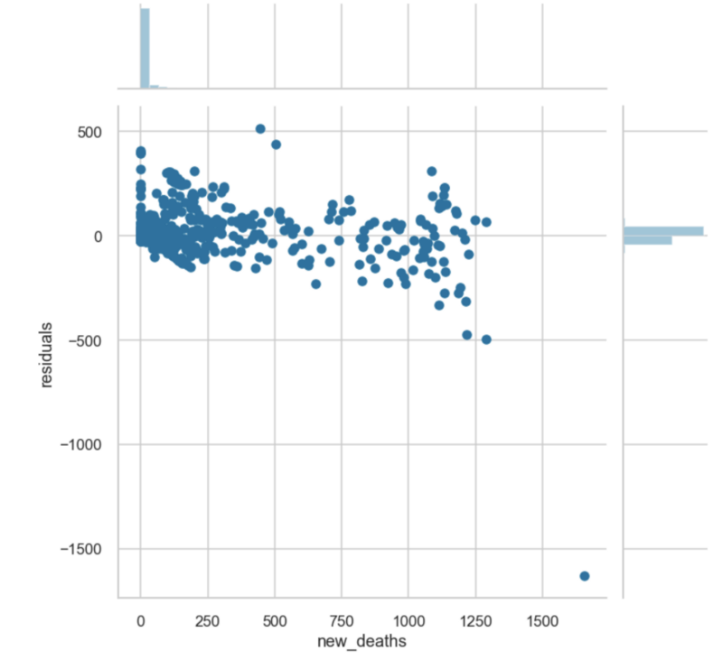
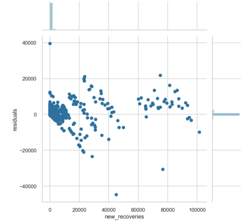
The justifications below may explain why some of the factors listed in the graph above were identified as the most important:

  • Changes in Movement to Grocery Stores, Parks, Workplaces, and Residential Areas: the virus spreads from person-to-person contact, and as people more frequently visit public places such as grocery stores, parks, and offices in larger numbers, the probability of virus transmission increases.
  • school, workplace, and public transport closures: closing public places limits the movement of people to these locations, reducing the probability of virus transmission through person-to-person contact.
  • Extreme Poverty: countries with extreme poverty are more vulnerable to COVID-19 outbreaks due to crowded living conditions, poor sanitation, and less sophisticated healthcare infrastructure.
  • stringency index: governments that enforce stricter restrictions on movement and mask-wearing may be able to better control the spread of the virus.
  • population density: social distancing is difficult to practice in densely populated countries where the virus is likely prone to spread rapidly due to close contact between people.
  • diabetes prevalence: research has shown that people with diabetes are more vulnerable to COVID-19 complications and people who get infected with COVID-19 have chances of developing symptoms of type 2 diabetes.
  • testing policy: more widespread testing affects the number of reported cases and also makes contact-tracing efforts possible in order to control the spread of the virus.
  • handwashing facilities: countries with more handwashing facilities will likely have better sanitation and thus will be better prepared to limit outbreaks in communities.

What factors have the greatest overall impact on the total number of deaths?

Most important factors in the total number of deaths.

Many of the factors in the previous graph are present here as well since the number of deaths in a country is generally correlated with the number of cases. It is interesting to note that both the number of handwashing facilities and the change in movement to residential areas rank higher in the list of important factors in the number of deaths than in the previous list. Countries with more handwashing facilities are likely to have more widespread access to healthcare and better living conditions, which can reduce the number of deaths. The increase in movement to residential areas may contribute to an increase in deaths as the virus spreads through large gatherings in homes.

What factors have the greatest overall impact on the total number of recovered cases?

Most important factors in the total number of recoveries.

Many of the factors that appeared in the previous two graphs are present in this one as well. The cardiovascular death rate and median age are likely negatively correlated with the number of total recoveries. Countries with lower cardiovascular death rates and younger populations are likely to have more recoveries from COVID-19 cases.

COVID Forecasting Models

All of the models follow the same network architecture shown below. Each model is a deep neural network with two hidden layers containing 90 neurons each. These models are designed to predict the change in confirmed cases, deaths, and recoveries for each day.

Neural network architecture for all models.

Each model was trained on a training set of 35,780 samples and tested on a testing set of 7956 samples. For each model, the following performance metrics were computed with reference to the testing set:

  • R² Coefficient
  • Adjusted R² Coefficient
  • Mean Absolute Error (MAE)

A residual plot was also constructed for each model to examine the distribution of prediction errors (residuals) on the testing data.

Cases Forecasting Model

Performance Metrics:

R² = 0.961

Adjusted R² = 0.96

MAE = 411.97

Residual Plot for Confirmed Cases Model

Deaths Forecasting Model

Performance Metrics:

R² = 0.91

Adjusted R² = 0.9

MAE = 11.15

Residual Plot for Deaths Forecasting Model

Recovered Cases Forecasting Model

Performance Metrics:

R² = 0.93

Adjusted R² = 0.929

MAE = 513.26

Residual Plot for the Recoveries Model

Forecasts for the United States for the rest of 2020

Case 1: No Significant Changes in Mobility

These forecasts are based on the assumption that there are no changes in movement or in policies from now until the rest of 2020. Imagine taking a snapshot in time and assuming that the exact conditions in October do not change at all for the rest of the year. In this highly optimistic scenario, the deaths and confirmed cases still follow an approximately linear increase until the end of the year, with the number of confirmed cases nearing 12 million and the total number of deaths crossing 283,000.

Confirmed Cases

https://datapane.com/u/AmolMavuduru/reports/confirmed_cases_us_case1?version=7

Daily Cases

https://datapane.com/u/AmolMavuduru/reports/daily_cases_us_case1?version=5

Total Deaths

https://datapane.com/u/AmolMavuduru/reports/total_deaths_us_case1?version=5

Daily Deaths

https://datapane.com/u/AmolMavuduru/reports/daily_deaths_us_case1?version=5

Case 2: A 5 Percent Increase in Mobility Each Day

In this scenario, the amount of movement to public places such as parks, grocery stores, and workplaces increases by 5 percent each day. This scenario produces nearly 15 million confirmed cases and around 348,000 deaths and the growth in cases and deaths is exponential rather than linear in nature. This dramatic shift only highlights how important social distancing and mobility restrictions are when controlling the spread of the virus.

Confirmed Cases

https://datapane.com/u/AmolMavuduru/reports/confirmed_cases_us_case3?version=1

Daily Cases

https://datapane.com/u/AmolMavuduru/reports/daily_cases_us_case3?version=1

Total Deaths

https://datapane.com/u/AmolMavuduru/reports/deaths_us_case3?version=2

Daily Deaths

https://datapane.com/u/AmolMavuduru/reports/daily_deaths_us_case3?version=2

Forecasts for the World

The following visualizations present COVID-19 case forecasts for the entire world for both scenarios. Note that these forecasts were generated using data until October 16.

Case 1: No Significant Changes in Mobility

https://datapane.com/u/AmolMavuduru/reports/covid_predictions_case1?version=4

Case 2: A 5% Increase in Mobility Each Day

https://datapane.com/u/AmolMavuduru/reports/covid_predictions_case3?version=3

Model Limitations

While these models are capable of generating reasonable COVID-19 forecasts, they have several limitations when compared to more sophisticated models such as the influential IHME model and when evaluated in a general context.

National vs. State-Level Predictions

These models generate predictions at the national level, which are still useful but less detailed than the state-level predictions generated by the popular IHME model for the United States.

Considering Mask Mandates

While these models take into account restrictions related to social distancing and closures of schools, workplaces, and public venues, they do not take mask mandates into account. The IHME model has generated predictions for COVID-19 cases and deaths depending on the level of mask usage.

What Happens If There is a Vaccine?

These models were trained with the assumption that a vaccine will not become widely available during the forecast window. If a vaccine becomes widely available, several countries could see a decline in cases and deaths that the models would not be able to predict.

Conclusions

  • Social distancing and mobility restrictions are extremely important when controlling the spread of the virus because increases in movement to public places can have an exponential impact on the number of infections and deaths.
  • Policies such as school closures, international travel control, restrictions on gatherings, and stay-at-home requirements have a significant impact on the number of confirmed cases, deaths, and recoveries for a given country.
  • The models created in this investigation predict between roughly 12 million and 15 million total confirmed cases and between roughly 283,000 and 348,000 total deaths in the United States by 2021 depending on mobility changes over the next few months. These predictions are similar to those generated by the IHME model.

As I mentioned earlier, the code for this article is available on GitHub, feel free to check it out.

Sources

  1. M. Roser, H. Ritchie, E. O. Ospina, and J. Hasell, Coronavirus Pandemic (COVID-19) (2020), OurWorldInData.org.
  2. E. Dong, H. Du, and L. Gardner, An interactive web-based dashboard to track COVID-19 in real-time (2020), Lancet Inf Dis. Github repository: https://github.com/CSSEGISandData/COVID-19
  3. IHME COVID-19 Forecasting Team, Modeling COVID-19 scenarios for the United States (2020), Nature Medicine.